Sublime Forum

Dev Build 3145

#42

I’m on Ubuntu 14.04 and I got the following error message upon installing build 3147
from the 64-bit .deb package.

Unable to load gdk_pixbuf_read_pixels from libgdk-x11-2.0.so

But the library seems to be properly installed:

$ locate libgdk-x11-2.0.so
/usr/lib/x86_64-linux-gnu/libgdk-x11-2.0.so.0
/usr/lib/x86_64-linux-gnu/libgdk-x11-2.0.so.0.2400.23

Does other people have the same problem ?

1 Like

#43

Currently, you have to downgrade to the previous version:

" One of the changes in this build inadvertently made it depend on a newer version of GTK, we’ll fix that for the next dev build, but I don’t have an ETA." – Jon

2 Likes

Latest development build fails
Ubuntu - after updating to Sublime Text Build 3147 got an error
#44

Ligature != doesn’t work with C++.

It works with JS for example. Ligatures actually look great in JS.

0 Likes

#45

I too have noticed a bug with ligatures. Comments starting with < are being rendered without the preceding < glyph.

4 Likes

#46

Same gdk_pixbuf problem using Linux Mint 17 [Based On: Ubuntu 14.04.5].

$ /opt/sublime_text/sublime_text
Unable to load gdk_pixbuf_read_pixels from libgdk-x11-2.0.so

Can anyone think of a way around this? Web search solutions were unhelpful.

Unfortunately the following did not help:

$ sudo apt-get install libgtk2.0-0
libgtk2.0-0 is already the newest version.

The other likely contender libgdk-pixbuf2.0-0 is also already installed.

0 Likes

#47

Upgrading Ubuntu will help :wink:

as discovered on Discord:

you need a version newer than version 2.0 - 2.31 for example
https://abi-laboratory.pro/tracker/headers_diff/gdk-pixbuf/2.30.8/2.31.0/diff.html
The latest version available for ubuntu 14.04 is 2.30.7

So you can either wait for the next dev build or upgrade your Ubuntu :wink: I proved it works on 16.04.

0 Likes

#48

Note that some ligature related bugs in 3147 are also being discussed here:

1 Like

#49

[quote=“kingkeith, post:47, topic:32340, full:true”]So you can either wait for the next dev build or upgrade your Ubuntu :wink: I proved it works on 16.04.
[/quote]
For me using Linux Mint 17 (Ubuntu 14.04) upgrading to the latest version of Mint (18.2 - Ubuntu 16.04) effectively requires a clean install. I keep meaning to get around to it, but it’ll be 4 to 6 hours of tediousness to sort: my desktop how I like it, my 50+ altered system hot keys (20+ of which run my own scripts needing the full path pasted) and all need to be manually re-entered, NTP, crontab, swappiness, custom icons, mass storage fstabs, mount points, grub, … make that 4 to 8 hours. Maybe I should install Linux Mint Debian Edition and avoid having to go through this pain every few years.

0 Likes

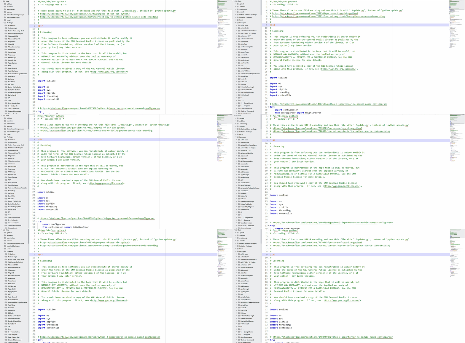
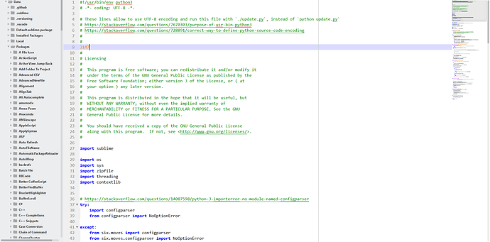
#50

I tried using these options but I could not notice anything different with Consolas font size 14.


Now on build 3147 my fonts are rendered wider than on build 3144, Issue: $1984

Can this be fixed?

2 Likes

#51

Correction, after testing it with Consolas font, it seems bigger, not just wider:

Reducing the font size, makes it smaller than it was while on build 3144:

Update

I was using font size 14, both on build 3144 and 3147. Now I set my font size to 13.5, and now I have the same font size as 3144 with size 14. So, nothing to fix, except my configuration files.

@danghm, you need to recude you font size like using fractional points like 13.5 to get the same size as the build 3144.

3 Likes

#52

Thanks, I did reduce my font size a little bit, but the letter spacing is actually just the same as build 3144 with no_round option. Not a big deal though. I get used to it after half day coding :wink:

My wishlist on the rendering engine right now is:

  • Ability to reduce font weight. This one is very important because on dark theme and light theme it looks very different. On Atom I use a CSS snippet to adjust Pragmata Pro on a dark theme:
atom-text-editor {
  -webkit-font-smoothing: antialiased;
  -webkit-text-stroke: 0.1px;
}
  • Ability to adjust letter spacing. Some font like Pragmata Pro and Iosevka looks nice but the spaces are too tight to stare at for the whole day.

To make SanFrancisco Mono looks the same as on Atom, I had to modify the font, and it not easy at all.

0 Likes

#53

System:

  • Win 10 1703
  • dpi_scale 1.0
  • resolution 1900x1200
  • ST 3147 x64
  • ClearType enabled and tuned (no default settings)

Tested fonts:

  • Roboto Mono
  • Source Code Pro
  • Consolas

Results:

  • Fonts render render with same visual “thickness” on dark and light background, that’s great!
  • Even grey fonts are better visible on white background

About “dwrite_cleartype_classic” and “dwrite_cleartype_natural”:

  • Both options have same results on my machine, with all three tested fonts.
  • Horizontal font spacing looks a bit erratic if one of the options is enabled. This effect is more significant for smaller font_sizes <12 and disapears with >=14. Maybe there are just not enough pixels on my screen. :smile: I can’t even say which version looks better. Some font spacing get better others worse.
  • larger fonts don’t look less smooth and accurate with these options, especially letters like o, a
  • I can’t confirm font size changes like @addons_zz stated, when toggling the option.
0 Likes

#54

When I use the options I do not get font size changes. I get font size changes when I switch between build 3144 and 3147 (bigger than 3144). Indeed the text I wrote is misleading. I am going to try to rephrase it.

0 Likes

#55

I’m not sure if the font difference between one version to another matters. Maybe it does. The real question is which version 's sizes are more accurate? I mean the entire font rendering was rewritten, so imagine the algorithm is a bit different (maybe better?). I guess better can be subjective.

Maybe there is a miscalculation, but it may also be that you are just used to the size in the previous version, and now its different. Or maybe these kind of things just don’t bother me ¯\_(ツ)_/¯.

4 Likes

#56

Dev Build 3147 some font ligatures aren’t working, i’m on MacOS High Sierra 10.13.

Also @jps will there be an option to choose a specific font just for font ligatures? I like Fira Code ligatures but not a massive fan of the font, so If I could use their ligatures with Roboto Mono like it’s capable of doing in Atom that would be great.

2 Likes

#57

Just a quick shout out, @jps and @wbond: thanks. Sublime remains a fantastic and irreplaceable part of my toolkit, and it’s great to see it continue to move forward. It’s not without its flaws, but the good vastly, vastly outweighs the bad. My license is one of the best investments I’ve ever made, and I’m actively looking forward to getting a chance to further support its development with future paid upgrades.

7 Likes

#58

My problem was when updating from build 3144 to build 3147, the font size increased for the same point 14. Using font bigger than before has the problem of free space on the screen, which reduced by a few lines. But I did not realize I could try to reduce it by fractional points as 13.5 instead of only 13 or 14. Doing 13.5 on build 3147 is renders the same size as 14 on build 3144.

0 Likes

#59

@petert82: What hardware and monitor are you running? Have you done anything along the lines of color calibrating your monitor?

The way 3147 detects monitor gamma has changed, and it looks like it’s using the wrong gamma value for your setup.

0 Likes

#60

Consolas used to default to GDI rendering, now it defaults to DirectWrite. You can set this explicitly via font_options, but you won’t get ligatures showing with GDI

1 Like

How to enable ligatures?
Strange thing about the default Consolas font
#61

With regards to ligatures, text is first tokenised within regards to the rules in the syntax definition, and then shaped. If text crosses token boundaries (i.e. has a different scope applied to it), then it won’t get transformed into a ligature. If you’re unsure, then change the current syntax to Plain Text, and the ligatures should show as expected.

6 Likes

Ligatures only show in some languages