Sublime Forum

Strange thing about the default Consolas font

#1

You don’t need to look at my screenshots, it’s super easy to replicate on your own.

I found a very interesting thing in sublime 3:
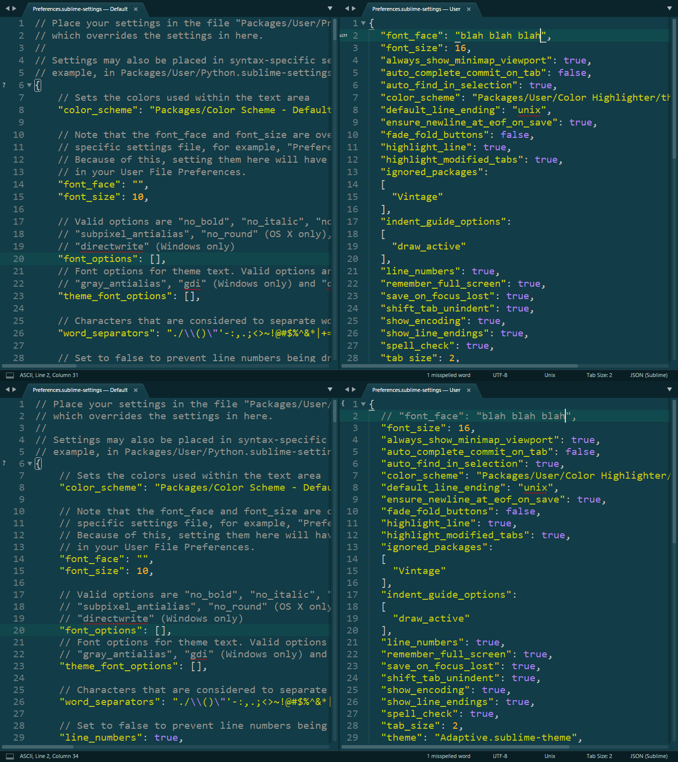
As we all know, the default font is Consolas when you don’t set a font, however, when you set the font to something unknown, Consolas will still be used, but rendered slightly differently, slightly thinner, which looks better to me personally, because I feel the original Consolas is a little bit too fat.

My question is: why does this happen and more importantly, does this thinner Consolas have its own name? How can I use it elsewhere?

My screenshots are self-explanatory, check out the maximum lines displayed on the screen, as well as the maximum characters displayed on each line.
(Drag the image to a new tab to enlarge it)

0 Likes

#2

Which Sublime Text build you are using? Is it windows?

Since build 3145, the default font option changed then the consolas font started rendering larger/wider.

I set it by default to “gdi”, because “DirectWrite” is rendering my fonts uglier, larger, I do not liked. Then due this, I lose the ligature support, however my default font is Consolas which does not support ligatures. Anyways, I am not sure I would like ligatures in my code.

  1. How to enable ligatures?
0 Likes

#3

Thanks! I’m using 3143 on windows.

After seeing your reply I tried to set my font-options to DirectWrite, and yes! That’s exactly it! Setting the font to a non-existing one will result in DirectWrite rendering, leaving it to default will make it GDI.

By the way I also found that GDI can’t correctly render all Unicode symbols, for instance :hourglass_flowing_sand: . But DirectWrite can.

1 Like

#4

This is a known internal GDI issue and maybe one of the reasons for DirectWrite to be used wherever possible.

0 Likes