One could argue that there is more difference between Boticelli’s venus and a DaVinci’s Mona Lisa… than between one variety of “s inside a thing” than anther variety of “s inside a thing”. (it looks like Skype… It looks like Superman… It looks like a stop sign… It looks like… )
But you dont like it, so that’s cool. No. Really… it’s ok.
[quote=“Squiggle”]Taking some inspiration from a variety of the icons already posted, here is a first attempt at another variation (although I’m no icon maker, so I don’t know what I’m doing). Please feel free to run with it.
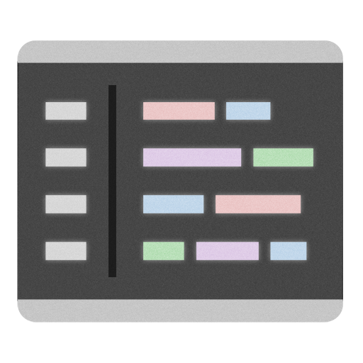
Text in the background is part the svg file itself and sublime_plugin.py for the right hand side, using solarized dark theme.
Just thought I’d throw another icon into the mix… I tried to keep some spirit of the while representing the theme I use (Tomorrow Night 80s, https://github.com/ChrisKempson/Tomorrow-Theme). It could certainly use some more refinement.
I love @natebeaty’s icon (and am using it now), but I have to be honest - pretty much any of the icons posted so far would be better than the default one. For such a superb piece of software, the icon really does look awful (and doesn’t give me quick visual distinction between that and a terminal when I have a lot of apps open).
you’re actually contradicting yourself, tacky is another way of saying its cheap looking or poor quality,
Now if you say it to someone worked on these logo that they’re designs are tacky, how could anyoune be offended by that?
@ natebeaty
loving your new icon, I think the way you’re using grey palette is more loyal to the original icon . I like this better than the blue one, well done
…odd having to pick the code to show in the icon. I’m assuming CSS isn’t the most common use of ST2, and there could probably be a more elegant snippet of something on there. But you get the idea.[/quote]
I love that Icon, i’m using it on my Linux and Windows desktop.
So I think that will be more cool make some extension specific icon , like package extension etc. etc.
I don’t take offense as I agree for the most part. But seeing these icons so large is deceiving. Once they’re in use on the dock or task switcher, they’ve been reduced to a (hopefully) easily identifiable, abstract shape. All the silly details, the gloss, shadows, code sample, etc, are extremely minimal at the size of use.
I like the simplicity of the original icon, and I like some of the more direct plays off of that, but most of them have the same problem as the original: they’re really hard to identify at a glance in context. (Often being confused with the Terminal.)
As far as I’m concerned, these are all just playful tributes to an editor we’re all really enjoying using. Someone will come along (or perhaps Jon will hire an icon designer at some point) with a genius idea that matches the feel & aesthetic of ST2. The same thing happened with TextMate ages ago – there was a rapid development and engaging dialog with the developer, many icons were proposed, many of them just as tacky as what we’ve all been offering up, and eventually an entry jumped out as The One. At least to Allan.
Here’s a variant following the Flurry icon style. Still needs tweaks; curious if you guys have any ideas. It also is not hinted, so viewing it below 128px gets muddy and loses contrast between the borders:
Hey all. I’m a recent switcher from TextMate and am quite liking ST2 so far … apart from the icon. And that’s only because it’s only 128x128 in the ICNS file and so look pixelated when I tab-switch apps.
Anyway, I present a larger version (256x256 here, but it’s vector so can be sized and hinted nicely for ICNS files). Things are pretty much the same, in keeping with the “sublime” and simplicity of the original. A bit more gloss, and a bit of a shadow, of course.
I also offer a slightly rotated option, which should make the icon less confusing when next to Terminal or iTerm, etc., on the Dock.
As for credentials, I’m the designer for the logos for PHP, and the Open Source Initiative, among others.
Though I’m still not a huge fan of the basic design (gray box + white square really says nothing to my lizard brain), this is a HUGE improvement over the current icon. You have my vote (for the non-rotated version).


 . I like this better than the blue one, well done