Sublime Forum

New logo discussion?

#1

With the alpha release of Sublime 2, I think that a new logo should be bundled with it :smile:

Maybe it’s just me, but I find the current icon doesn’t describe the application very well. From what I can tell, it’s supposed to display that Sublime is focused on the middle of the window, ergo, the code.

A new logo and icon would add a new lease of life to it. Especially for advertising the new editor!

I’m not a designer myself so I wouldn’t be able to do this myself. And like always, this is just an idea!

0 Likes

Sublime Text Icon
Where is a forum navigation link?
Which icon do you use for Sublime?
#2

You’re late. I already proposed a new logo some time ago. No word from Jon about it yet, though. :wink: :laughing:

0 Likes

#3

i think sublime would benefit by changing the whole theme to attract new users. the scrollbars + buttons seem very strange (ugly at least to me -.-) and too game-like. the nonexistant contrast on the tabs are also way to hard on the eyes.
in my opinion intype does this very well:
http://intype.info/screenshots/0_3_5-PM-S.png

is there a way to use the standard system scrollbars?

0 Likes

#4

Here is one of my attempts at a logo.

https://dl.dropbox.com/u/7323096/SublimeTextLogo.png

Kind of makes sense to be using Green with lime in the name :smile:

0 Likes

#5

Here is another using a slightly different font.

https://dl.dropbox.com/u/7323096/SublimeTextLogo_Solgas.png

0 Likes

#6

Sublime is Dark.
Not Green.

0 Likes

#7

[quote=“luisvelaz”]Are you kidding? Sublime Text is all about elegance and style, molded from a piece of obsidian, not an anoying lime-lemon editor.

And yes, you are not a designer :smiley:[/quote]

No I am not kidding


Like I said, I am not a designer, so you do not have to repeat it to make me feel bad. I’m a programmer and I work as one. I was bored, and hence the mess that took me 5 minutes to come up with. Most of my time was taken looking for a font.

I’d like to see you do better.

@Sublimator, I agree, dark works, but it’s contradictory to lime, and the theme doesn’t have to change to match the logo. Perhaps a dark version of a better incarnation of a new logo would satisfy.

0 Likes

#8

Is this like some bizzaro thread of the forums where everyone suddenly turns 12?

I agree Sublime’s logo isn’t really informative of it’s purpose. Heck the name it’s self, Sublime Text, is quite a mouth full. As far as your attempt jbrooks I don’t think it really does much to solve the original problem which was not being able to tell Sublime’s purpose from it’s icon. A lime is equally as telling as a black square. Although it was a decent effort for getting ideas flowing.

As far as the other 2 idiots in this thread a favorite quote comes to mind: “Don’t argue with idiots. They’ll just bring you down to their level and beat you with experience.” Just ignore them. They’ll go away faster.

0 Likes

#9

You limey barsteward!

0 Likes

#10

Logos (or icons) shouldn’t be taken literally. Pop open your Windows start (or the equivalent for your OS) menu and look at all the icons. How many describe what the app does? For a more concrete example, look at the icons/logos for IE, Firefox, Chrome and Safari. And what about the Adobe apps?

A good logo and/or icon should encapsulate the brand - the feel, the philosophy, the vibe - of an app, and should make it distinct and recognisable. The current icon, while being a little raw, is reminiscent of the black monolith from Arthur C. Clarke’s Space Odyssey series, which is a brilliant association IMO. It has all the right connotations, and is geekily cool, and shares the Sublime look. What could be more perfect? Take a look:

google.co.uk/images?q=black+monolith

Whoever works on the branding of Sublime (IconFactory would be cool), riffing on the black monolith theme seems like it might be worth considering at least.

0 Likes

#11

I agree with some of your points.

First, saying: “Well all the other icons don’t describe what they’re owners do so it’s ok!” doesn’t make it a good thing to do. Sure there might be other acceptable reasons but that really isn’t one of them. Perhaps the majority of apps just have bad icons? IE is an initial of the app as well as the planet ring giving off the idea it has something to do with the internet. Firefox, again the planet associated with the internet and a fire colored fox. Chome’s icon at least has Google’s colors. Safari’s is a compass indicating you’ll be navigating something. Adobe apps all have the app initials in their icon.

On your second point I agree with what a logo or icon should encapsulate. I personally don’t find that a black square is easily recognizable as “Sublime Text” however. Personally the one major identifiable feature of Sublime to me is it’s minimap. Plenty of other editors can use dark themes or be skinned to be dark. Many people use / prefer dark themes and don’t think of editors as being light or dark.

Again, in the end this is just about an icon and Sublime’s really isn’t so bad that it’s a problem. A strong and stable feature set speaks a lot louder than an icon ever will.

0 Likes

#12

I just want to go on record as saying the current icon of ST is perfect. Don’t change anything about it. It’s simple, and clean, just like ST itself. When ST is first installed, a blank, dark-themed window (like the icon!) is the first thing you see, even if you change it later.

As for the full “logo” which currently seems to be “Sublime” in #757575 and “Text” in #000000, all in Trebuchet MS
 I like the colours, but IMHO it could be spruced-up a bit, is all.

0 Likes

#13

Here is me messing around with a few ideas. Not that a new logo is a big deal or anything ST needs; the current one is, if anything, sufficient. In the following designs I tried to evoke the minimap, which is a defining feature of ST IMHO. I made two of each, one with a slight gradient, and one using the plain original colours.


0 Likes

#14

I didn’t say that. :smile:

OK, following this logic, Sublime’s icon is as good as any of these other icons. It’s a black square which represents the look of Sublime and its philosophy of zen simplicity and hidden depths. On my Windows 7 task bar it stands out perfectly well, and looks good, unlike some of the other icons. How would making it a more literal interpretation help?

Completely agree. Jon seems to have the aesthetic judgement of a designer even though he may not be a designer (just like Steve Jobs) and I believe the look and feel of Sublime is in good hands with him. The last thing he needs is ‘design by community’ and I’d imagine (I hope!) he’s ignoring this thread. :wink: Although the very fact the community is having this conversation shows that we care. We’re passionate. We love Sublime and want it to succeed. That’s a good thing.

0 Likes

#15

When you started talking about other icons (incorrectly) that failed to do the same thing, that’s what you were implying.

It really isn’t. If you’re only exposure to Firefox/IE/Chrome/Safari/Adobe was looking at their equivalent “tour” pages and then you later saw their icon you’d probably recognize what it belonged to. It’s not necessarily that it should be more literal, just more defining, and being more literal is one way to help accomplish that. There are a lot of apps that have a “dark look and a philosophy of zen simplicity”. Should they all share the same icon? Currently the icon doesn’t identify with it’s owner in any significant or unique way, and in my opinion Sublime is truly a unique editor. If my only exposure to Sublime was it’s tour on the front page and I later saw it’s icon, I’d have no idea what it belonged too.

Indeed.

0 Likes

#16

No, you inferred it. I said “Logos (or icons) shouldn’t be taken literally,” then gave some examples of successful non-literal icons, then went on to say “A good logo and/or icon should encapsulate the brand.” I stand by that argument. I would qualify the first statement with “Logos (or icons) shouldn’t necessarily be taken literally.” A good icon can be literal.

OK, but that’s a different argument. You’re not arguing that the icon should be more literal, but arguing that it should be more distinct. I could agree with you on that, perhaps. However, your original argument was that you should be able to “tell Sublime’s purpose from it’s icon,” which is why I said “Logos (or icons) shouldn’t be taken literally,” which, again, I stand by. You should be able to identify Sublime from it’s icon, that’s true. It’s purpose is inferred from everything you already know about it: you see the icon, you think Sublime, your brain does the rest.

I personally find ST’s logo distinct enough, but then I don’t have any other apps with similar icons, which means for me Sublime ‘owns’ the black square. And I don’t think I’ve ever come across another app with a similar icon. So for these reasons, it is a good icon for me. It may not be a good icon for you because you have a bunch of apps with similar icons. I agree that it could perhaps be made more distinct. I guess it’s for Jon to decide.

0 Likes

#17

The first sentence you type said they flat-out shouldn’t be taken literally. You pretty much just reworded the sentence “Those other icons aren’t literal so this one doesn’t need to be.” which was what I said you were implying and was apparently correct about. No idea why you would refute that and then go on to do exactly what I said it was you were doing.

Saying icons shouldn’t be taken literally then giving examples of successful non-literal icons gives the very implication you believe icons don’t need to be literal because hey here are some successful non-literal ones. Especially only when you go on to say A good logo should encapsulate the brand. in a separate paragraph. I could have listed just as many successful literal icons.

[quote=“charlesroper”]OK, but that’s a different argument. You’re not arguing that the icon should be more literal, but arguing that it should be more distinct. I could agree with you on that, perhaps. However, your original argument was that you should be able to “tell Sublime’s purpose from it’s icon,” which is why I said “Logos (or icons) shouldn’t be taken literally,” which, again, I stand by. You should be able to identify Sublime from it’s icon, that’s true. It’s purpose is inferred from everything you already know about it: you see the icon, you think Sublime, your brain does the rest.

I personally find ST’s logo distinct enough, but then I don’t have any other apps with similar icons, which means for me Sublime ‘owns’ the black square. And I don’t think I’ve ever come across another app with a similar icon. So for these reasons, it is a good icon for me. It may not be a good icon for you because you have a bunch of apps with similar icons. I agree that it could perhaps be made more distinct. I guess it’s for Jon to decide.[/quote]

I was arguing that being literal is a way of making an icon more distinct (which I prefer over just being something abstract). If Sublime’s icon was a black square with a pencil or a cursor then surely it wouldn’t be the icon for the media player “with a dark look and a philosophy for zen simplicity”.

0 Likes

#18

Took the slab idea into some perspective :stuck_out_tongue:

Screenshot:

0 Likes

#19

So how about some logo ideas that include the icon? Best of both worlds? :smile:


Here is a 128px x 128px blowup of the icon in case anyone wants to use it:

0 Likes

Linux .desktop file
#20

That’s true, although I later qualified that with necessarily which you perhaps missed?

With the greatest respect, you’re putting words in my mouth. That’s a misrepresentation of my position; a straw man argument. You’re quite literally inferring this as you inferred that other sentence you made up. I am implying that logos/icons should not necessarily be literal.

I gave some examples of successful icons that aren’t literal. I am saying that icons shouldn’t necessarily be literal. What is your point here?

OK, you could have listed just as many successful literal ones - so why didn’t you?

You seem to be plucking bits of my argument out in support of your own and not taking the whole thing into account. To put things simply so that you don’t misunderstand me, the vast majority of icons are not literal, they are abstract. Most successful icons are abstract and do not literally represent what the application does. This is a basic principle we learn at design school in logo and branding classes. It’s been over 10 years since I was at design school, but the principle hasn’t changed. I’m not just making this stuff up.

You may prefer it, but the body of evidence suggests that successful icons tend to be more abstract than literal. An allusion rather than a realistic rendering. I have no problem with the icon being more distinct, but it looks pretty good to me already. It works.

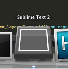
Surely the icon is alluding to a blank slate? That suits a text editing app, right? What are blank slates for after all (apart from roofing material, of course)? A black square with either a pencil or a cursor is cheesy and clichĂ©. But maybe that’s appropriate for the feel Jon is going for? What do you think?

@marksteve Nice - that makes the blank slate idea more obvious and fits with the definition of sublime as “sloping up to the lintel”, although it loses some of its purity. How does it look at different sizes?

0 Likes