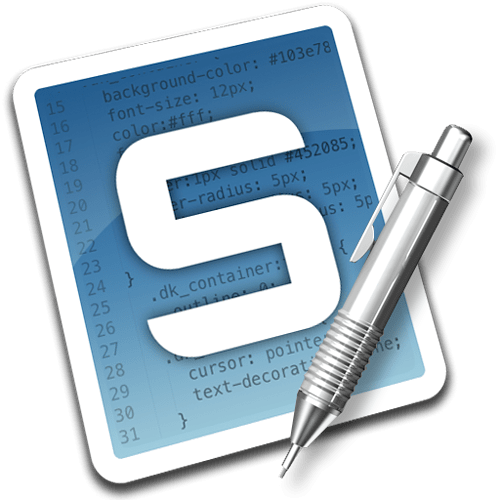
Whatever new logo you pick, just please, PLEASE pick something that isn’t a black square. As any number of other people have pointed out, it’s too similar to the Terminal icon.
New logo discussion?
[quote=“atomi”]
Same feeling from me here. Except the gray to me is a bit too light.[/quote]
I darkened it up a bit (to match the overall luminosity of the current icon) and made a quick ICNS file (with FastICNS, so it isn’t hinted very well at lower resolutions yet). Here’s the ICNS if you want to try it out in your dock.
Sublime Text 2.icns.zip (74.5 KB)
- Colin
http://www.designkode.com/wp-content/uploads/Sublime_512x512.png
I created another replacement icon for Sublime Text…
You can grab a .ZIP bundle that includes the icon in .ICNS, .ICO and .PNG formats from my site at http://www.designkode.com/blog/sublime-text-icon.
That’s a pretty descent one doppopp. Remove the bevel and emboss and I like it even more. Plain and simple.
[quote=“doppopp”]http://i.imgur.com/tjfAO.jpg
Inspiration from Adobe icons.
Icon used is from iconSweets2[/quote]
this one is pretty awesome!
[quote=“doppopp”]Inspiration from Adobe icons.
Icon used is from iconSweets2[/quote]
Yet another black square, except this one looks EVEN MORE like the Terminal icon.
Please stop doing that, folks.
[quote=“CaptainCrowbar”]
[quote=“doppopp”]Inspiration from Adobe icons.
Icon used is from iconSweets2[/quote]
Yet another black square, except this one looks EVEN MORE like the Terminal icon.
Please stop doing that, folks.[/quote]
Haha I think you’re capable of distinguish this one from the Terminal. This one has a pen in it and it will say “Sublime Text” below or above. Just because the Terminal icon is black it doesn’t mean nothing else could be. If we make it blue it would look like Photoshop, orange would be Illustrator, red flash and so on. What’s left for Sublime text then? 
[quote=“CaptainCrowbar”]
[quote=“doppopp”]Inspiration from Adobe icons.
Icon used is from iconSweets2[/quote]
Yet another black square, except this one looks EVEN MORE like the Terminal icon.
Please stop doing that, folks.[/quote]
I disagree, this one is much easier to distinguish from Terminal than the default icon.
I actually really like it.
Nice.
But please PLEASE do not put any text in the icon. It’s an icon, not a logo.
Hey,
I had to change the default one, because (sorry guys) its really ugly! And since I was moving from TextMate Im used to search for that violet icon within application icons I decided to use the textmate one!
So here’s the preview
veryicon.com/icons/system/li … ate-2.html
Cheers!
Hi guys,
On Linux I have a constant issue with tab switching since the existing built in icon looks so much like a terminal. Saw this thread and just wanted to put in my 2c worth
looks good, has a bit of colour and can easily be used to establish visual branding.
Yet another try… Based on this dribbble by Lindsay Mindler: dribbble.com/shots/317512-Sublime-Text-2-Icon
I love Lindsay’s original but found that it didn’t reduce well in my dock.
Ah, I love it! Very nice. I do like that subtle green detail line in Lindsay’s original, but I can definitely see it getting lost & looking odd when reduced.
[quote=“doppopp”]http://i.imgur.com/tjfAO.jpg
Inspiration from Adobe icons.
Icon used is from iconSweets2[/quote]
I think that is the logo that should be used, it fits Sublime Text perfectly! No strange colours, images or type, it’s simple and an evolution of the current design.
I would say that the light grey area on the left hand side should be removed, and possibly a very subtle gradient from the top left to bottom right to help curve the front of the logo, similar to the CS3-4 logos…

After that, it would be useful to see it at the correct size for Windows 7 task bar and a standard OSX dock icon, to be sure that you can see the top part of the logo clearly.
Great work though, definitely gets my vote!
After looking for a replacement icon for a bit, I decided to take a stab at it myself. Used Blender 2.61 and tried out its new Cycling rendering engine, which really simplifies shader (material) creation, so it’s quite easy to get nice results. 
You can get an .icns file and a huge PNG on Dribbble: http://drbl.in/cBaf
http://dribbble.com/system/users/31731/screenshots/354229/sublimetext2replacement.png?1324029318
Hey guys,
Here’s my stab at it. My eyes are pretty used to the TextMate icon, so I tried to go for something kinda TextMate-y.
Cheers!
Download the ICNS here:
shadowreactor.s3.amazonaws.com/S … 2.icns.zip
Thank you! Finally an icon that doesn’t look like Terminal and doesn’t look like crap 
Now I just need to wait for ST2 to stabilize so I don’t have to keep replacing the icon every time it updates 
I have a Ruby script I run after each release that updates ST2 with my favourite icon. It’s a single command from a Terminal (which I generally have open all the time anyway).
If you’re on a Mac (I really don’t guarantee anything else) it’s here:
gist.github.com/3d55b1272a126393aed5
Before the first time you run it do this:
$ fix-sm2-icon ~/Downloads/whatever.icns
This reads, encodes and embeds “whatever.icns” within the Ruby script itself (self-modifying)
Then whenever you want to fix the icon, just do:
$ fix-sm2-icon
This extracts the embedded icon in to the right place.


