My attempt.

sublimetext2.psd.zip (232 KB)
Hi, my name is david aka switcherdav, I’m a french web programmer and sometimes designer …
Here is my proposition
Thanks to the creator of Sublime Text !

Please don’t do this…
I love the current logo & default color scheme. So clean, easy on the eyes, and aesthetically pleasing. If there’s nothing wrong with it, don’t fix it.
That logo looks horrid… reminds me of Notepad++ logo. (Not trying to put shame to anybody’s design skills, the actual design is cool, just not my cup of tea for something that goes in my Windows 7 hotkey bar - the logo needs to be clean, sleek, and professional which it currently is).
@MMackus, that’s my thought too. Have you checked my own logo here in the thread? (it’s only a more polished version of the current logo)
Your right, it’s not very important to change the default logo because it’s very easy to change it.
note : I think the design of the logo is more important for mac users ; )
[quote=“iamntz”]
Probably because windows/linux users are just focused on… you know… coding? ![]() [/quote]
[/quote]
Or… Because the icon is always visible for the a Mac user, unless they hide the dock.
Without trying to start a flame or something, windows 7 is also display only the icon in taskbar. Something like 32x32px (give or take).
So unless you are hiding taskbar (the dock equivalent), you also see the icon always.
[quote=“natebeaty”]I can’t stop fussing with this thing. Here’s another pass, this time larger:
…odd having to pick the code to show in the icon. I’m assuming CSS isn’t the most common use of ST2, and there could probably be a more elegant snippet of something on there. But you get the idea.[/quote]
This is the best one yet. It has my vote. This should be the new default icon.
Aesthetics aside, I find the default icon too similar to the terminal icon on Ubuntu, which is a nuisance when alt-tabbing because I often land on one when really want the other. As for aesthetics, I like the “S” icon.
[quote=“iamntz”]
Probably because windows/linux users are just focused on… you know… coding? ![]() [/quote]
[/quote]
Linux user here…
In my I’m more focused on finding the editor. The icon looks an awful lot like my terminal icon making it annoying when I keep bringing up another terminal when I fully intend to switch back to the editor.
I personally don’t care too much what a new icon would look like so long as it’s unique and doesn’t look so much like other common icons.
Does anyone know how to install Nate Beaty’s .icns for Windows? I can change specific icons by converting his image to .ico > clicking properties > change icon, but can’t change all the icons throughout ST2.
[quote=“sam1am”]
[quote=“natebeaty”]I can’t stop fussing with this thing. Here’s another pass, this time larger:
http://i.imgur.com/JjlFk.png[/quote]
…odd having to pick the code to show in the icon. I’m assuming CSS isn’t the most common use of ST2, and there could probably be a more elegant snippet of something on there. But you get the idea.
This is the best one yet. It has my vote. This should be the new default icon.[/quote]
+1 to that!
Maybe you could use an online converter like convertico.com/ ? That big image above is just a png, right click and copy the image URL, then paste it in. Or try the file attached to this post, which I made with that service.
After using the icon for a few months, I think the white border needs to be fatter. Otherwise it holds up alright. Thanks for the positive feedback.
sublime-text-2.ico.zip (62.5 KB)
Taking some inspiration from a variety of the icons already posted, here is a first attempt at another variation (although I’m no icon maker, so I don’t know what I’m doing). Please feel free to run with it.
Text in the background is part the svg file itself and sublime_plugin.py for the right hand side, using solarized dark theme.
All done with Inkscape.
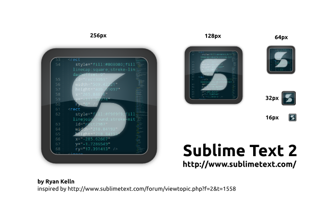
Sublime-Text-icons-source.zip (233 KB)
I like that one too.
Thanks for the effort Nate, but I guess what I was asking earlier was how do I change the icon in ST2 itself? I can change the icons on my desktop all willy-nilly, but when I open a program, it usually opens with it’s original one.
After some Googling I realized this is a problem specifically for .exe and such and you need to download something else to change it. Ah well, I’ll just wait until a new one is standard. Hopefully soon as the current one looks pretty bad.