[quote=“Neurotok”]Hi guys! My name is Martin and Im from Poland (Cracow). I just install Sublime as a Ruby editor. It is just great! Because I work as a graphic designer I decided to take my best shoot 
I hope you are like it If so contact me by mail (neurotok@gmail.com) to get a source files.
Pozdrawiam![/quote]
I think this is my favourite logo so far, but I’m not sure I like the logo being round, and the X needs changing to a regular one that joins in the centre.
The logo should be simple, and modest, Sublime Text doesn’t shout about all of it’s features and it doesn’t need to, people use it and love it for being a great program, and that is how developers find a new IDE.
I don’t think the logo should have:
Interface elements - They will be too small to see and locks you into a UI design
Code - This could put people off looking to code in say Ruby if the logo has HTML tags, or CSS on it
Bevels, gloss, texture - To me, Sublime is flat code, there is no textured background, or glossy buttons, it’s incredibly simple and the logo should show it
Unrelated imagery - Like the Lime, because of SubLIME, or pencil, ruler and blueprint paper because it’s a code editor, I think they’re completed unrelated to the software
Logo as part of the text - The logo can’t sit within in the text, the two need to be able to separate, so it can be used as an icon
I know that leaves a logo that you could say is very boring, but as long as it’s well designed like Neurotok’s then it’ll suit perfectly.
I think the website needs updating to better show that Sublime can run on any platform, and instead of screenshots there should be a video that runs through the main features of within about 30 seconds. Covering GoTo Anything, multi-select, mini-map, themes, snippets and then ending by quickly flicking through all of the languages that can be used in Sublime text. That would sell it to me, and give me everything I need to know to want to download it.


 I shall use this~
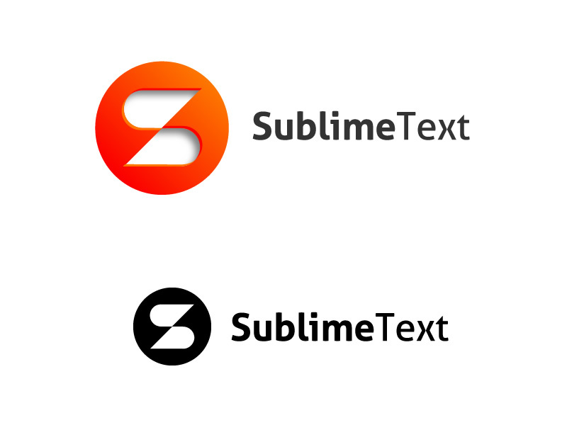

