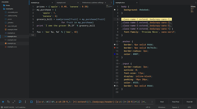
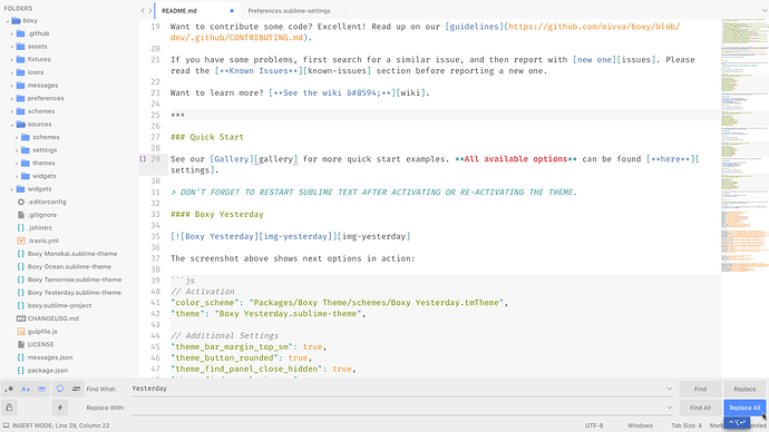
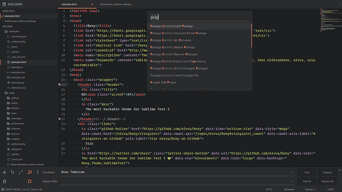
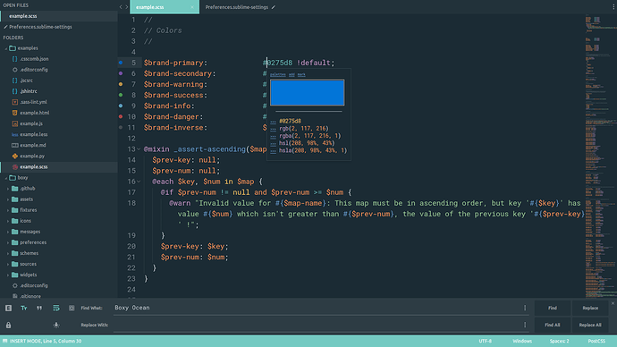
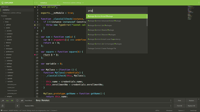
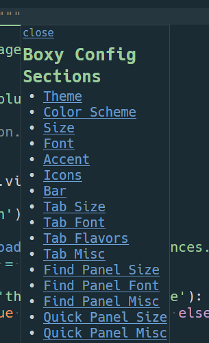
Love monochrome variant for folders.
Any chance we can have the same option for file icons?.. or at least reduce saturation to make file icon colors less prominent as currenty they tend to compete with text area/syntax highlight scheme colors.
Anyways, thanks for a great theme!
Boxy – It Was the Most Hackable Theme for Sublime Text 3
Thanks! Yes, I have plans to implement monochrome icons in 2.1.0.
I’ll add some options in 2.0.3 
 Boxy v2.0.3
 Themes
 Improve regex highlighting in find panel
 Fix hover state of the sidebar icons
 Add saturation levels of the sidebar icons
 Color Schemes
 Highlight string interpolation placeholders
 In Action
"theme_bar_margin_top_sm": true,
"theme_find_panel_close_hidden": true,
"theme_grid_border_size_lg": true,
"theme_tab_selected_prelined": true,
"theme_tab_separator": true,
"theme_tab_arrows_hidden": true,
"theme_sidebar_icon_saturation_md": true,
 Thanks To
@michaelblyons for 4a1f852 & d6e0567
 Boxy Addons
Available for installation via Package Control.
These addons enable you to control Sublime Text UI font face, change the widget font size (Find & Replace text input, Console input and the text log) and more.
Check them out 
 Boxy v3.0.0
 Themes
 Add new accents
 Add alternative ui icons
 Review all file icons
 Add monochrome file icons via addons
 Add sidebar indent options
 Make top bar monochrome by default
 Add new flavors of the bar logo
 Add rounded scrollbar variant
 Add optional sidebar disclosure buttons
 Add colored status bar variant
 Change quick panel & autocomplete highlighted background by default
 Fix assets of the scrollbar line variant
 Disable line highlight in widgets
 Disable margin top when active bar option
 Improve colored bar colors
 Make loader monochrome
 Make sidebar title font regular by default
 Reduce sidebar margin
 Fix default size of the tooltips
 Fix tab separator styles
 Fix issue when tabs do not shrink enough when tab scrolling is disabled
 Fix widget colors
 Color Schemes
 Add popup styles
 Fix arguments are of the same color as functions
 Fix highlighting on blocks with background color
 Change colors of the guides
 Improve json highlighting
 Make cursor color the same as default foreground
And many more exciting improvements and enhancements!
NOTE: If you have some problems with file icons try to delete other custom themes. More details here.
 In Action
 Thanks To
 Boxy Monochrome Icon Addons
Available for installation via Package Control.
These Boxy addons enable you to set monochrome icons for the dark & light UI themes.
Check them out 
I’ve really started to warm up to this theme set. It is customizable enough to work for a wide range of users.
Unfortunately, I hate having to look up the settings everytime I want to make a change (but I like have the settings  ). I have to pull up the theme’s wiki to see all the options, and then enter them in one by one. It’s kind of a pain. So I threw this plugin together to make setting the options easier (it is assuming mdpopups is available on your system, though it could be modified to not use mdpopups). It’s a static list of the options, so it has to be updated manually if more settings are added to Boxy.
It’s pretty easy to use as you just click the link to go to the setting section you want, and then click the checkbox to toggle the item etc.
It is not available publicly on Package Control, though you can dig it out of my experimental plugin sandbox here: https://github.com/facelessuser/SublimeRandomCrap/blob/master/boxy_config.py.
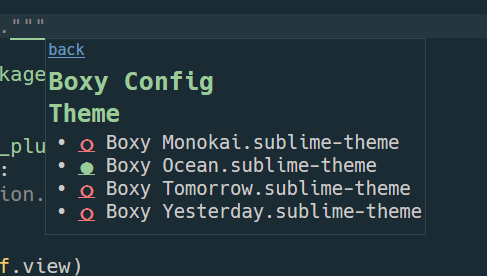
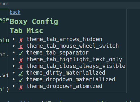
Anyways, just wanted to share this with anyone interested.
Wow! Looks very good  Thanks a lot! Don’t you mind if I add it in the theme starting next release?
How can I change the font size of the search/replace, console and output tabs. It is a little too big for my liking. Is there a setting to control it?

To give a perspective, the font I use it Arial 8pt. Thats the top half in red/black. What I would like is for the font in the console to be around 10pt. Thats the bottom half in white.
Regards
Just try to install one of these addons.
Boxy Theme Addon - Widget Font XS changes the font size to 10px.
Here’s another solution of providing toggleable settings by using a quick panel: https://github.com/SublimeText/LaTeXTools/pull/773
Might be worth considering that too since they are fuzzy-searched. The only downside would be that you can’t see what categories are available at first (setting names could be prefixed with their category for discoverability though). The filter text would most likely need to be restored somehow.
FYI, you can also remove the underline for links with text-decoration: none (or text-decoration: inherit, if the former doesn’t work). I’d also make the entire line clickable, not just the box, like you do with <label> tags in HTML.
Yeah, I didn’t want to search for a single setting, I wanted to see the settings related to a given topic and see if they were set. That is why I took the popup route. But panel is fine, I just don’t think I would use it and it would clutter my searches with more irrelevant stuff. It isn’t really something I need constant access to, just when I want to make a change, I don’t want to hunt around for all available settings.
Yeah, Yeah, I know, I literally just threw it together yesterday  . I figured if it got picked up by Boxy, that there may be changes to it anyways; it was more of a proof of concept (that I am using). I also noticed that on OSX, the fake radio buttons turn into actual emoji, while on Windows they still look like font chars. I don’t know, maybe I could pick something that consistent.
Sure, I like the popup settings too. Might even get me to check out the theme at some point.
Which codepoints did you use for theradio buttons? I don’t think any of these[1] qualifies as an “emoji”, but mac has always been a bit special about their unicode rendering.
[1]: http://unicode-search.net/unicode-namesearch.pl?term=CIRCLE
I used medium white circle and medium black circle. White was just a circle, and black was a solid circle. On Mac they are glossy colored circles…which is fine, I just wasn’t expecting it.
 Boxy v3.1.0
Starting 3.1.0 linter theme is included into the theme package. Boxy Theme Addon - Linter Theme will be removed soon. More info →
 Themes
 Add option to highlight text only for selected item in the sidebar
 Add linter theme into the theme package
Boxy Theme Addon - Widget Font LG will be renamed to Boxy Theme Addon - Widget Font Size. Other font size addons will be removed soon.
Its aim to have only the one widget font size addon and customize it like Boxy Theme Addon - Font Face.

