Sublime Forum

Your favorite color scheme?

#1

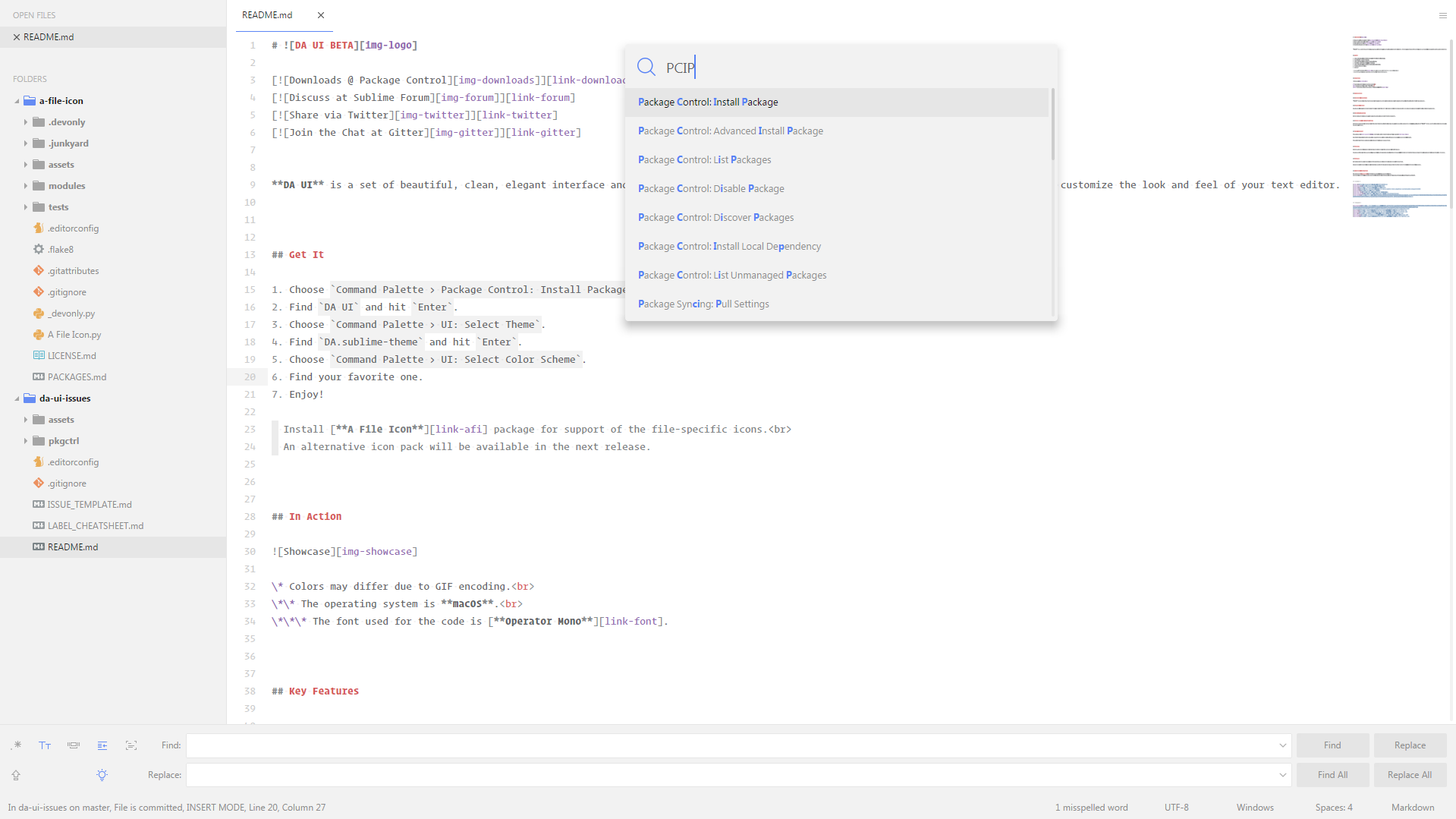
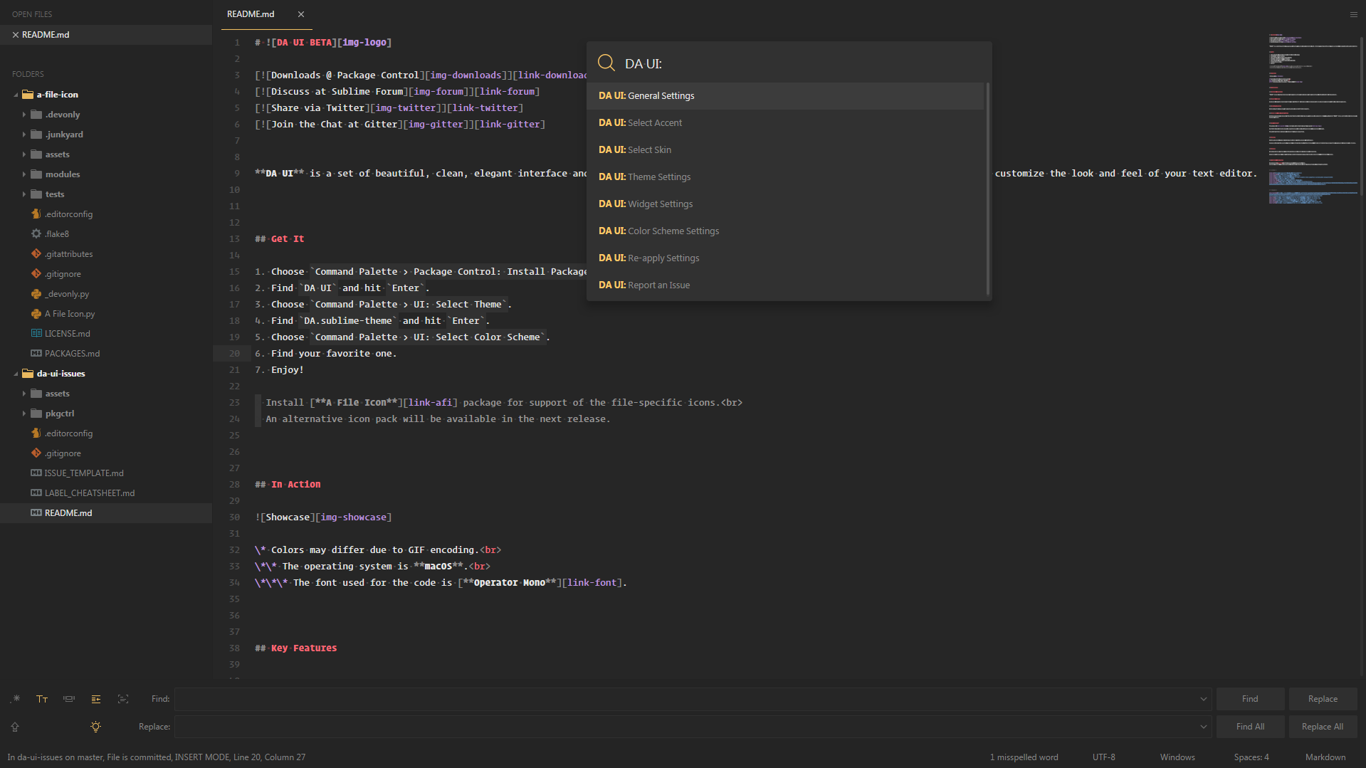
I’ve had a pretty bad time yesterday. I downloaded all the themes that showed up under “Package Control: Install Package”, which totaled up to 175+.

But not a single one is good. Some are kind of okay, but they’re not the best in terms of not being distracting. While some are just plain out ridiculous and impractical in design. Most notably the ones where the entire thing looks like it’s underwater (strongly tinted blue).

So I wanted to see if I can get some opinions, to help me choose. I have no problem creating my own color scheme, but I wanted to see if there’s any proper ones already out there.

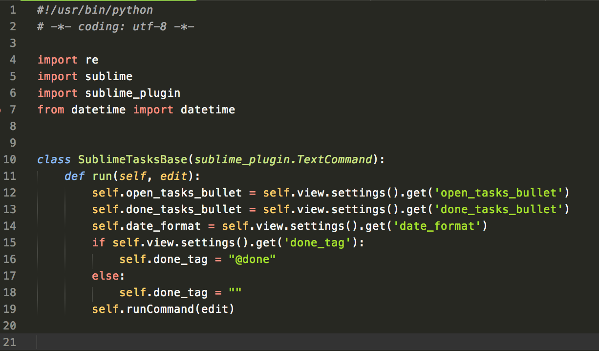
Currently I’m using EmoKid, which is the only one I consider to be on par with the default Monokai one. But it is kind of weird to use, because the colors it has work in such as way, that it’s hard to quickly find your way around your own code, to find a specific section. Which pretty much caused me to use the Find hotkey 300% more than I ever did.

So, which themes do you guys use? Do you have an installed package, or did you make your own?

3 Likes

#2

I use my own ones from DA UI package.

Theme: DA.sublime-theme.

Color Schemes:

DA Light.tmTheme

DA Dark.tmTheme

Also you can try some popular color schemes from DA CS package. It’s not currently on Package Control, but I hope it will be available soon.

4 Likes

#3

EmoKid Dark looks nice, however as for EmoKid Light I do not like it at all, due to bad contrast of accent colors (especially greenish ones).

You can also try:

Dark

Light

3 Likes

#4

I always end up going back to Monokai, but with desaturated background (and line highlight) colors (because who came up with that background color?? :wink: 
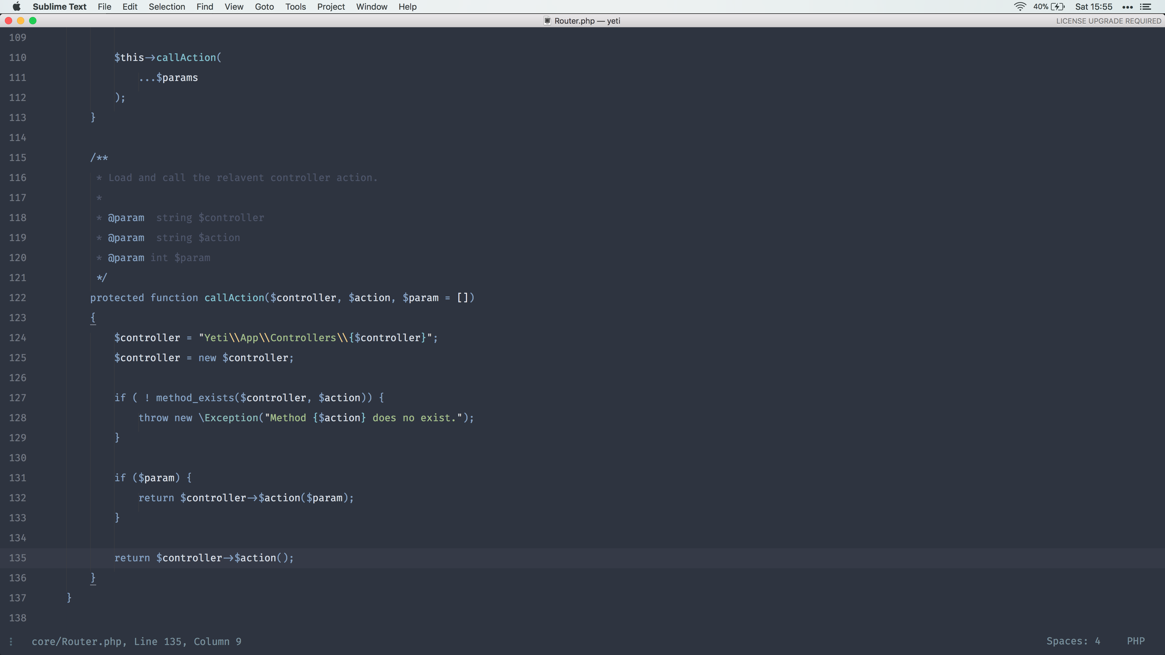
). It’s dark, but with good contrast. I appreciate having less light coming off my screen, but contrary to popular believe you want lots of (foreground to background) contrast for reduced strain. Sadly most themes that look awesome from a glance lack contrast. I’m also not sure what is up with the “underwater” thing as you say it, it’s super popular and it definitely says “I’m hip and trendy” better than good old Monokai, but I can’t imagine using those for real.

PS. I do maintain Solarized, which is designed to be low contrast based on the misguided idea that that’s a good thing, and I kinda sometimes like to use the light version, but the low contrast on the dark version is really terrible.

2 Likes

#5

The bundled Mariana theme is based on Oceanic Next, but with revised selectors to work well with our standardized scope names.

3 Likes

#6

MonokaiFree, an enhanced version of Monokai. Improves various aspects of the color scheme aswell as fixes a variety of issues.

If you like Monokai you’ll certainly like MonokaiFree.

More screenshots here: https://packagecontrol.io/packages/MonokaiFree

4 Likes

#7

1337

1 Like

#8

I use my own theme and color scheme : https://packagecontrol.io/packages/Guna. It was started for me.

1 Like

#9

I’m using a modified version of the Espresso Libre. I tried to make it extra precise with semantic bracket coloring.
At first it looks like someone puked a rainbow on your screen, but after a while you tend to rely a lot on all this visual hints.

It looks like that:

You can find the theme at https://github.com/gwenzek/scalaSublimeSyntax

2 Likes

#10

I use a modified version of Mariana with brighter, more saturated colors. (The default version seems a bit dull to me.)

2 Likes

#11

Sounds interesting, is it available for others to try out?

0 Likes

#12

I use Molokai with the adaptive theme. Dark background, clear concise code

1 Like

#13

I use my own color scheme

6 Likes

#14

I’m using Nord color scheme, although it isn’t officially out for Sublime yet this is what i’ve come up with.

3 Likes

#15

@Denisowator I understand what you mean and had the same feeling. I couldn’t find a theme that works for me.

So I started to once and for all define a theme that I personally would like to work in, day in and day out. Based on my original Monokai color theme from more than 10 years ago I created the commercial theme Monokai Pro. I tried to balance the colors, create pixel perfect file icons and customize the syntax highlighting so that you maximally focus on the parts of your code that matter. My goal was to harmonize beauty and functionality.

Re: “underwater colors”: I see this too indeed :slight_smile: 
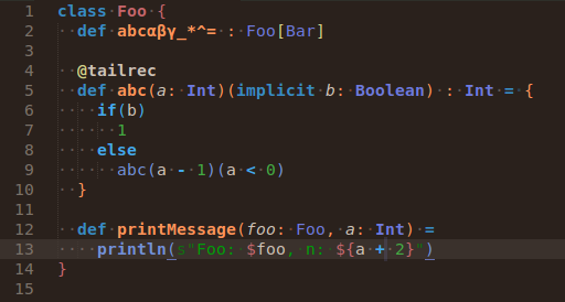
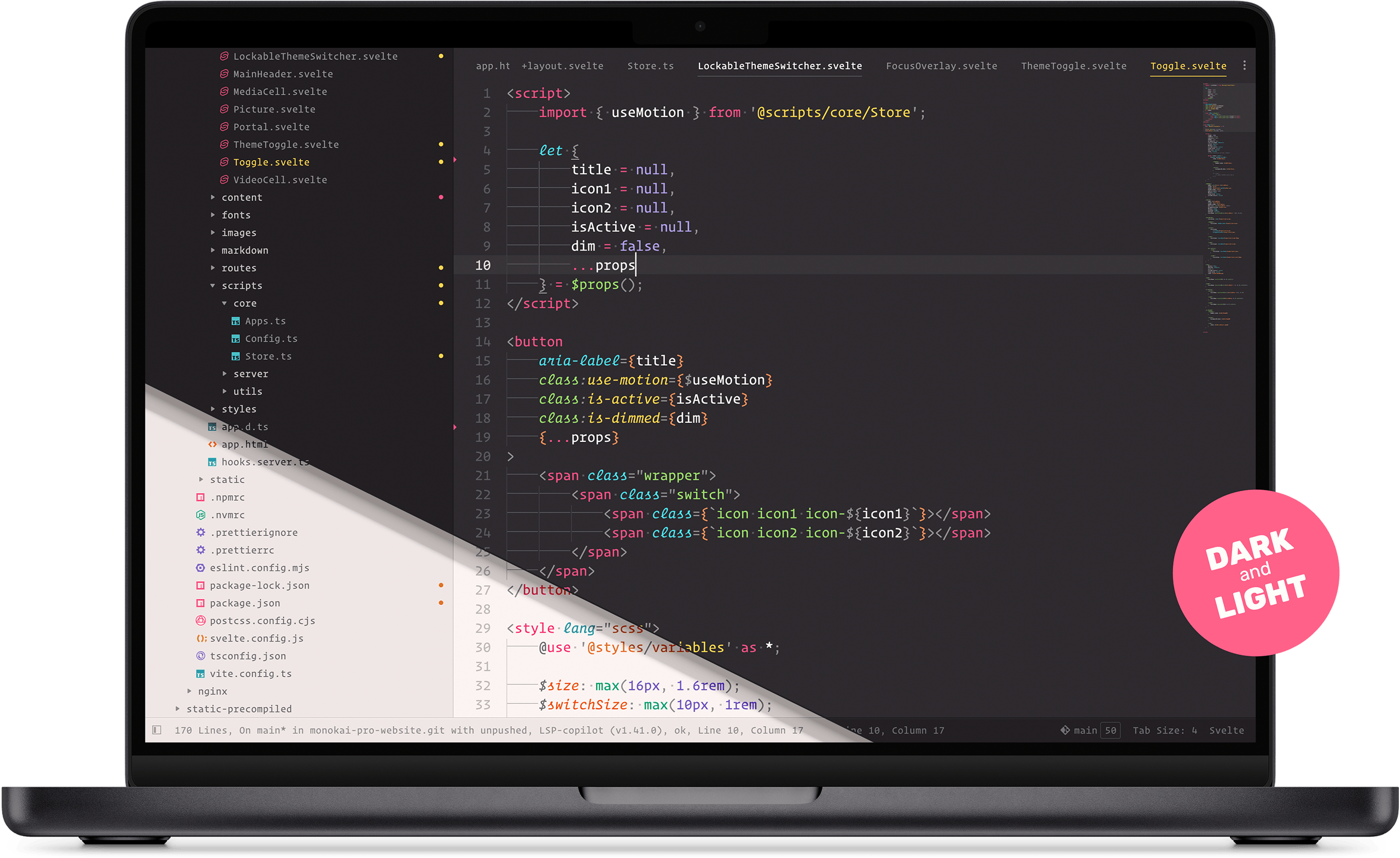
In Monokai Pro I have 5 filters that are variations on the default theme. There’s a warmer one, one with more contrast, and indeed a somewhat more blue one :slight_smile:

Anyway, I know color themes and schemes are for a large part a matter of taste, just wanted to let you know that Monokai Pro exists. Good luck finding a good theme!

4 Likes

#16

Hi, I like your scheme, do you mind sharing it ?

0 Likes

#17

Sure :slight_smile: here it is.

0 Likes

#18

I also use my own, inspired on the Notepad++ Default Theme: Notepad++ Color Scheme for Sublime Text

0 Likes

#19

Currently using Dink Donk, not really happy with it, but it’s the only dark theme that colors comments correctly (to stand out). Solarized has nice harmonious colors, but it’s too dark (sublime issue?), monokai pro is just gorgeous but I don’t want the theme/icons.

1 Like

#20

I use a modification of the Tubnil color scheme, which is included in the Nil theme. I intend to update it upstream eventually, but never got around to iterating on it properly. So far I’ve just amended quick fixes here and there and am not satisfied enough to commit it yet.

1 Like