Sublime Forum

Theme - Nil (Update: Bright theme, HDPI, icons, dog washing)

#1

[size=150]Update — Version 2[/size]

Want to skip right to the repository? Click here.

Alright, given that I recently bought myself a new retina MacBook Pro, I needed to update this theme. So, first on the list of things that needed doing was HDPI support. Well, I think I’ve got that down:

http://www.spifftastic.net/skitch/hdpi-20120618-011056.png

Because the HDPI image is big enough to be a nuisance, this is resized. Click the image above or right here to see the full screenshot. Bear in mind that I do not yet have the new MBP, so I had to take this by forcing my regular display to run in HDPI resolution, so the window is kind of small. If anyone else would like to provide a full, enormous screenshot, I would be eternally grateful and throw your name in the README.

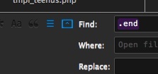
So making that was fun. I’m not sure if I hated rebuilding the tabs (there are PSDs in the repo now! Hurray! You can probably customize those if you feel like changing colors) or icons more. The old icons had to go anyway – I borrowed them from Pseudo OSX, and they didn’t fit very well. So, there are some snazzy new ones that communicate about as much info as any other icon (so, nothing at all). But they look pretty, and that’s what matters most. I think by now I know what all the buttons on the find bar do without needing to guess from an icon, so it probably didn’t really matter, but I digress.

Also, as is probably obvious from the above screenshot, there’s a bright theme now too. It’s called Ayin because it’s fun to pronounce. Also apparently a silent O — don’t know how that works, but that’s cool too. Here’s a picture of it that isn’t scaled down from HDPI, just in case:

Here’s an additional picture of the dark theme, which remains mostly the same aside from some new buttons, icons, and scrollbars. Overlay scrollbars are still borrowed from the default theme because I don’t know how I could possibly improve on them. Whether anything I’ve done is an improvement is also debatable, but I think the overlay scrollbars are fine without my meddling with them.

So with that all said, if you want to try this out, you can grab the themes off Package Control by installing or upgrading “Theme - Nil,” or you can grab it off GitHub.

The old, original post for posterity’s sake.

Well, this is less interesting since C0D312 released his theme, but here we go. I went and forked Raik’s Pseudo OSX theme and created my own after seeing C0D’s. Basically, I wanted something like his, though not quite what his is, after seeing it and the easiest way to do that was to just go and modify a theme for my own purposes… and so we get Nil. I’m bad at naming things. A screenshot follows.

There was a hole here. It’s gone now.

You can grab the theme over on Github: https://github.com/nilium/st2-nil-theme

I’ve submitted it to Package Control, but I don’t know if or when that’ll be accepted, so you’ll have to go through Github for now. Just remember to put it in the right directory.

Two points. First, orange tabs are modified/dirty and blue tabs are active/selected. Dirty active tabs are just a brighter orange. Second, an orange bullet next to an open file in the sidebar also means the file is dirty/modified. That’s about it, pretty simple. I’m not aware of any issues, but this isn’t very old and I haven’t bothered testing it with much of anything, so just let me know if you encounter anything.

0 Likes

#2

Looks great. Differs from my tastes a bit but I really like some of the features. It reminds me of a blender theme I used to use. I’m not a huge fan of orange but I like that it ties in with the icon.

I’ll give it a quick review.

[size=120]Tabs:[/size] Awesome. I really like the illuminated look of the selected tab. The orange on the modified tabs does really fit, though. It looks too blurry. I think it would look better with the sharpness of the unmodified tab. Also, the “unmodified” tab seems to have a border around it while the other’s don’t. You should keep it consistent.

[size=120]Sidebar:[/size] I particularly like the highlight on the selected file and the chispness of the sidebar icons.

[size=120]Statusbar:[/size] You’ve inspired me to change my status bar. I like the dark themed statusbar and the extra height definitely affects the readability.

Overall, it’s a nice dark theme with crispness and high contrast. Nice job.

0 Likes

#3

With the right color scheme that teal and orange really do go well together.

0 Likes

#4

I really like this any shot at you making a light version as well?

0 Likes

#5

I updated it a bit earlier to try to make the tabs a bit crisper and fix the inactive tab having a border (was from an earlier version of the tabs). I think it looks better now.

I wasn’t planning on it. Everyone is free to modify it as they see fit, but I generally don’t use light themes, so I don’t really have any motivation to do it.

0 Likes

#6

[quote=“Nilium”]Well, this is less interesting since C0D312 released his theme, but here we go. I went and forked Raik’s Pseudo OSX theme and created my own after seeing C0D’s. Basically, I wanted something like his, though not quite what his is, after seeing it and the easiest way to do that was to just go and modify a theme for my own purposes… and so we get Nil. I’m bad at naming things. A screenshot follows.

You can grab the theme over on Github: https://github.com/nilium/st2-nil-theme

I’ve submitted it to Package Control, but I don’t know if or when that’ll be accepted, so you’ll have to go through Github for now. Just remember to put it in the right directory.

Two points. First, orange tabs are modified/dirty and blue tabs are active/selected. Dirty active tabs are just a brighter orange. Second, an orange bullet next to an open file in the sidebar also means the file is dirty/modified. That’s about it, pretty simple. I’m not aware of any issues, but this isn’t very old and I haven’t bothered testing it with much of anything, so just let me know if you encounter anything.[/quote]

I really like the tabs and side bar highlighting blue line. Got some inspiration for a new theme.

The text shadow in find and replace dialog is too white i think:
. Readability is low.

0 Likes

#7

Thanks, fixed that in the latest push. It’s probably safe to assume there are other things I’ve forgotten to change…

0 Likes

#8

Ooft I like this, however I wish that the sidebar items were taller, like the Refresh theme is.

0 Likes

#9

I agree but I think the sidebar would look better if it was the same as the default and soda themes.
By the way the theme looks great with Emacs Strict color scheme:

github.com/jonrohan/my-textmate … ct.tmTheme

0 Likes

#10

I’m curious, how do you have the open files listed on the sidebar? I’d love to have that.

0 Likes

#11

View > Side Bar > Show Open Files

0 Likes

#12

Nice theme, but highlighting changed tabs - not working for me, any ideas why?

0 Likes

#13

Very nice theme, but I think the active tab needs a bit more visual focus (or the dirty, non-active tabs need a bit less visual focus).

0 Likes

#14

Do you have highlight_modified_tabs enabled?

At this point I’m not planning on changing the theme much since it does what I need, so it’s mostly up to you/other folks to modify it if something doesn’t feel perfect. As it is, I don’t really have any issues with it, so I’m just leaving it be since it functions as intended and I’d rather not spend too much more time on it fiddling with tiny things.

0 Likes

#15

Don’t get me wrong, I really love your theme. Great work! It has now overtaken Soda Dark as my default theme.

0 Likes

#16

What color scheme are you using? It looks ace with your theme.

0 Likes

#17

Just wanted to say I really like the theme. Thanks!

0 Likes

#18

Color scheme is Tubnil. You can grab it over in my random-junk-for-Sublime repo on Github, but I’ll go add it to the theme’s repo as well since I’ve had a few different folks ask about it now.

0 Likes

#19

Grats on getting added to Package Control!
Not sure when it happened exactly, but I noticed it just a bit ago.
Thanks for creating such a great theme!!

0 Likes

#20

^ This :mrgreen:

Could you give me some pointers on where to look if I want to tweak the text color/bg color for inactive tabs? Completely new to theme hacking…

Edit: Never mind, found it :smile:

0 Likes