Doesn’t it remind you of something sinister?
The new logo is bound to be controversial
wunderbar
#4
From that thread - “It is unfortunate that you associate it with something traumatic.”
This is a pretty tone deaf response IMO. Anyone who has seen the logo of the SS would notice the similarity in design.
There is a reason the swastika remains a controversial design even though its origins are from Hindu mythology and thought to represent good luck. The symbol’s adoption (albeit in modified form) by the Nazis means it is still considered distasteful to this day.
I venture the same is true for the logo and typography used by the SS. It is distasteful to use something so tainted to represent such a great piece of software.
Unless of course the developers of Sublime are happy with a subset of users being inadvertently reminded of the SS every time they open Sublime Text!
0 Likes
dhbn
#5
I don’t see that much similarity to the Schutzstaffel runes (“ᛋᛋ”). I think there is a distinct difference. Only one S is used to symbolize Sublime Text. Furthermore the Sublime S is in a different angle as well.
For me the symbol looks fine.
8 Likes
bizoo
#6
No, didn’t noticed until braver post about it.
Only one S, different angle, not usual color.
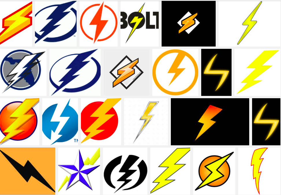
You can find dozens, if not hundreds, electricity logo that have more similarities.
And damn, it’s a logo for a text editor, not a political party!
pfff! 
6 Likes
wunderbar
#7
3 people in my team noticed the similarity immediately.
Having said that I didn’t know that electricity companies commonly use this symbol. Is this true? Got any examples?
While I notice the similarity, I’m not offended per se. It is, however, the sort of thing that causes negative attention and “outrage” in these sensitive times.
“Unless of course the developers of Sublime are happy with a subset of users being inadvertently reminded of the SS every time they open Sublime Text!” <-- that was meant to be humorous BTW.
0 Likes
idleberg
#8
It’s clearly an homage to the Winamp logo. Anybody over 30 will confirm this! 
But seriously, the comparison is a bit far fetched. I mean, if you stare hard enough, you will see swastikas on every tiled floor.
8 Likes
facelessuser
#9
If you look hard enough, you can find offense in almost anything. The Sublime logo is very different. Single s, dramatically different angles and form. It is stretched more horizontally and more compact vertically. Just because it’s an s with angles shouldn’t get it associated with the SS.
I’ve seen metal bands with S shapes closer to the SS than Sublime.
3 Likes
mwb1100
#10
I’d guess that would often be intentional.
As far as Sublime’s graphic goes I don’t see a problem personally, but I also don’t see a reason to fight to keep the new icon/logo if it’s something that does leave a negative impression on people.
2 Likes
deathaxe
#12
Yeah. All electricians are nazis because the warning sign looks like an S of the 1940s

Sorry guys, you are all paranoid.
4 Likes
Monty
#13
The new Sublime Text logo looks like a folded ribbon, nothing like a lighting bolt or that nazi symbol you are referring to. Just do a search for “lightning bolt logos” and you’ll find dozens and dozens of other logos that look far more similar to that nazi symbol than the new ST logo does.
5 Likes
frou
#14
On the next census, being theoretically-offended-on-behalf-of-an-abstract-someone-else will be shown to be the most popular pastime in the western world.
5 Likes

Jackeroo
#16
How do you change the icon? I tried to change the icon in my task bar, after hunting around for a suitable replacement, but it wouldn’t take. It’s not that the new icon reminds me of Nazis, it is that I don’t like it.
Windows 8.1.
1 Like
zoredache
#17
The icon appears to be embedded in the EXE. If you really wanted to change it you would probably use something like this.
1 Like
Jackeroo
#18
Thanks for your help. That was my suspicion as well, but I wasn’t sure how to go about making the change. I will look into it. Thanks again for your quick reply.
Edit: No go. I got “access denied” when I tried to save the file. The only way I can change the icon is if I create a shortcut on the desktop and change the icon for it. I prefer the icon being on the task bar.
0 Likes
wunderbar
#19
Nice straw man argument - that’s not meant to be the letter S and is a representation of lightning.
It’s not “paranoid” to note there’s a resemblance and to consider what the consequences might be in the wider world.
0 Likes
idleberg
#20
I think it’s fair enough to consider whether a symbol might hurt somebody’s feelings. I’d have immense trouble using a software using a swastika icon for instance, even though the author might argue it’s meant to mean “good luck”, as it does in ancient East Asian religions. But as I said before, in this case it’s a bit far fetched. Different angle, different orientation, different strokes and stylistically it’s not at all as sinister looking as a pair of Sowilo runes. The new Sublime Text logo is rather friendly looking, I love it.
If you really want to go that far, you might use the same argument against every N-logo, because the Sowilo rune looks just as much like that. Not to mention other SS insignia resembling asterisks, simple arrows or even the peace symbol.
1 Like