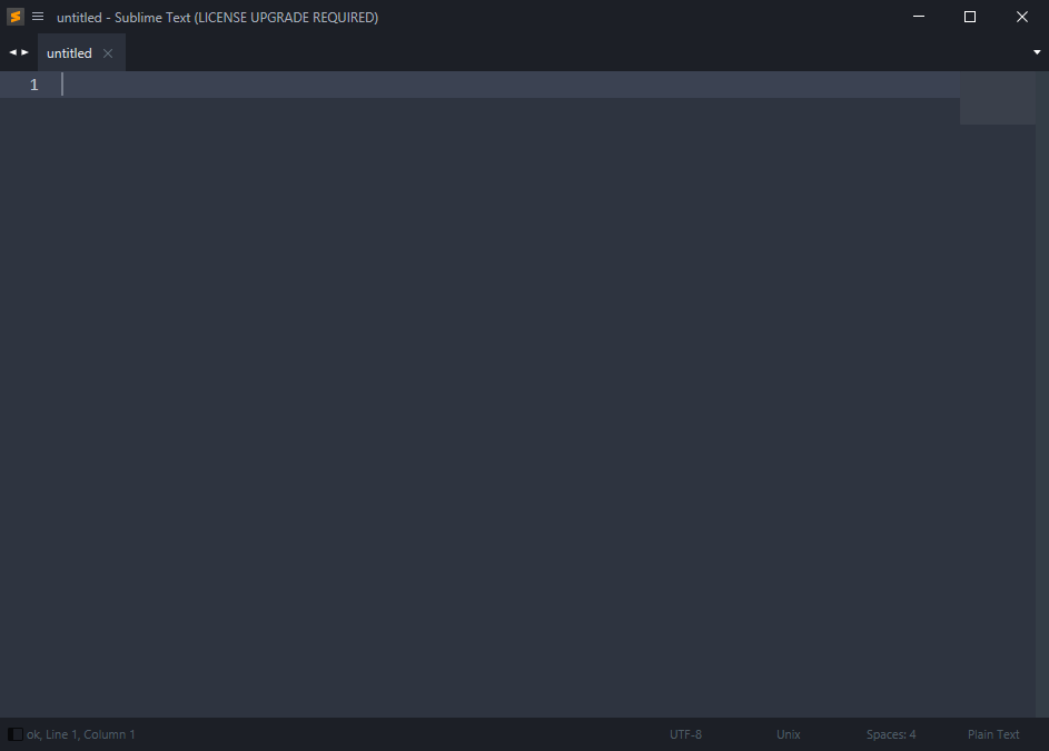
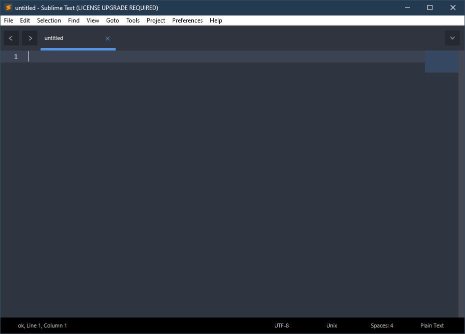
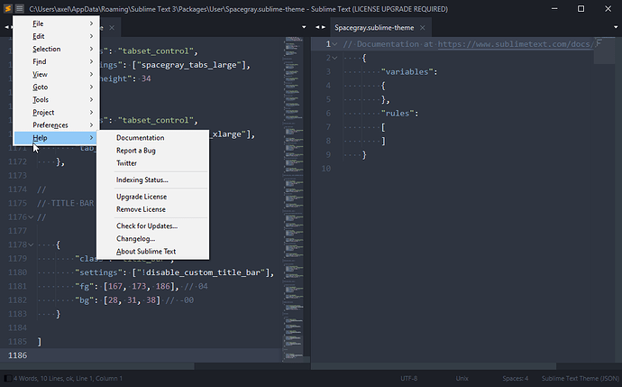
In all the years of using ST, this is the first time I (a) got really confused (b) had to bring back the previous version and settings from backup © got so annoyingly distracted from work I had to come here and rant 
No, seriously, devs, if I had known you took the main menu away without an obvious way to bring it back (such as View -> full menu) I would never have installed v4. Thankfully I keep all settings backed up, because v4 makes a bunch of config changes that break v3.
Before I even noticed the missing menu, my custom scheme became black on black, why should this ever happen? Then losing the main menu without a warning or explanation was really the last straw.
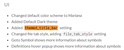
Why theme the main UI, anyway? It’s always bad design. The main UI is themed by the OS and tweaked by the user, but there is huge value in all windows having the same-looking controls and a consistent theme. (For one thing, lots of 3rd party utilities like macro apps depend on that.) Things like that should never be changed, and certainly not without asking! Of course, lots of software does it now, the pox started a long time ago with media players, I believe, and now even web browsers don’t have UIs consistent with the OS. But I would think that the kind of people who use Sublime Text (if one can speak of such a kind  ) would appreciate more restraint there, and at least the courtesy of an upfront explanation or prompt.
I still love ST and don’t want to use anything else, but it seems like v4 is not for me. And thanks to self for diligent backups.
(Yes, it’s my first post here. Using ST since 2017)

