Hi folks,
I’ve released a new update to Soda Theme, which I hope you’ll enjoy.
For this initial release, the Light version has been updated, but Dark will follow soon.
Install from: https://github.com/buymeasoda/soda-theme
Or update via Package Control
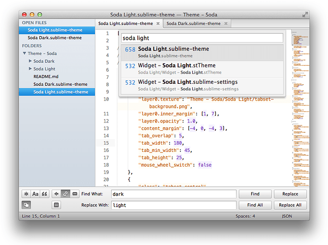
Here’s a screenshot of the Soda Light version:
If you have any feedback (hopefully some of it positive  ) please let me know.
Here’s a few of the changes:
-
New tab design
-
More prominent dirty file indicator
-
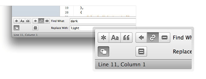
Updated buttons for the search / replace panel
-
Tweaked panel background and other buttons styles
-
Tweaked status bar size and colours
-
Updated sidebar design (eg. background shading, icons cleaned up, colours adjusted, padding)
Some notes:
Gimme back my chromium tabs!
For lovers of the original chromium style tabs - I’ve locally tested the ability to have both tab designs ship with the theme while providing a user setting for people to opt into which tab style they’d like.
I didn’t include it in this first 2.0 release because I wanted to see how people reacted to the new tabs (since maintaining only one stream of design is simpler for me in the long run), but also would like to get a bit more information from other ST2 devs and Jon about the most appropriate way to introduce custom settings.
For example, I’ve established how to add a simple named boolean flag (eg. “soda_classic_tabs”: true), but to keep things clean, I’d prefer to namespace all settings under one top level variable (eg. {“soda_theme”: {“tabs”: “classic”, …}}), rather than have one for every configurable component. If you know how that can be implemented, and how to reference a nested setting in a theme, please let me know.
Gimme back my chromium tabs! - UPDATED
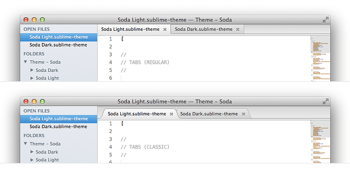
I’ve pushed an update for Soda Light that now includes both square and curved tabs. The tab style can be toggled via a user setting. Square remains the default at the moment, but to opt into using the curved tabs, add the following line to your “Settings - User” file:
"soda_classic_tabs": trueI’m still looking for an elegant way to handle custom settings. I’d like to use more than just booleans, and be able to group together all Soda settings under a single namespace rather than introduce a bunch of top level custom flags that may conflict with each other. If you know how to do that in a way that can be then read by a theme, please let me know 
Here’s a screenshot of the two tab styles for Soda Light:
Dirty file indicator?! Ze goggles they do nothing!!!
This one is tricky - one of the more common pieces of feedback I received about the original theme was that the dirty file indicator wasn’t clear enough and became lost in the tab bar, making it hard to see which files were changed and unsaved. However, some people have already said they find the new dirty file indicator to be too prominent. I’d like to see how it goes for a while, but no reason it can’t changed or made configurable. Let me know what you think, but give it a few days to settle in first, as it may grow on you 
Sidebar ideas left on the cutting room floor
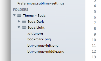
I had some bigger plans for the sidebar which included icons for folders but unfortunately I couldn’t find a suitable way to make it work with the current theme capabilities. I’ll update the challenges wiki on github with information about it soon, but here’s a quick peek at what I was aiming to implement, and will continue to try and resolve.
Clearer licensing
There’s been some nice theme remixes coming out, and a few people have found the theme useful as a starting point for their own designs. To make it easier for everyone to know how they can use the theme, I’ve added a Creative Commons license. Please check the project Readme and have a read through that if you are a theme designer / tweaker. And don’t hesitate to get in touch if there’s any questions.
Anyway, I hope you like the changes. And if you have suggestions, or issues please lodge a ticket via github, or send a pull requests.
Ian
[size=150]UPDATE - July 10, 2012[/size]
I’ve released another milestone update for Soda Theme 2 and thought I’d share a few of the details here.
Soda Light UI - Cut and Polish
The first improvement - which you may or may not notice, depending on your eagle eyes  - is that the entire Soda Light UI has been given an end-to-end cut and polish of the UI assets.
All the graphics have been sub-pixel adjusted by hand for rendering sharpness at default and retina resolutions with lots of subtle visual tweaks and clean up along the way. Some existing graphics were rebuilt from scratch. I’ve also retired the Pictos icons for the standard “Soda Theme - Find / Replace Panel” icons - but kept the essence of the original icons consistant for now. The newly created versions have received a bunch of adjustments for improved clarity.
Soda Light (and soon Soda Dark) now includes full retina support, so should look nice and crisp for thost lucky folks who have the new retina MacBook Pro. Going retina with the UI was a lot of fun.
Square tabs for Soda Dark
I’ve also added the new tabs design to Soda Dark. If you want to keep the original classic tabs, they are still available for Soda Dark by adding the “soda_classic_tabs” setting to your “Preferences - Settings User” file and setting it to true.
Dirty file indicator
I’ve taken a half-step back with the solution for the “dirty file” indicator to re-evaluate the approach. For now it’s returned to being a subtle indicator (albeit a nicer one than the original version from Soda Theme 1). I’ll definately be revisiting this soon, and ideally provide multiple default options, as it seems people really do fall into three very distict camps on this one (eg. Make it not stand out / Make it stand out more / Blind me with that sucker!). So if you’re hoping for a stronger or subtler version, fear not - it’s coming 
Retina issue with tab dragging and other theme challenges
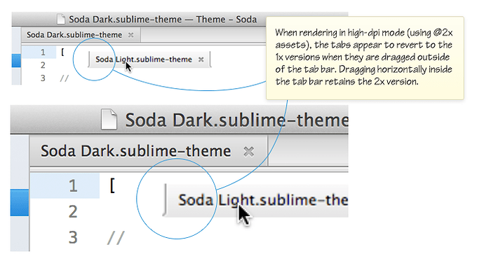
There was an issue I noticed while doing the retina version with the current Sublime Text 2 (Build 2215) and that was related to dragging tabs out of the tab bar while in high-dpi rendering mode. It looks like the dragged tab flips to the 1x version when leaving the tab bar. Below is a screenshot of the issue at jumbo retina size. When dragging the tab horizontally within the bounds of the tab bar, the tabs remain the sharp 2x versions.
I’ve also update the Theme Challenges and Ideas wiki page on Github with a couple of additional challenges:
https://github.com/buymeasoda/soda-theme/wiki/Theme-challenges-and-ideas
As always, please post ideas, suggestions or issues on the GitHub issue tracker so I can easily keep track of everything. From here, the next few updates will be focussed on Soda Dark. I’ll be doing the same UI polish that was done for Soda Light and creating the retina version, as well as addressing the dirty file indicator.
[size=150]UPDATE - July 30, 2012[/size]
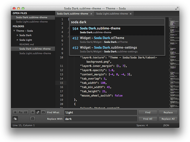
Another update for Soda Theme, this time it’s mostly all about Soda Dark.
-
The latest update brings the same refinements to the overall UI that had been introduced for Soda Light.
-
Retina support has been added for the dark theme.
-
The modified tabs implementation has been updated to allow for subtle and prominent dirty tab indicators. (See this github discussion for more details, and some tips on further customisation).
Soda Dark
I’ve also published a project wiki page on github to help people take advantage of the Sublime Text 2 User Theme feature. User Theme’s are a great feature for adjusting existing base themes like Soda Theme to suit your personal preferences or working style.
github.com/buymeasoda/soda-them … tomisation
Anyways, hope you’re all enjoying the theme 
Ian

