Sublime Forum

Soda Theme - New Sublime Text 2 UI theme

#81

Jon, I proceeded with your suggestion of using a widget settings file and widget scheme file to control the text input field design. This has worked out well, and hopefully people will be happy with it. One thing that came out of it though, was that the colour scheme files are getting picked up by the main application and added to the colour scheme menu in the “Preferences -> Color Scheme” area.

It’s not really a problem, but since the widget schemes aren’t useful as general colour schemes, it does add some unneeded entries to the menu.

Perhaps you might want to take a similar approach as you did with parsing the widget settings files and use a file naming convention for these theme widget scheme files that will allow them to be be ignored for the Color Scheme menu.

For example, I have named the theme widget scheme file in a similar manner to the widget settings file:

Widget - Soda Dark.sublime-settings
Widget - Soda Dark.tmTheme

Tapping into the “Widget - *.tmTheme” format for filtering theme based widget schemes might be a good way to keep them out of the Color Scheme menu. Or if you have another approach that allows them to be filtered out of peoples app wide scheme menu, then I’m happy to change my implementation.

Ian

0 Likes

#82

Awesome, thank you! Jon, please include this theme with the application.

0 Likes

#83

This theme is fantastic, I did a combination of the two though, cl.ly/97Ex.

0 Likes

#84

You should be able to change the extension from .tmTheme to something else, and it then won’t show up in the menu, but should still work when set via the .sublime-settings file.

0 Likes

#85

Awesome, that does the trick. I’ve updated the widget syntax scheme files to use the extension “.stTheme” instead of “.tmTheme”, and that’s kept them out of the main preferences menu. Cheers.

0 Likes

#86

If people are looking to stay automatically up to date with the latest version of Soda, I just released a package manager called Package Control for ST2 that does automatic upgrades. This theme is included on the default channel, so if you install or upgrade it through Package Control, updates to Soda will be discovered and installed each time to start the editor. You can check it out at wbond.net/sublime_packages/package_control.

@buymeasoda

Thanks for all of your hard work on this theme! It is awesome to see an alternative theme for the editor. A number of co-workers are using, especially the Light variation with light color schemes.

0 Likes

#87

[quote=“buymeasoda”]
*] Overflow indicator shadows are inset on widget fields due to content_margin for theme text field design. This one might be unavoidable (Screenshot)[/list][/quote]

2102 now has a draw_shadow file setting which you can use to disable drawing the shadows for widgets - not ideal, but probably better than having an offset shadow.

0 Likes

#88

That does the job nicely.

I’ve added it into the theme, thanks Jon

0 Likes

#89

Soda Light is excellent, I’m so happy you made it! Thanks! My ST2 install feels much better now.

0 Likes

#90

Please excuse an utter newbie to themeing in ST2 - how exactly do you install themes? There seems to be a dearth of information about it online. Thanks.

drew

0 Likes

#91

You can use package control

0 Likes

#92

Thanks for this excellent theme.

Do you know how to make the tab label and file tree label font larger? I looked everywhere. The old eyes are going…

0 Likes

#93

Hey, could you please add support for the “dirty” tabs glowing? (Global setting: highlight_modified_tabs) :smiley:

0 Likes

#94

Indeed, that would be great – at least when there are lots of tabs, and the usual dot indicator gets invisible.

0 Likes

#95

Howdy Jon,

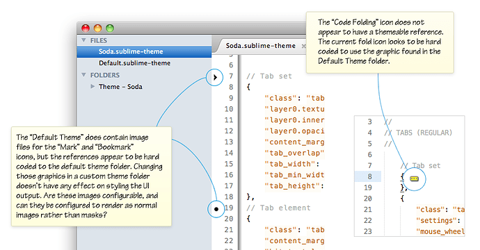
I was wondering if there’s a way I can theme a couple of the remaining UI components that appear to have hard references to assets in the Default Theme folder?

The outstanding items I’ve tried (but failed) to customise are:

  • Gutter: Bookmark icon

  • Gutter: Mark icon

  • Editor: Folded code …] indicator

If I add them to my themes folder they don’'t seem to get picked up, but if I edit the source images in the Default Theme folder they work from there.

I’ve noticed that some of the other UI plugins have managed to customise the gutter icons, if anyone knows the rules I’d be keen to know.

There’s also some other details of visual rendering anomalies on the github wiki page: github.com/buymeasoda/soda-them … -and-ideas

I’m keen on getting something in as well, I’ve got some ideas but playing around with execution at the moment.

Ian

0 Likes

#96

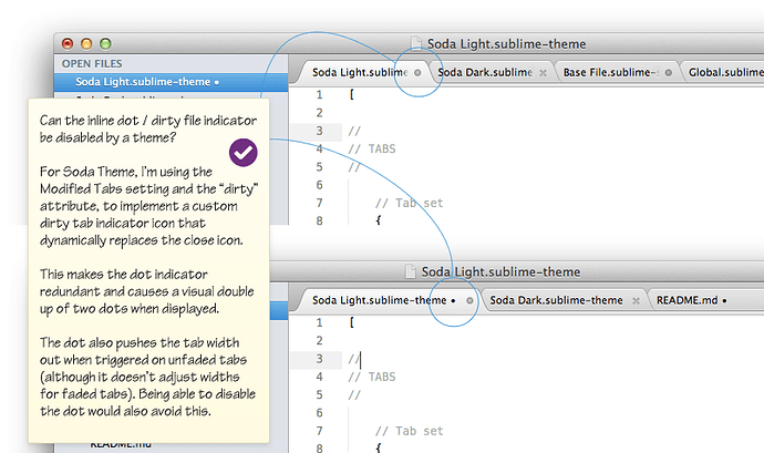
I’ve added my initial take on the “unsaved changes indicator” to Soda Theme.

When a file is edited, the close button dynamically changes to a circle icon to show unsaved changes (or for users with close buttons disabled, the circle will simply appear).

One thing that arose from this implementation is that it makes the existing text based label dot redundant, and I’d really like to disable it via the theme.

Is there option or setting for themes to be able to disable the default text based dot that renders at the end of a tab labels name?

It would be nice to be able to turn this off to avoid the double dot effect (see below), and it would have the added benefit (for themes that don’t need it), of not causing tab widths to be pushed out due to the text dot rendering.

Here’s some details on that request, and a look at the unsaved changes indicator of Soda Light:

0 Likes

#97

[quote=“buymeasoda”]I’ve added my initial take on the “unsaved changes indicator” to Soda Theme.
[/quote]

I do like the look of this approach but it seems to suffer from the same issue as the original dot method. When I have too many tabs open, I cannot see your dirty indicator. At least with the orange glow, I could always see it. Though I do like the look, functionality is always very important to me.

Is there a way to force the close icons to always be shown that I am just not aware of? If not, it would be nice if you could implement a dirty indicator that doesn’t disappear when a lot of tabs are open.

0 Likes

#98

Yeah, that is something that would be nice to find a way to fix.

There seems to be some logic in place (that may be configurable by a theme, or perhaps is hard coded in the app), that auto-hides the close button at a calculated minimum width. If anyone knows how to adjust this, let me know and I’ll try some adjustments to keep it there at much smaller sizes.

At the moment on a 1280 wide resolution with an average sized sidebar, it’ll fit about 21 tabs with a visible indicator, regardless of the length of the tab label file names. With wider resolutions, or no sidebar showing that number increases, but yeah, I end up with lots of files open too and would like to resolve that.

Jon, are there any parameters that can set what the trigger width is for auto-hiding the close button?

0 Likes

#99

Changing the close button for dirty files should also be done for Open files in the side bar, as I suggested here:

Preferably it should also be done for dirty files in the Folders section in the side bar, since one might hide both tabs and Open files and just show the project folder.

0 Likes

#100

Completely agree. I would also like to see this.

At the moment, based on my interpretation of how Jon has implemented the “dirty” state trigger, it appears to be a property of the tab_control, rather than something more abstract, like the file itself.

When determining whether or not to trigger the dirty file icon in place of the close button, the theme does more or less the following check: “For this close button, if the parent tab element’s dirty attribute is true, display the dirty file icon”

The actual theme rules are:

// Tab dirty button
{
    "class": "tab_close_button",
    "settings": "highlight_modified_tabs"],
    "parents": {"class": "tab_control", "attributes": "dirty"]}],
    "content_margin": [8, 8],
    "layer0.texture": "Theme - Soda/Soda Light/tab-dirty.png",
    "layer0.opacity": 1.0, 
    "layer1.opacity": 0.0
},

You can see the check there with: “parents”: {“class”: “tab_control”, “attributes”: “dirty”]}],

I’m not aware at the moment of a way to leverage that for the sidebar tree without Jon adding some other form of indicator for determining if a file is clean / dirty.

I’d certainly use it, if there’s a trigger available or one was added.

0 Likes