Sublime Forum

Soda Theme - New Sublime Text 2 UI theme

#1

**
UPDATE: The theme folder location has been updated to now reside in “Packages” instead of inside “Packages/User”, further details in this thread at: viewtopic.php?f=2&t=2471&p=11592#p11592**

UPDATE: A dark theme has now been added, along with the original light theme.
Hi folks,

I’m creating a UI theme for Sublime Text 2
github.com/buymeasoda/soda-theme/

Initially, it’s a light based version, but I’m looking to create a dark version too.

There are some areas that I couldn’t fully address in the theme, either because I haven’t worked out how to access styling a feature, or it may not be exposed by the theme system. The white button text on the Find / Replace buttons being a good example of something I couldn’t find a rule for, or changing the “Bookmark” and “Mark” gutter images.

I’ve been in contact with Jon, and documented some of the theme challenges faced, so hopefully I’ll be able to tackle a few of those soon:
github.com/buymeasoda/soda-them … -and-ideas

If anyone knows how to address some of these areas, perhaps there are some undocumented properties, please let me know.

Loving the editor, hope you find the theme useful.

Ian

0 Likes

Theming ST is too hard. Theming documentation collective effort
#2

Holy crap, your Find dialog redesign is gorgeous. It’s by far the most jarring design element on the Mac version.

As a dark theme user (Blackboard), I’d love to see a variant.

Great work!

0 Likes

#3

Nice! Works much better with a light color theme. Only the new tab behavior (hiding the close button and fading instead of elide) does not work with the theme.

0 Likes

#4

Amazing! Thanks. Just small request - label color of search buttons is white, why?
grab.by/azc9

0 Likes

#5

[quote=“rooc”]Amazing! Thanks. Just small request - label color of search buttons is white, why?
grab.by/azc9[/quote]

buymeasoda did document this. He couldn’t find any settings for it.

0 Likes

#6

If there was a darker variation of this, it’d be amazing, since I no longer use light themes, but I have to say, this theme is sweet!

0 Likes

#7

+1 for a dark theme, but I’m tempted to use it as-is anyway. Absolutely beautiful.

0 Likes

#8

Button text will be themeable in the next dev build, btw

0 Likes

#9

Loving it. Been looking for a nice clean Sublime theme for my Mac for a while now.

Thanks!

0 Likes

#10

This is excellent!
What color scheme are you using in the screens?

0 Likes

#11

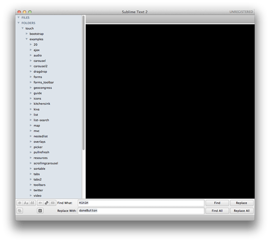
Having trouble making it work on Mac OS X: imagebin.org/163864

0 Likes

#12

Thanks everyone for the positive feedback :smile:

I’ve been curious about the fade vs. elide thing, but not sure how to replicate it. On my install (Beta Build: 2083, Mac OS X), the tabs drop downwards when closed. Is that different to what happens for you? Is there a configuration settings to toggle that?

[quote=“rooc”]Just small request - label color of search buttons is white, why?
grab.by/azc9[/quote]

Yeah, that bothers me too. I tried every setting I could find, but no luck. Jon looks to be adding it to the themeing system in the next build which is great news.

The code syntax scheme is “Espresso tutti colori”, which is a ported TextMate theme originally based on the Espresso Editor default theme.

I’ve added notes and links for the colour scheme file to the project readme.

Did you place the “Theme - Soda” folder in your “Packages/User” directory? That screenshot is a familiar sight, saw it a lot while trying to understanding the themeing system :wink: The red is rendered when it can’t find the images. If you put the theme in “Packages” instead of “Packages/User”, it would have the wrong path to the theme images.

0 Likes

#13

Yes! That was the problem :-p …I had put the theme in the Packages folder, not Packages/User :smile:

The theme is awesome! It’s very nice buttons, tabs and icons, I love it… however, I generally like dark colors. Is there any way you can make a Dark Soda? That has dark colors like the default theme… Only using those nicer icons and tabs? :smiley: …do you have a psd file you could share?
0 Likes

#14

+1 for dark theme.

0 Likes

#15

That wasn’t what i meant :wink:

Here the close button is only visible by rollover and the text fades out at the right side of the tab (both are new features for versions 2081 and 2082):

If i change to your theme it looks like this. The text fades at the right side but the close button is always visible:

After i restart sublime text it looks like this. The text doesn’t fade anymore but includes an ellipses ("…"):

0 Likes

#16

I suspect this comes from Soda.sublime-theme being derived from the default theme that shipped with build 2076, but there have been a few changes to the default theme in the dev builds since then, to fade the tab labels and do a few other things.

A summary of the changes:

tab_control

Changed the content margin, and added the max_margin_trim, which allows it to shrink the content margin when space is tight:

"content_margin": [20, 4, 20, 4],
"max_margin_trim": 4,

tab_label

Added the fade property, which will cause the labels to fade rather than elide:

"fade": true

tabset_control

This has been setup to assign the mouse_wheel_switch property based on the mouse_wheel_switches_tabs setting:

{
    "class": "tabset_control",
    ...
    "mouse_wheel_switch": false
}

{
    "class": "tabset_control",
    "settings": "mouse_wheel_switches_tabs"],
    "mouse_wheel_switch": true
},

tab_close_button

Now uses unpadded_cross.png, and the content margin has changed from [8, 8] to [5, 8, 4, 8], i.e., it’s now 9px wide rather than 16px wide.

Also, tab close buttons are now hidden by default, and shown only if the show_tab_close_buttons setting is true. This is done via:

{
    "class": "tab_close_button",
    ....
    "content_margin": [0, 0]
}

{
    "class": "tab_close_button",
    "settings": "show_tab_close_buttons"],
    "content_margin": [5, 8, 4, 8]
}
0 Likes

#17

Note that if you apply these changes to the theme, then it’ll require build 2083 or later to work as expected. The next non-dev build will be out in a week or two.

0 Likes

#18

There’s a further change in 2084 now: the sidebar headings now have their font style assigned by the theme, so if you’d like them to remain bold, you’ll need:

{
    "class": "sidebar_heading",
    "color": [96, 110, 128],
    "font.bold": true
},

Also, the buttons in 2084 should now pick up the label colour as desired - they’re no longer hard coded to white (!).

0 Likes

#19

Great theme. Good work!

@jps

Is it possible to add some text-shadow to some of the text properties? (sidebar_label, sidebar_heading, label_control, etc.). Would finish it off nicely.

Also, right now I don’t think you can change the main window background color:

0 Likes

#20

Good job!

0 Likes