What do you guys think of this paid theme? I love it, maybe not the default font, but seems really well put together. IMO Sublime should look like this out of the box.
Monokai Pro Theme
gj1118
#2
Is this just a color scheme ? Somehow I cannot use it as a theme. Please correct me if I am wrong.
thanks
0 Likes
davorin
#3
I think something is broken. There are two packages, one named Monokai Pro and the other Theme - Monokai Pro, try the second one and then from the command palette choose Monokai Pro: select theme. At least that works for me.
1 Like
deathaxe
#4
Just another Boxy / Material theme. Not bad and not such memory hungry, but too flat for me.
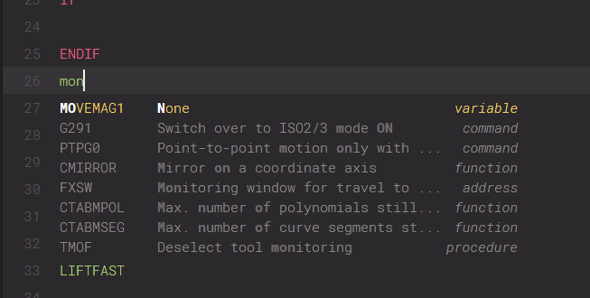
A little quiz: What of the following picture belongs to the code and where is the auto-completion panel?
The theme is not listed in default UI: Select Theme or UI: Select Color Scheme commands. These are the ways a theme should be selected but nothing else (except UI: Select Skins).
I prefere the current Adaptive theme. It is the best compromise between flat design with clearly visible controls.
5 Likes
gj1118
#5
I defaulted back to the default theme and material theme color scheme. I feel it suits me best.
0 Likes
gerry
#7
I was using Boxy Monokai, now I use the Adaptive theme too. I think many were using 3rd party themes mostly because there was no default dark theme available. I find the default themes are faster and more responsive (at least that’s my perception). I don’t what 3rd party themes can bring to the table that is worth switching.
I do like the idea of a polished, accurate, well thought out Monokai colour scheme. It was one of the primary motivations behind ColorSchemeUnit, a colour scheme unit test framework. Can’t see myself paying 10 euro for a colour scheme when I’ve got Molokai which also a Monokai variant. I just haven’t got around to polishing it. With the test suite it makes it easier to polish.
Molokai
Monokai variant
2 Likes
davorin
#8
I’m also using the adaptive theme. But it is still not very sleek. For example the sidebar is plain ugly, showing both the triangle and folder icon, which looks really crowded, and totally goes against the minimalist aesthetic.
0 Likes
deathaxe
#9
Your ColorSchemeUnit is an interesting thing. I can remember a discussion to provide some test scenarios for color scheme devs based on the currently available syntax_test_… files. If you could add some check, whether a color scheme provides rules for the least required scopes, it would just be perfect.
1 Like
deathaxe
#10
This is a question of taste. I never felt comfortable without the folder icons. It looks like something is missing. Maybe its because I am a Windows user 
0 Likes
wbond
#12
Jon and I discussed the arrow and folder icon when redeveloping the default theme. We opted for the arrow and folder for consistency with the underlying platform. You’ll notice macOS and Windows both use the same pattern. Additionally, it leads to the folder and filename labels being aligned. Without the folder icon, the left edge of labels is not aligned.
But yes, this is leading an area where different people will have different opinions. Obviously not everyone is going to like the Default, or Adaptive themes, but so far the feedback on the Adaptive theme has been overwhelmingly positive. We are now shipping a far superior out-of-the-box experience, especially on Windows and Linux HiDPI setups.
Overall I’m pretty happy that we are shipping a unique, consistently designed theme that still has the feel of Sublime Text, while embracing recent UI design trends. All of the icons and assets were designed to be pixel-perfect at 1x and 2x, we use system standard fonts for labels, and we provide an extensive theme engine so people can make it look just the way they want. Just the fact that the Material Theme, Boxy, Soda and Monokai Pro exist means that people can have a powerful, efficient text editor that looks slick too.
10 Likes
ihodev
#14
I think that memory usage is related to some old techniques, UI element classes and properties. Currently I’m working on a new adaptive theme and I can say that if you build a theme from scratch and don’t forget to read the new theme docs often, you’ll get the best performance.
That’s because it builds on the fly when you hit the command: “Monokai Pro …”
IMO the Adaptive/Default theme is the best choice for now.
0 Likes
 At first glance it’s amazing stuff
deathaxe
#16
Good to read as Boxy Theme itself is a really good theme, even though its customizabilities currently go far beyond what the theme engine was meant to be used, I think.
0 Likes
davorin
#17
Good points. Thank you for a very considerate comment. Been using sublime for years, nothing else comes close, but to my eyes there’s always a few things that could be polished a bit. I think it’s important to pay attention to details.
1 Like
sublimeworld
#18
I just did a fresh install of ST3 and don’t see a Default/Adaptive theme. Only default color schemes. I also could not find any mention of this anywhere else on this forum or through google. You are talking about a UI Theme and not a color scheme, right?
How can I find and use the new Default/Adaptive theme?
0 Likes
wbond
#19
The new theme and color schemes are currently in the dev channel, so you won’t see them in build 3126.
2 Likes
rppn
#20
@deathaxe see http://brianreilly.me/sublime-syntax-dashboard/, code lives at https://github.com/Briles/sublime-syntax-dashboard
0 Likes