Sublime Forum

Is there a way to add padding to top of page?

#1

There is no padding at the very top of the page, which makes the text on the first line bump right up against the bottom of the tabs. It’s only cosmetic, but for some reason this really bugs me.
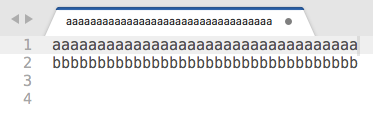
Is there any way to add some padding at the top of the page?

2 Likes

Scroll_past_top
#2
2 Likes

#3

Thanks! I guess there is no way to add the padding, and I’m not the only who would like some there.

0 Likes

#4

Honestly, I haven’t tried to play around with the theme to see what can be accomplished. Considering it was there before, it should certainly be possible since we added a bunch of new functionality to the engine, but I don’t think we took anything away.

0 Likes

#5

Would that require editing the adaptive theme to add the padding? I’ll see if I can figure it out, but if you or anyone else knows where I should look or what setting to edit to accomplish this, please let me know! Thanks, Will.

0 Likes

#6

Yes, but you can add your own rules to the theme by creating Packages/User/Adaptive.sublime-theme and adding the rules in there. Docs are at http://www.sublimetext.com/docs/3/themes.html#elements.

0 Likes

#7

The issue is/seems to be: There is no real padding value available which works for the view. Anything I tried increased the borders around the view or created gaps between the tabs and a view.

We’d need something like the “content_margin” attribute for a “view_control”.

    {
        "class": "text_area_control",
        "content_margin": 10,
    },

Does not exist unfortunately. But we would end up in redefining the meaning of the “margin” setting in the Preferences then.

But a closer look to the legacy default theme shows, the top padding there is negligible, too.

It looks best in ST2, where the text is faded out at the upper border. This makes the padding look larger and smooth.

0 Likes

#8

Did you try scroll_area_control with a parents containing grid_layout_control? Thay may work.

0 Likes

#9

The Themes panel in ST3 says that the adaptive theme files should be located in Theme - Default/adaptive. While I have a Theme - Default folder, there is no adaptive folder in there, so, not sure where to find the files for the adaptive theme so I can see how elements are already styled in there in order to play around with it. Any ideas? Thanks!

0 Likes

#10

Packages shipped with the editor are compressed into .sublime-package files located in a subfolder that is a sibling of the Sublime Text executable (filename varies by OS).

The theme engine is special in that you can add rules via your own file in the Packages/User/ package.

If you want to see the version that is shipped, use https://packagecontrol.io/packages/PackageResourceViewer.

0 Likes

#11

You mean:

    {
        "class": "scroll_area_control",
        "content_margin": [0,20,0,0],
        "parents":  [{"class": "grid_layout_control"}],
    },

Results in an unhandled black bar being added between the tabs and the text content, which is overpainted with the background color after scrolling. The gutter area behaves even worse. The big gap above the tabs is added by this setting as well.

The engine seems not to know what to render there.

Seems we need a tinted tab_control background picture, which simulates the padding, but this goes far beyond my skinning skills.

0 Likes

#12

This is probably due to no instructions telling it what to draw there. If I recall correctly, the scroll area control should have a tint set to the color of the BG of what it contains, so it may just be that the tint needs to be applied to layer0. That said, it probably won’t be able to handle the situation when the gutter and text background colors are different.

0 Likes

#13

Here’s what I added to my Adaptive.sublime-theme file:

{
    "class": "scroll_area_control",
    "content_margin": [0, 5, 0, 0]
}

Which does add 5 pixels of padding at the top of the text area, yay! However, the padding is dark grey so this is what it looks like:

Any way to make the content margin transparent? I tried adding a color setting like this, but it didn’t do anything:

{
    "class": "scroll_area_control",
    "content_margin": [0, 5, 0, 0],
    "color": [255, 255, 255, 255]
}
0 Likes

#14

The color attribute controls the foreground/text color normally. What you’ll want to do is set layer0.opacity to 1.0 and set tint_index to 0. At least, that is my hunch as to what may work.

0 Likes

#15

I honestly found the ST2 solution best. The text is faded out with some kind of small shadow. It somehow looks like the “draw_shadow” of the minimap if text is too long to show.

With or without padding … the suddenly disappearing text looks a bit strange anyway.

Any idea where it has gone? May we reintroduce it?

2 Likes

#16

I tried this, but it didn’t work:

	"class": "scroll_area_control",
	"content_margin": [0, 5, 0, 0],
	"layer0.opacity": 1.0,
	"tint_index": 0

I also tried "layer0.tint": 0 as well as layer1.opacity, layer2.opacity and layer3.opacity, but doesn’t get rid of the dark gray background. :frowning: So close!

0 Likes

#17

Alright, I’ll have to look into it some the next time I am working on the theme engine.

2 Likes

#18

@wbond Thanks for your time anyway!

0 Likes

#19

That would be great, thanks!

0 Likes

#20

Another thing you might consider looking into: Adding “content_margin” to “scroll_area_control” seems to add the same margin to other elements. I notice 5 pixels of margin being added above the tabs and to all fields, such as the search field, which pushes down the field content like this:

0 Likes