Sublime Forum

Lack of padding between editor screen and tabs/window

#1

Hey everyone,
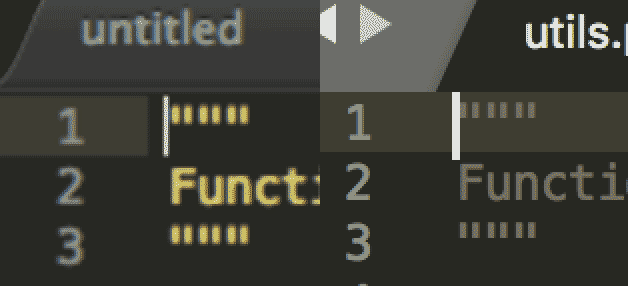
i really like the new release, there’s just one small thing that’s nagging me a bit about the new theme. There doesn’t seem to be any space between the editor pane and the tab bar, or if you’ve disabled the tab bar, the top of the window. In the old theme there was a subtle padding at the top of the window, just a couple of pixels, but just enough.

It’s especially noticable when you look at the top of the caret in the before/after image i’ve attached to this message.
0 Likes

#2

There seems to be no padding at all for the text content of a view.

If you change the color of the gutter, the text is rendered without padding. Increasing the “margin” in settings just increases the size of the gray gutter area.

Maybe its worth an issue at https://github.com/SublimeTextIssues/Core/issues ?

0 Likes

#3

With this release, we increased the default caret size to be a little wider and taller. So now the caret draws up to the upper clipping edge, which I believe is giving the illusion that there is no margin there. Additionally, I think the old tabs had a line along the bottom that made it appear as if there was more height to the text editor control.

0 Likes

#4

Thanks for clarification, but everything is an illusion, isn’t it? :wink:

I’d find a “content_margin” property for the view control in themes or the “margin” setting applying as padding for the view control very useful. So user could decide how much space is drawn to the left, top, right, bottom.

0 Likes

#5

The old theme had a small line at the bottom indeed, which had the same effect as having padding at the top of the content window. A setting for increasing the margin on the content window would definitely be very useful!

0 Likes

Is there a way to add padding to top of page?
#6

+1 to add some padding at the top of the page, or at least provide a setting so that it can be added. It’s a small thing, but the lack of padding always sticks out to me.

0 Likes