Sublime Forum

Interface Suggestions

#35

Moving the bottom input panel to a quickpanel-like input panel at the top.

Importance: minor.

Motivation : I’ve always found it awkward to, for example, initiate a new folder command from the sidebar (folders are at the top of the tree) and then having to look at the bottom of the window to type in the folder name. I’d like input to be typed in somewhere around the top of the window.

I don’t mind the search panel being at the bottom since it is unobtrusive/out of the way of the buffer, and we can let it opened to keep the context of the search options/input and so on. But for quick inputs that will disappear immediatly after anyway, I’d really prefer it to be somewhere near the top, like where the quick panel/overlay panel already are. Plus, some commands activated by the command palette requires input, and shifting my eyes from the top to the bottom, then the top again and so on, really is annoying. Hopefully some will agree as well.

4 Likes

#36

This would be a hugely beneficial feature for todolist packages like PlainTasks.

1 Like

#37

Add support of the svg UI assets (icons, textures, etc)

Importance: Minor

Description: @1x @2x @3x @4x . . .

Motivation: Currently, Sublime Text theme styling supports only png assets.

17 Likes

#38

Add option for scrollbar up/down/left/right arrows to move page in adjustable speed with mouse

Importance: Major

Description: it is not possible to move page with mouse in precise steps. In Linux arrows can be added to the Gnome GTK 2 or 3 theme but they do not appear in Sublime 3 but in every other app (file manager, terminal, firefox…).

See my original topic: Adding Arrows to Scroolbar for up down

0 Likes

#39

Confirm before deleting files in the sidebar, this has irked me for so long now.

5 Likes

#40

Multiple selection of packages to be updated

This is regarding Package Control, but since Will is now part of the Sublime Text theme, I’m going to assume that some future version of Sublime Text might eventually ship with or integrate Package Control.

Currently, one can choose between “Upgrade/Overwrite All Packages” and “Upgrade Package” and then select a single package to be updated. For the latter, it would be nice to be able to select multiple packages (e.g. using Space key) and then upgrade all selected packages. While I can’t think of a practical example, multi-selections might be useful for other dialogs as well.

Importance: Minor

3 Likes

Interface Suggestions Discussion: Multiple selection of packages to be updated
#41

Style console output

I often use the console and the overview is currently very limited. I’d like to propose options to style or colorize the console output.

  • bold / italic / underlined text
  • colored text: red for errors, yellow for warnings

Needless to say, that these should be optional.

Importance: Biased :grin:

8 Likes

Interface Suggestions Discussion: Style console output
#42

It would be nice if each menu entry was also available in the search bow (ctrl+shift+p).
I’m thinking for example to “Exit”, changing line endings, Open folder, Open recent, Record macro, …

There are a lot of commands that I don’t use very often and that I struggle to remember shortcuts and/or positions in the Menu.

5 Likes

#43

Imo, every action listed in the menu should be exposed to the command palette as well. That includes packages and their “open Settings” commands. Sadly, only few packages do this.

9 Likes

How do I disable word wrapping?
#44

Configuring sublimes settings via the command palette (much like a plugin provides support for) would be a good one to have native support for as it feels much more intuitive and in most cases faster.

0 Likes

#45

Customized title bar, and Menu Bar with background-color & font-color
Importance: Minor

Description: ST like a very beautiful girl but wearing a very old hat.No matter how beautiful clothes can not save the regret caused by the hat.

And, if themes can modify the Menu Bar’s background-color & font-color,it seems to be more harmonious and beautiful.

If the title bar and menu bar can be combined together, it will be better.
eg:

3 Likes

#46

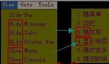
Fix the bugs of UI Localization (1)
Importance: Major
Description: There’s no setting used to localize this part of the picture:

1 Like

#48

Fix the bugs of UI Localization (2)
Importance: Major
Description: The caption of toggle menus…

Whether it can be like this:
“caption”: “the caption to be show||the caption to be hide”,

When ST read the “||” contained in the caption, to deal with it as a toggle menu.

1 Like

#49

Fix the bugs of UI Localization (3)
Importance: Major
Description: There’s no setting used to localize these parts of the picture:

1 Like

#50

By modifying the EXE file, these can be localized. But this is not good. At least, it’s too tired to keep up with the pace of the upgrade.

0 Likes

#51

also,this:

1 Like

#53

Strengthen the sidebar
Importance: Major
Description: Show the headers tree of MD file in the sidebar, and click the header to jump to the corresponding location. This is better than Ctrl+R (goto symbol).

1 Like

#54

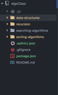
Support for sidebar customizations like the color-coded system for git integration in Atom:

20 Likes

#55

Add the possibility to change the background color of match_selection, right now is only possible to change the border color.

0 Likes

#56

It would be great to be able to hide tabs per pane. This is useful if you have a REPL (e.g. SublimeREPL) with a single tab below your main pane and don’t want to waste vertical space for that one tab.

2 Likes