Some editors (eg Notepad++) have a configurable function list panel which my colleagues love, but I can’t match in ST: It gives an immediate clickable overview of all the lines in a file matching a regexp - e.g.
Match: ^\s(*FUNCTION|PROCEDURE) \s+[A-Z0-9_]+
Show: \2
This only shows functions in the current file. Maybe a multifile-tree-based varient based on sublime’s index files would be even better,
Interface Suggestions
steveh4133
#15
2 Likes
braver
#16
Support multiple icons per line in the gutter.
Major.
Gitgutter, linter, bookmarks, bracket matcher, etc. all fight for a place in the gutter and there can be only one. There is no solid logic for which one to show, so Sublime should support having multiple icons. Perhaps through multiple gutters, but that’s not very elegant (this is Atom’s solution and it’s an annoyance as far as the GUI goes). Instead, the gutter could simply grow to accommodate icons as required.
9 Likes
braver
#17
Indicate active editor pane when multiple are open.
Minor.
Currently, there is no hook for themes to indicate which editor is active / has focus. Visually they are identical.
9 Likes
Boxy – It Was the Most Hackable Theme for Sublime Text 3
huot25
#18
I guess I envisioned this working independent of the pop_up API altogether. What happens when you are using a plugin that uses pop up’s and this notification is trying to display. Since you can only have one pop_up per view they would be battling to display. I guess I feel like these really serve two purposes. One is for contextual information related to what is in the view and the other is strictly for informational purposes related to an even or action that occurred.
I do like your innovation and thinking outside of the box. It is a really interested approach that you have come up with based on what we have available!
With my limited testing on_query_completions was not invokable directly. It could only be called when you pressed ctrl+space. Although, now that I think about it you could just invoke the command via run_command which might be something to look at.
0 Likes
wbond
split this topic
#19
2 posts were split to a new topic: Interface Suggestion Discussion: Indicate active editor pane when multiple are open
0 Likes
wbond
split this topic
#21
2 posts were split to a new topic: Interface Suggestion Discussion: Add possibility to create new Gutter
0 Likes
gj1118
#23
Here are two I would absolutely love .
Importance : Major
Description :
- Icons in the tab bar.
- A stylish autocomplete (changes might need to be done in the api as well ) . Much like the one that Atom has.
Motivation:
-
I would like to have these features because more often than not, I am working with sidebar closed and with multiple technologies - for example LUA embedded in a C++ Container which also contains HTML/CSS and JS. Having icons at the top bar will easily help me to identity which type of files are open very quickly instead of gauging it from the syntax .
-
Having an advanced (yet stylish) autocomplete dropdown would help me to easily identify the type of the item in the dropdown (if its a method, a variable , etc) . Another example of the advanced Autocomplete would be the parameters that a function that i chose in the autocomplete is expecting.
Thanks
9 Likes
wbond
split this topic
#24
A post was split to a new topic: Question about Interface Suggestions
0 Likes
d21mike
#25
Scroll Bar Colors are too Dark to see
Please change the color of the scroll bars. They are extremely hard to see. Dark color on top of a dark color is pretty useless. I recommend you use the same colors that the underlining systems use. I am on a MAC and in Safari they are GREY over WHITE. I think that is the same on Windows.
Or at least has an option to indicate you want to use the systems color.
Thanks
1 Like
noreffer
#27
Possibility to open / search in http://devdocs.io/ inside editor ( like in Atom )
https://atom.io/packages/api-docs
1 Like
Lucas
#28
Block Cursor Foreground Colour
Importance: Major
Motivation: I want to easily read the text that dsiplays in front of the block cursor
Description of the problem:
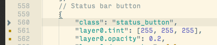
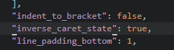
Currently we can get a block cursor by setting inverse_caret_state to true.
I can style the cursor in tmTheme files with the selection and caret keys.
The problem is that even though the cursor uses selection to set the background colour, it completely ignores selectionForeground unless you actually click and drag over some text.
Here is a gif of the problem: (selectionForeground is set to #000000)
I would like selectionForeground to be toggled on the current character that is in front of the block cursor when it blinks on and off rather than using the syntax colour.
In the gif you can see that when the block cursor is resting on a character and blinking the character foreground colour stays the same.
I want the colour to change to black (in this example) when the cursor blinks on, and revert back to normal when it blinks off.
The normal selection styles are fine.
If this could be added Sublime would finally have a decent block cursor in my opinion.
My thread describing the full problem can be found here: inverse_caret_state foreground colour
4 Likes
FichteFoll
#29
I use Zeal and the Zeal package for this, which works perfectly fine. I do not think that we need an inline HTML panel for everything, especially if it already exists in external applications (compare “live HTML preview” packages that use chrome). Also, this needs to be done as a plugin anyway, which is why your suggestion is extremely unspecific and in fact the same as Interface Suggestions.
0 Likes

FichteFoll
#31
This is true, and will continue to be the case: https://github.com/zealdocs/zeal/issues/24
You’d have to use Dash on OSX.
0 Likes
bijan
#32
Peek Definition (like in VS Code)
https://code.visualstudio.com/images/editingevolved_references.png
6 Likes
iamntz
#33
It’s weird that no one bring the toolbar problem in discussion.
Importance: Biased
Description:
For some, it will be nice to have a quick access to various functionality, like save, text transforms and so on. For me, this is quite useless in most cases, but it would be useful in cases where you’ll use mouse a bit more, like doing debugging (i.e. set a breakpoint, evaluate variables and so on).
9 Likes
Simon-Claudius
#34
Make Sublime Overlay a regular feature that also works on Mac.
Description: I think it would be nice to be able to tie the colour of the silver/grey border on OSX to the main colour of the theme to have a seamless transition. Even more so I think Sublime would benefit from having a themeable top-border element.
9 Likes
dubeg
#35
Moving the bottom input panel to a quickpanel-like input panel at the top.
Importance: minor.
Motivation : I’ve always found it awkward to, for example, initiate a new folder command from the sidebar (folders are at the top of the tree) and then having to look at the bottom of the window to type in the folder name. I’d like input to be typed in somewhere around the top of the window.
I don’t mind the search panel being at the bottom since it is unobtrusive/out of the way of the buffer, and we can let it opened to keep the context of the search options/input and so on. But for quick inputs that will disappear immediatly after anyway, I’d really prefer it to be somewhere near the top, like where the quick panel/overlay panel already are. Plus, some commands activated by the command palette requires input, and shifting my eyes from the top to the bottom, then the top again and so on, really is annoying. Hopefully some will agree as well.
4 Likes
fredcallaway
#36
This would be a hugely beneficial feature for todolist packages like PlainTasks.
1 Like