Sublime Forum

Git Integration: Side Bar Badges

#1

Hi,

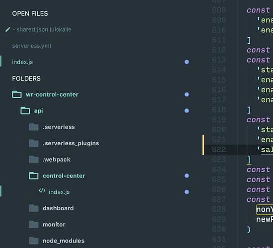
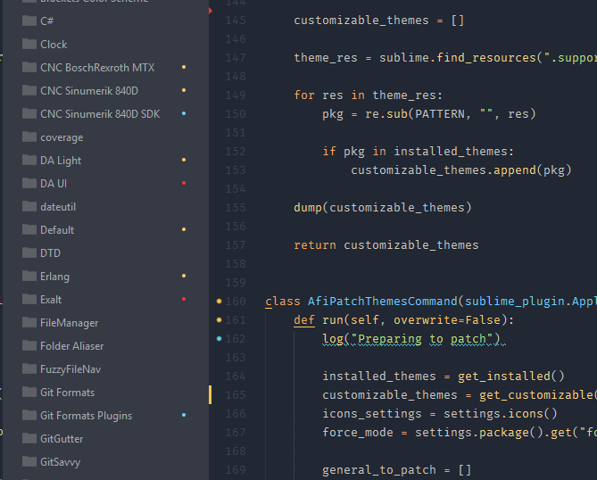
First of all thanks for the new git integration! The badges are great, but I find the placing confusing. The badges are aligned to the right, where they are closer to the code than the files and folders. That makes it confusing for me. Is it possible to move them all the way to the left?

Maybe a screenshot says more than a thousand words.

A setting for this would make me happy! Or is it a theming issue?

Thanks!

2 Likes

#2

No, currently they are designed to stick to the right-hand edge of the side bar. There is no setting to control the placement, not any way via the theme.

2 Likes

How to move the LED dot of git indicator to the beginning of filename in v3.2?
#3

I should note, while it is not possible to change the position of the badges, with a theme customization, or third party theme, it is possible to change the color of the filename text and hide the badge.

For info on theming elements in the side bar, see https://www.sublimetext.com/docs/3/themes.html#elements-side_bar. Using the View Package File to view the file Theme - Default/Default.sublime-theme can be a useful reference. Ignored files utilize the coloring the filename text instead of adding a badge.

To create a theme customization, see https://www.sublimetext.com/docs/3/themes.html#customization.

1 Like

How do I hide icons? show_git_status
#4

I agree with OP. It is a bit confusing. I posted a new thread (How to move the LED dot of git indicator to the beginning of filename in v3.2?) before noticed this thread.

@wbond Is that possible to tweak Sublime Text’s codes a bit to make it able to change the position?

Anyways, Sublime Text is a genuine editor.

0 Likes

#5

Certainly it is possible, but I’m not sure it works visually. I tried that before I settled on the right-hand edge. It felt wrong for a few reasons:

  • If there was a dedicated place for the badge, most files would look like: [ICON] [blank space] [filename]
  • If the badge only added to the layout when present, the left-edge of filenames would be inconsistent
  • It looked pretty busy in any way [expand arrow][folder icon][badge][folder name]
  • When scrolling horizontally, it make sense to fade the filename when there is insufficient space. Fading the icons over the expand arrow and icon would look very funny.

If you don’t like the icon on the right, using color on the folder or file name seems like the next best option.

2 Likes

#6

There are so many people making suggestions about what ST should implement by comparing with Microsoft VS Code. Now that ST implemented such a feature exactly the same way people complain about it again.

I fully agree with @wbond about the current position of the badges to be the only logical one.

If the GUI is reduced to a minimum - as illustrated in the screenshot of the initial post - you simply loose the ability to distinct otherwise clearly visible parts.

I don’t have any issues with identifying the badges, the mini diff and the SublimeLinter markers in my ST

Note

The only possible alternative I could imagine was to add some kind of overlays to the existing file icons (if visible). I think about TortoiseGit, which adds such kind of overlays to the Windows Explorer.

2 Likes

#7

Well, I’ll take slight issue with that. :slight_smile: While we did benchmark a number of editors, we also leaned on experience writing our own git client. Here are a few things that we do differently than some of the popular editors and IDEs, and I think mostly better:

  • We use strictly symbols for git badges, and every status (other than the type of action that is staged - e.g. added vs modified vs deleted) can be determined without looking at the color
  • We indicate on a folder when a contained file is missing or deleted
  • We use color sparingly, only in the git badges, not in icons, filenames and badges
  • A folder that contains modifications includes a tooltip enumerating the types of changes
  • We make it very obvious when an unmerged file exists

This should be doable right now, as the file/folder icon is a child of file_system_entry (https://www.sublimetext.com/docs/3/themes.html#elements-side_bar), which has the status attributes applied to it.

1 Like

#8

Well, I’ll take a slight issue with that. :slight_smile: … you do better!

My comparison was just about the position of the badges not the superior implemantation of the other details. :slight_smile:

This should be doable right now,

I know. Already started playing around with overlays of file and folder icons. This is more or less a question to answer by upcomming themes.

The only question I have about it, was whether we can find some kind of commonly used settings to be used by themes to control such visual details. While settings like overlay_scroll_bars or bold_folder_labels settings are already “standardized”, some more might be required to ensure theme authors can make use of a common set of settings to enable to tweak the GUI via settings.

I think users might be annoyed if each theme would use different settings for the same basic things in the futuere.

Here is a list of some settings which might be worth thinking about to be used to tweak the appeareance of themes. This is just a very personal list of settings which have been implemented into https://github.com/SublimeTextIssues/Core/issues/2683/DA Light.zip. Not all of them might be worth a standard, but things like show_vcs_status_badges probably do.

{
    // Whether to show the disclosure buttons in the sidebar
    "show_disclosure_icons": true,

    // Whether to show folder and file icons in the sidebar
    "show_sidebar_icons": true,

    // Whether to show the tab scroll buttons
    "show_scroll_tabs_buttons": true,

    // Whether to show the show tabs dropdown button
    "show_tabs_dropdown_button": true,

    // Whether to show the show panel button in the status bar
    "show_panel_button": true,

    // Whether to show the show panel close button in the status bar
    "show_panel_close_button": false,

    // Controls whether to show vcs status badges in the side bar
    "show_vcs_status_badges": true,
}
1 Like

#9

If you haven’t already, and apologies if you have, could you make an issue on the tracker out of this idea?

0 Likes

#10

Of course, I will do.

0 Likes

#11

I do see where you’re coming from. I think the level of detail is great, but I think in its current form it is more distracting then it is useful. It is hard to distinguish the color in the sidebar from the color in the gutter, both adding add attractive colors in the same visual area. Until now the sidebar was an area of relative calmth, keeping focus on the meat; the code.

0 Likes

#12

Check out these links and you can pretty easily change the tint on the icons to just be dark grey:

0 Likes

#13

I totally agree that current state of badges brings a lot of confusion, especially when you are switching between editors / IDEs. IMHO badges should be completely removed in favour of highlighting the files / folders in the sidebar. That’s basically the only feature which makes default Atom build superior to ST.

0 Likes

#14

Nothing prevent you to highlight files with a color and have no badge, it is just a question of customising your theme.

0 Likes

#15

Imho toxin is a great theme which supports this:


https://packagecontrol.io/packages/Theme%20-%20Toxin

1 Like

#16

Unfortunately my knowledge prevents it :wink: I’m fresh ST user - so it’s just a matter of modifying my theme? I’m currently on One Dark (I think Atom designers nailed it).

0 Likes

#17

This is my current Packages/User/Adaptive.sublime-theme. You’d want to name it so the last part of the filename is the same as your theme’s filename, and tweak the colors and logic as desired.

[
    // Documentation at https://www.sublimetext.com/docs/3/dev/themes.html
    {
        "class": "vcs_status_badge",
        "parents": [{"class": "file_system_entry", "attributes": ["staged"]}],
        "layer0.texture": "Theme - Default/common/status_staged.png",
        "layer0.tint": "color(var(--orangish) min-contrast(var(--background) 2.5))",
        "layer0.opacity": 1.0,
        "content_margin": 6
    },
    // Adapted from https://github.com/p3lim/sublime-toxin/blob/master/Toxin.sublime-theme
    {
        // File not tracked by VCS
        "class": "sidebar_label",
        "parents": [
            {"class": "tree_row", "attributes": ["!expanded"]},
            {"class": "file_system_entry", "attributes": ["untracked"]}
        ],
        "color": "var(--purplish)"
    },
    {
        // File not tracked by VCS (with parent folder)
        "class": "sidebar_label",
        "parents": [{"class": "file_system_entry", "attributes": ["untracked"]}],
        "settings": ["vcs_color_expanded"],
        "color": "var(--orangish)"
    },
    {
        // File modified in VCS
        "class": "sidebar_label",
        "parents": [
            {"class": "tree_row", "attributes": ["!expanded"]},
            {"class": "file_system_entry", "attributes": ["modified"]}
        ],
        "color": "var(--orangish)"
    },
    {
        // File modified in VCS (with parent folder)
        "class": "sidebar_label",
        "parents": [{"class": "file_system_entry", "attributes": ["modified"]}],
        "settings": ["vcs_color_expanded"],
        "color": "var(--orangish)"
    },
    {
        // File added to VCS (when a new file is staged)
        "class": "sidebar_label",
        "parents": [
            {"class": "tree_row", "attributes": ["!expanded"]},
            {"class": "file_system_entry", "attributes": ["added"]}
        ],
        "color": "var(--greenish)"
    },
    {
        // File added to VCS (when a new file is staged) (with parent folder)
        "class": "sidebar_label",
        "parents": [{"class": "file_system_entry", "attributes": ["added"]}],
        "settings": ["vcs_color_expanded"],
        "color": "var(--accent)"
    },
    {
        // File staged to VCS (without unstaged modifications)
        "class": "sidebar_label",
        "parents": [
            {"class": "tree_row", "attributes": ["!expanded"]},
            {"class": "file_system_entry", "attributes": ["staged", "!modified"]}
        ],
        "color": "var(--accent)"
    },
    {
        // File staged to VCS (without unstaged modifications) (with parent folder)
        "class": "sidebar_label",
        "parents": [{"class": "file_system_entry", "attributes": ["staged", "!modified"]}],
        "settings": ["vcs_color_expanded"],
        "color": "var(--accent)"
    },
    // {
    //     // File ignored by VCS
    //     "class": "sidebar_label",
    //     "parents": [{"class": "file_system_entry", "attributes": ["ignored", "!staged"]}],
    //     "color": [90, 90, 90]
    // },
]
1 Like

#18

The links I added in the post you replied to cover the theme engine in detail. If you like have a specific look to the UI, it is probably worth learning some of the basics so you can make tweaks like this.

0 Likes

#19

I will definitely look into it, thank you!

0 Likes

#20

I followed the links but still don’t understand how to do this. Can you provide some more detailed guidance?

0 Likes