Hi I am new here. Just installed ST3 in Linux Mint. I wonder, why my file icons in side bar look like this? Is this normal?
File Icons change to asterisk
aldyahsn
#1
2 Likes
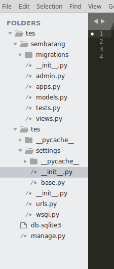
QUESTION: what is the "/*" in front of every file on folders pane?
Wildcard '/*' icon used for all files
ihodev
#2
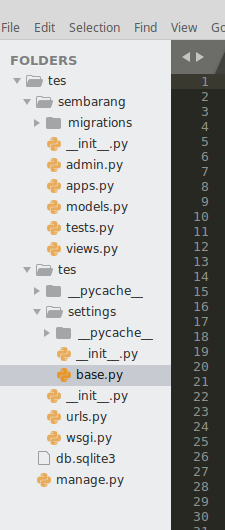
Yes, that’s the source icon. You can try A File Icon for enhanced file-type icon support.
3 Likes
aldyahsn
#4
Btw. Why it doesn’t look like this. As I remember, I am not sure because It has been a while, I had used ST in Windows it looked normal

2 Likes
ihodev
#5
Starting 3127 Sublime UI theme was refreshed. I and many other users like it a lot, however some users don’t. That’s just a matter of taste.
2 Likes
Paapaa
#6
But does ANYONE actually like the /* icon? I think the icon should not look like text at all. The filename is text, the icon should look like an icon. I think this should be reconsidered. And even worse: it starts a comment block. I don’t think this was thought out well enough. But maybe I’m just minority here. What do others think?
I want to emphasize that I have only seen the screenshots. I have not used the new theme/dev versions.
4 Likes
Paapaa
#8
Maybe some outline/border could improve the icon. I don’t know. Don’t know the reason why the old icons had to be changed. (I think this has been discussed in another thread, maybe it has been reasoned there too.)
EDIT: This is the resoning by wbond:
The primary motivation for the various icon choices was to have a symbol that was abstract, but all visually distinct. Previously all of the icons used a similar page outline that made it difficult to scan for different file types. The new icons are crisper, eschew the paper outline, and should hopefully be fairly easy to distinguish without a detailed look.
Not sure if the crispyness and distinctiveness outweight the problems, though.
3 Likes
addons_zz
#9
What icon is this? I am using build 3142 and quite do not remembering seem it. Do you have some screenshot?
0 Likes
wbond
#10
What problems are you referring to? I’m not sure I’d consider liking the icon, or lacking a “paper” outline to be a problem. Those seem to be more of a preference.
1 Like
mikemaccana
#12
Exactly. This is not a matter of taste. ‘/*’ has a specific meaning - it’s a wildcard for all files, and doesn’t make sense to display besides a single file. A simple empty document icon ‘[ ]’ as almost every other app uses would suffice perfectly.
1 Like
wbond
#13
It is also the beginning of a comment in very many programming languages (C/C++, PHP, CSS, JavaScript, Go, D, Java, Swift, Rust), which is why I chose it.
The entire UI can be changed, you can tweak this yourself, or use one of the hundreds of other themes. There is full documentation on the theme engine at http://www.sublimetext.com/docs/3/themes.html.
0 Likes
kolega
#14
I feel your pain. I am also bugged by the /* icon – mostly because A)) it looks like text and B) an asterisk is very often used to indicate a changed/unsaved file.
You can configure the icons for source files to be the same as for default (unknown) file types:
open command palette -> Package Resource Viewer: Open Resource -> Default -> Icon (Source).tmPreferences
inside, replace “file_type_source” with “file_type_default” and you should no longer see the /* icons.
4 Likes
The source code sidebar file icon is a major source of cognitive dissonance
inopinatus
#15
For me that is proving a painful decision. My mind is seeing a long list of unterminated comments. It’s tripping my syntax error fuses and this hurts my productivity.
I took a look at “File Icon” but it is a source of more visual noise again.
Is the icon configurable? If not, please make the file icon configurable (edit: it is, thanks kolega). But even that won’t help for pair work, I can’t force my preferences on a colleague.
1 Like
LucianoCodes
#16
Thank you so much for this solution! The /* as an icon is insanity IMHO. It feels like my entire project won’t build because there are open comments everywhere.
Cheers!
1 Like
benfrain
#17
Also not a fan of that icon. Not a deal breaker but having the start of a comment as the file icon just seems wrong. If it was surrounded in a box to make it look like a file it wouldn’t be as bad.
5 Likes
doneykoo
#18
The new theme for ST3 looks good, especially it also provided the “adaptive” one.
But regarding the asterisk icon, I agree with Paapaa and benfrain.
Now in latest ST3, all my code files showing "/" everywhere in my project file panel looks wierd.
1st, they do not look so intuitively as file icons. They have no background-shape. And they do not have border. At the first glance of my opening my code project with ST3, I was even guessing the / is indicating a folder structure sense of parent-and-children.
2nd, a “/*” might also not be quite suitable as a file type for code. In my own opinion, I suppose a “[]” or “<>” is much more often used as indicating a coding file type.
0 Likes
mikemaccana
#19
Understood @wbond and I’m glad it can be changed.  I think the main thing people are saying here is that it’s not an ideal default - as @benfrain said just adding a box around it would be fine.
0 Likes
mikemaccana
#20
@inopinatus use the color option with ‘A File Icon’ - it will make the icons greyscale, less noisy and fit in the the ST3 final theme.
0 Likes