Dev Build 3164 is out now, addressing a couple of recent regressions - https://www.sublimetext.com/3dev
Dev Build 3164
deathaxe
#3
I basically like the idea to use Winows’ ClearType settings to adjust antialiasing, but this change reintroduces an issue from older builts, which causes the font weights to be unbalanced between light and dark color schemes.
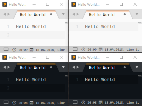
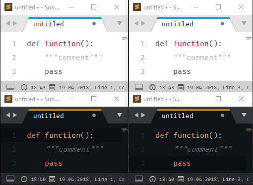
While ST3161 (screenshots on the left) renders the fonts with nearly the same thickness in both dark and light color schemes, ST3164 (screenshots on the right) causes fonts to look good in either dark or light color schemes depending on dwrite_cleartype_classic.
Fira Code / dwrite
Without dwrite_cleartype_classic text looks good with light color schemes, but tends to be too thick in dark ones. Have a look onto the tabs or the status bar of the dark themes, which look much better in the older 3161. Theme uses "font.face": "Operator Mono" which even renders worse (too thick) with dark color schemes, than Fira Code.
(ST3161 dark = ST3161 light)
(ST3161 light = ST3164 light)
	"font_face": "Fira Code",
	"font_options":
	[
		"directwrite",
	],
	"theme_font_options":
	[
		"directwrite",
	],
Fira Code / dwrite_cleartype_classic
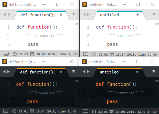
With dwrite_cleartype_classic looks good in dark color schemes (only a little bit thicker), but too thin on light backgrounds. Theme uses "font.face": "Operator Mono" which even renders worse with light color schemes, than Fira Code.
(ST3161 dark = ST3161 light)
(ST3161 dark = ST3164 dark)
	"font_face": "Fira Code",
	"font_options":
	[
		"directwrite",
		"dwrite_cleartype_classic"
	],
	"theme_font_options":
	[
		"directwrite",
		"dwrite_cleartype_classic"
	],
Conclusion
I tried with different ClearType settings without reasonable effect. Font weights keep unbalanced in ST3164.
The effect is more or less obvious depending on the fonts and the text color being used. But even red or blue text is less readable on light color schemes again or too heavy in dark ones.
Again need to switch between Regular fonts for light and Light fonts for dark color schemes to make them render the same way.
I personally tend to prefer the balanced way of rendering of ST3161.
The new built makes reading source code on white backgrounds harder again.
My Setup
- Windows 10 1803 x64
- Full-HD display 24’’
- scaling 1.0 (per-monitor v2)
0 Likes
wbond
#4
What are your ClearType tunings set to? You can see them easily in the registry at HKEY_CURRENT_USER\SOFTWARE\Microsoft\Avalon.Graphics\. Sublime Text 3162+ uses the tuning from your primary display, which may not be DISPLAY1.
From my quick testing, setting EnhancedContrastLevel to decimal 200 and ClearTypeLevel to decimal 100 gets pretty much the exact same anti-aliasing as 3161. I checked with both Consolas and Fira Code on a low-DPI display at 100% scale and use the Windows zoom tool to check out the pixels.
0 Likes
New DPI scaling makes my text look like old TV screen text
deathaxe
#5
Need to correct myself: I love the idea to use Windows’ ClearType settings. 
I followed your suggestion and additionally modified the GammaLevel from 2200 to 1800.
As I use the HDMI to connect to my A/V-Receiver (primarily for audio), the display assignment seems to change if the receiver is powered on or off. Don’t ask me for details, Windows seems too stupid to handle that well. Therefore I cloned the registry keys from DISPLAY1 to DISPLAY2 to ensure the values to be applied.
- Now the text is very well readable and balanced with both light and dark color schemes.
- The
dwrite_cleartype_naturalanddwrite_cleartype_classicsettings now have a visual effect and help to make the text look good.
Finally it looks like ST has evolved to be a better ClearType tuning tool 
Thanks @wbond for your support. “Issue” fixed
My final setup now is:
Windows Registry
[HKEY_CURRENT_USER\Software\Microsoft\Avalon.Graphics\DISPLAY1]
"ClearTypeLevel"=dword:00000064
"EnhancedContrastLevel"=dword:000000c8
"GrayscaleEnhancedContrastLevel"=dword:00000032
"TextContrastLevel"=dword:00000001
"PixelStructure"=dword:00000001
"GammaLevel"=dword:00000708

[HKEY_CURRENT_USER\Software\Microsoft\Avalon.Graphics\DISPLAY2]
"ClearTypeLevel"=dword:00000064
"EnhancedContrastLevel"=dword:000000c8
"GrayscaleEnhancedContrastLevel"=dword:00000032
"TextContrastLevel"=dword:00000001
"PixelStructure"=dword:00000001
"GammaLevel"=dword:00000708
Sublime Text
	"font_face": "Fira Code",
	"font_options":
	[
		"dwrite_cleartype_natural"
	],

	"theme_font_options":
	[
		"dwrite_cleartype_natural"
	],
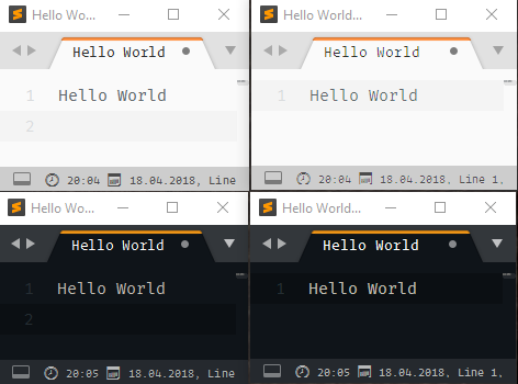
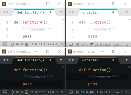
Looks balanced again
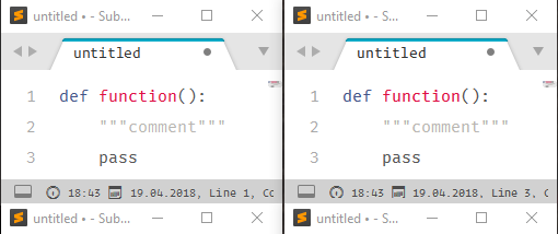
To compare the results for all those who are interested.
Left 3161 Right 3164
1 Like
Switch panel and tabs uses different font rendering after GDI changes
Bad font rendering (Win, 3170)
facelessuser
#6
I don’t know if this has been reported, but occasionally, the find regex find box wraps searches with \b...\b even when whole word isn’t selected. I have to toggle whole word on then off to get it to stop. Really annoying…
1 Like
facelessuser
#7
Also Find box, if open, automatically copies my selection into it when I press Ctrl+D (on Windows). It used to be that if I pressed Ctrl+F and had a selection, my selection would get copied into find, which is fine. But I do not like how every time I select a whole word with Ctrl+D it modifies my find box. I think this action also triggers whole word mode, but the whole word mode button is not selected. Something is definitely broken.
I’m doing a bunch of refactoring at work today, and this is killing me.
1 Like
rwatt
#8
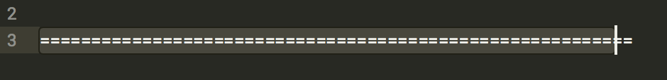
I’ve noticed on DEV 3164 (might have been present earlier, but didn’t catch it) that the cursor starts to fall behind the actual position when trying to type out a line of repeating dashes or equals. This is on two different Macs, both using 10.13.4.
6 Likes

addons_zz
#10
I already have this behavior some times, but I have to clue on how to reproduce it yet.
This also bothers me. I think the find box should only be modified when I explicitly call Ctrl+F and I have a selection, not when I call for Ctrl+D
1 Like
iamed2
#11
Yes, this happens for me too, and was also happening on 3163 at least, possibly earlier. Also macOS 10.13.4.
0 Likes
facelessuser
#12
For me, it is definitely when I run the command invoked by ctrl + d. It not only copies the end selection into the find box, but it enables whole word search even though the “whole word” regex button is not enabled. Then I see the failure of the regex in the status bar showing it searched with \b...\b. Toggling whole word on then off fixes it.
This is definitely a bug as whole word should never get silently set like this. But I’d further argue that the behavior of ctrl + d copying my content to the find box is also a bug. It makes it so you can’t search for something modify it manually with normal shortcuts and then search for the next instance to repeat.
0 Likes
facelessuser
#13
For now it seems this is a decent workaround:
[
    {"keys": ["ctrl+d"], "command": "expand_selection", "args": {"to": "word"}}
]
I like what find_under_expand tries to do, but the side effects kind of ruin it for me. Here’s hoping it gets reworked moving forward.
0 Likes
deathaxe
#14
It’s GitHub light (rainglow) which is part of https://packagecontrol.io/packages/Rainglow
1 Like
hakusaro
#15
I’m pretty certain that there’s a noticeable performance drop when using the new Celeste theme – I’m guessing because of on the fly hashing of names. I can’t really measure the input lag right now, but I do notice it when in really big files.
On another note, I do find it really useful to have hashed themes. It’s really nice to be able to instantly identify using a new variable versus re-using an existing one.
0 Likes
ajlakanen
#16
In Find --> regex search, typing “ä” (or “ö”, “å”, as well as some other special characters and a backslash) causes a crash.
1 Like
addons_zz
#17
I can confirm it is also crashing with this on Build 3161
- https://github.com/SublimeTextIssues/Core/issues/2276 Crash when searching “ä” (or “ö”, “å”
0 Likes
goran
#18
Probably the same issue here too. It’s been happening with the last two builds:
When I use non-alpha characters they end up using less than the whole character width. The issue corrects itself at the point where the rendered color changes, as per the video below.
Tested with default font too. mac os 10.13.4
2 Likes
timkang
#19
@goran @rwatt I first noticed this issue as well in build 3163. A workaround for now is to set "font_options": ["no_round"] in user preferences.
0 Likes
wbond
#20
The next build will include a fix for the width issue on Macs.
6 Likes
Regression with monospaced font(s)?