I’ve been using a much older version of Sublime Text 3 and am finally moving to the latest release. Adding “dwrite_cleartype_classic” to “font_options” makes rendering in the code area match the old style. I can confirm that adding “gdi” fixes this issue but I understand that this is a compatibility option and is discouraged.
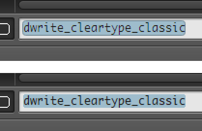
There is still a rendering disparity in text controls within the switch panel. Consider the following new rendering (top) compared to the old rendering (bottom):

The new rendering is very sharp and makes it harder to read.
I also noticed that there is also a slight difference for the text on tabs as well but it’s much more subtle.
Is this a bug? This is the only reason I’m still using the GDI option.
