Hopefully this general solution will bring back selectionForeground.
Dev Build 3148
3148 fixes the 'Unable to load gdk_pixbuf_read_pixels from libgdk-x11-2.0.so' bug on Linux Mint 17 [Based On: Ubuntu 14.04.5] - many thanks.
Windows ST build 3148 all linting seems to fail (using sublinter) works the first time of loading sublime but does not update visually however it looks like the console is picking up changes. Will check tomorrow if its throwing any errors anyone else having issues? Or just me
I second that. Can you please take this request into consideration, please ? It would be well appreciated.
Thanks
Gagan
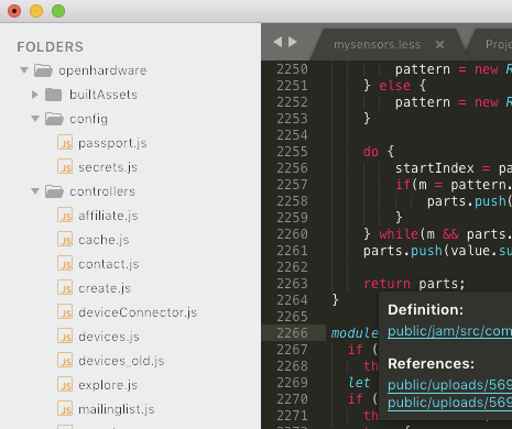
I am very happy about drop shadows being supported by the popup controls as they improve visibility for all the popups using nearly the same color as the view’s background. 
The OS shadow in windows is indeed quite sharp-edged. Don’t know whether it can be tweaked somehow, but I had the same idea in mind as @ihodev. A layer support to let a theme decide how to draw the drop shadow would may allow a better look and feel as all shadows of all overlay controls would look the same way.
I am with @wbond, too. Partially splitting ligatures by selections causes unpredictable and hard to handle effects. In general I therefore find ST3148’s behavior more consequent and consistent. If a series of chars is to be rendered as ligature, it must be under all circumstances or not at all.
I am wondering, whether it was possible somehow to (efficiently) return to the old rendering behavior in some way and just partially redraw the selected part of a ligature.
Means:
- Draw background
- Draw unselected ligature
- Draw selection background
- Draw selected part of ligature and clip it at selection background boundaries.
Clipping may be a bit tricky, but it could solve the foregroundColor issues for those who need them. I personally did not pay any attention to the way selections are rendered at all.
Jumping characters while selecting text is more annoying, I think.
I’m not sure if this is related to selectionForeground, but I’ve noticed that 3148 also changed the behavior of the “secondary selection” hint (no idea what it’s actually called). What I mean is, when you select a word, other instances of that word (which would be selected if you mashed Cmd-D a bunch of times) in the buffer are given an outline. It used to be that this outline was more or less the same color as the selection, which made it relatively easy to see where things were. Now I’m finding it to be less than half of the opacity (or equivalent… I use a dark editor background), meaning it is nearly impossible to see even when I’m looking right at it. For example:
I have the first expansion highlighted. The second one is surrounded by a hinting box, but you can barely see it even knowing that it’s there! I can’t figure out where this is configured in the theme (if it is configured at all), and this behavior very definitely regressed in 3148 specifically.
It seems to be the same issue I have, the borders colors and highlights are weaker on build 3148. Black is not black anymore, the other colors are weaker. I reverted to build 3147. I already think old border highlight is weaker:
- Core$1427 The current match_selection highlight is too poor, something stronger is needed
Build 4148

Build 3147

These are the colors generated by the ColorHighlighter when I edit my theme files. On this animation, we may notice the small phantom is not affected between build 3147 and 3148, i.e., the red kept red. But the highlighted regions are with their color distorted:
Actually, Nothing was “selected” proper in my screenshots. The cursor was on line 306 (the one with the cursor, and with the ‘current line highlight’).
The wordhighlight plugin highlights words that match the one under the cursor, automatically. If its highlighting was too bright, as in your screenshot, it would be distracting.
I might want a vivid highlighting when looking for a specific term or pattern, but it’s a different use case, I think.
Dashes also look weird… way too short for my taste (on an old 13" Macbook Pro with the low-res display).

"font_face": "Source Code Pro",
"font_options":
[
	"subpixel_antialias"
],
"font_size": 10.5,Can you let me know what hardware you’re using, including any external monitors, and if you’ve gone through a calibration process, or changed color profile for the monitor?
I’m using a mac with an external Dell U2713H. The internal screen looks better than the external screen but worse than the previous release.
It looks like antialiasing has gone bad.
I can get by by increasing sidebar font size in Default.sublime-theme… But I would rather have a smaller size like before.
It’s presumably Sublime Text using the wrong gamma value for text rendering, as that is one aspect that has changed in recent builds: assuming that’s the case, light-on-dark text should be ok, but dark-on-light text would be wonky. There should be a fix in one of the next few builds.
On my mac which is on 3147 it works fine and before the upgrade it was working fine but when I get a chance to sit down on my windows machine I will do a bit of investigating to see if I can see the cause.
Your color scheme uses the background color that equals editor background, of course in this case you want to leave the shadow, especially if you are on macOS, however you won’t see the shadow on Linux and on Windows it’s indeed quite sharp-edged (in the latest dev release, the shadow was missing before).
Many color schemes use different background for popups, in that case some users would like to disable it at all.
However, if the theme developer will be able to change it, there will be option for everyone.
I think I understand, so if the popup background is different from the editor background the shadow isn’t needed, but if it is there should be an option for the theme developer to add it to improve visibility.


