Sublime Forum

Dev Build 3148

#21

Setting the opacity of the selection is not new. I was using the selectionForeground because setting the opacity is not good. So basically it’s broken to support ligatures which is annoying. The selection highlighting support was already bad. Now it’s worse.

The changes to the find/searching and the regions is confusing. Stuff is broken now and I really have no idea how to fix it. Not even sure that can be fixed.

0 Likes

#22

I believe it was stated it is a regression and will be addressed in the future. As this is a dev build, the full feature is still rolling out in pieces.

1 Like

#23

Never mind, it was highlight that was a regression…

2 Likes

#24

What’s wrong with opacity?

0 Likes

#25

Setting the background improves the selection and find/searching MonokaiFree color scheme

Some people will obviously have no issue with it or will never know the difference.

0 Likes

#26

I’ve reverted to 3147. Not just because of the selection issue, but also because find/search highlighting is broken too much. Can’t remember the last time I had to revert to an earlier version…

0 Likes

#27

On MacOS, can you please expose a setting to disable the drop shadows underneath the popups ,especially under the autocomplete popup , please ?

Thanks
Gagan

1 Like

#28

Here is some info about why changes were made to background/foreground color handling.

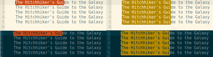
Since Sublime Text’s font drawing engine has been updated to support characters than span multiple characters (specifically in this case to support the much requested feature of ligatures), it is no longer possible to presume that a character is contained within a selection (or other filled region). If the characters >= are displayed as a glyph that is 2em wide, selecting the > will result in the selection cutting down the middle of the character.

Previously, when a character could not overflow the monospace bounding box, it was possible to draw a background color for a selection/region and then draw the selected text over the background in a different color. There was some wasted performance, but there were preconditions that made it straight forward to handle.

Now that characters can be bisected by selections and regions, there isn’t a straight forward way to handle drawing half of a glyph in one color and half in another. Thus, to fix certain aspects, we had to limit certain features.

Obviously during these dev cycles we are working on significant changes, and sometime we’ll need real-world validation from users about those changes. Please keep the feedback coming, and we’ll keep working on finding the best possible solution. I know Jon is already working on further improvements!

13 Likes

#29

The colors are not right now. The selection borders are weaker. And what was black on build 3147, now is gray on build 3148. How to make the section borders black as on build 3147?

Build 4148

Build 3147

0 Likes

#30

Depending on the color theme, the highlighting changes can be nicer than what was in previous builds.

For example, with the Solarized (dark) theme I use, the foreground color is preserved with the word-highlight plugin.

3148:

3143:

0 Likes

#31

No. I think it’s just a choice between the following two

  • you want to see the contact1 in syntax highlight.
  • or, you want to find out where are contact1s quicker.

I almost cannot tell what you selected is contact1 in the above screenshot.

However, I can see all selections at the first glance and know they are converters.

2 Likes

#32

The “old” behavior from the dev-build 3147 when selecting single characters from ligatures was more straightforward (essentially the ligature was removed when the selection is active). Any chance to get that as an option back?

1 Like

#33

I think both of those are bad. 3148 is worse because at a glance the it looks like the second one is selected.

Find

I’ve already noted that selection and find highlighting is bad. One reason is because you can’t color the background of the occurrences i.e. the one’s that have a border.

Here’s search in NeoVintageous, this is broken in 3148, I assume because of whatever has happened to regions:

Press / to search, and type “key” in the search input:

Now press Enter and then n to cycle forward, N to cycle back.

There’s still outstanding issue which is that the current occurrence should be blue like the first search match. I’m pretty sure it’s possible to do. Maybe not 3148.

0 Likes

#34

Incidentally, you’re using Solarized. I wanted to change Solarized for NeoVintageous search to have the following highlighting. Where the first image is the search match and the right is occurance. It mirrors the search highlighting in Vim solarized.

It looks better in vim because the selections are not rounded in Vim:

0 Likes

#35

Just my two cents. I don’t like how popup drop shadow looks like on Windows now:

Is there any chance that tool_tip_control and popup_control will act like overlay_control:

  1. Disable OS-shadows by default.
  2. Add layers and tinting support to these controls.
  3. For Default & Adaptive themes provide optional texture with the shadow.

This allows to control that shadows easily from the theme side, theme developers even will be able to use hidden "draw_shadows" setting to enable/disable them.

2 Likes

Dev Build 3150
#36

Yeah we had hat discussion (about Solarized) and I think it’s a pretty bad idea to lose syntax highlighting in selections, especially if you’re selecting multiple lines. It’s a trade off of course, horses for courses and all that, but I don’t see how one can be such a fan of ditching syntax highlighting in selections.

0 Likes

#37

jfcherng showed the benefit in his screenshots quite well, I think.

0 Likes

#38

"font_face": "Consolas Bold" is broken again (text displays no differently than when it’s simply "Consolas").

This was previously fixed in Build 3140:

Windows: Fixed selection of Consolas Bold on Windows 7

But Build 3148 has regressed.

0 Likes

#39

I don’t see a reason for not splitting up ligatures when a selection intersects them partially. I can’t even imagine how it could not look broken since ligatures fundamentally disregard character bounding boxes.

If ligatures were split again for the selection, there shouldn’t be implementation issues with a selection foreground color either, unless im missing something here.

1 Like

#40

This was initially my thought, but it ends up causing various issues. Take the ligature for ... in Fira Code. If you had a sequence of four periods, ..... Without a selection, you’d have the ligature for ... followed by .. If you selected the first ., you’d now want . followed by the ligature for ...? Also, the ligature for ... shifts the letter spacing of the dots, so as you make a selection the periods would be jumping around.

However, this also doesn’t take into account other complex text layout that we may want to support in the future. Certain languages don’t have clear, boxed letter forms and we can’t assume such being true. So, we need a more general solution.

0 Likes