Exactly!  However, that’s not possible currently.
P.S. From my point of view this is the last annoying thing. New theme engine allows you customize the UI appearance as good as Atom and far better than VS Code.

Exactly!  However, that’s not possible currently.
P.S. From my point of view this is the last annoying thing. New theme engine allows you customize the UI appearance as good as Atom and far better than VS Code.
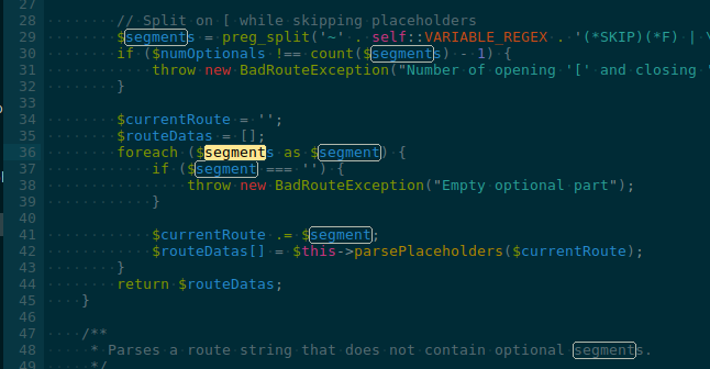
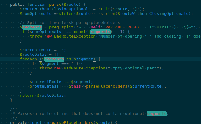
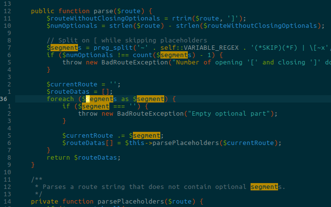
Why are there some ligatures disabled for some languages? Try typing != in Python and you get ligature effects, while in C++ the != does not work.
That’s a bug in the C++ syntax. The ! is scoped as keyword.operator.arithmetic and the = as keyword.operator.assignment. Both characters should be scoped as keyword.operator.comparison instead.
Because the characters have different scopes, they could be colored differently, so it isn’t possible to combine them into a ligature. Plus, if they really were two different operators adjacent by coincidence, you wouldn’t want a ligature anyway.
I believe this was fixed by https://github.com/sublimehq/Packages/pull/1212, thanks @jfcherng!
I just noticed that with completions of say bla $1 bla $0 bla it tells me in the status bar when typing $1 that I’m in field 1 of 2. Shouldn’t it be 1 of 1?
I was using the regions without an outline and custom scopes to colourize variables and methods when used inside code - which seems to be broken now. Is there an alternative way to do this?
AFAIK highlightForeground has never worked. The doc says:
Find

highlight
    The border color for "other" matches when the Highlight matches option is selected in the Find panel. Also used to highlight matches in Find in Files results.
findHighlight
    The background color of text matched by the Find panel
findHighlightForeground
    A color that will override the scope-based text color of text matched by the Find panel
The ability to highlight the other matches background and foreground is missing. Also the ability to highlight the findHighlight outline is missing. That is to say, ideally you want to be able to control the fg, bg, and outline, of both the current match and the other matches.
It’s important to distinguish between selections, find, and search. The change I was looking to make in https://github.com/braver/Solarized/pull/58 is specific to progressively enhance search.
The difference between find and search is that find is built in to ST. So you use global settings in the color schemes i.e. highlight, findHighlight, and findHighlightForeground. These have limitations. Besides, when a plugin provides any kind of search feature it can’t piggyback off those settings, that is to say, you can’t just apply those global settings to regions for custom search highlighting. Ideally you actually do want to use those settings for search, or at least have your search highlighting look the same as ST’s find feature.
So what does Solarized Color Scheme look like in 3147?
Selections in Solarized Color Scheme in Sublime Text:
This what selections in Vim look like (Solarized8 in Vim (an optimized up to date version of the official solarized)):
I think these selections in Vim look tons better than the selections in Sublime Text.
Find i.e. ctrl+f (Sublime Text):

Search with NeoVintageous (Sublime Text):

Vim (find/search are the same in Vim):

I prefer Vim’s selections and highlighting. The find highlighting in the ST Solarized Color Scheme in 3147 is good. I think it would be better as one of the colors from the standard solarized color palette i.e. yellow and orange for first /current matches (Vim):
I don’t want to disable shadows. I like them very much and they are needed to be able to see the popup for most themes/color schemes. But as @ihodev stated, a theme should be able to tune it. The quick panel supports layers, so a theme can add a drop shadow on its own and tweak its size, style and visibility. The drop shadow of the popup on the opposite is quite static and edgy and therefore might differ from the quick panels - not harmonic.
On the other hand - unfortunately, almost no themer did it, right now - overlay controls could use a complementary (totally different) color to make them clearly visible without shadows. In such a case, drop shadows are not needed to be able to see the overlay - a flat/minimal API would be possible.
It’s just a question of freedom for themes.
I’m using Trailing spaces, https://github.com/SublimeText/TrailingSpaces
How can I get the color back to the bright pink in 3147?
![]()
![]()