Sublime Forum

Dev Build 3148

#1

Dev Build 3148 is out now at https://www.sublimetext.com/3dev

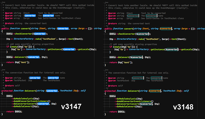
3148 contains the second part of ligature support, with selection drawing redone so ligatures don’t get mucked up by the selection.

In the old system, rendering went like this: draw the background, draw the text, draw the selection box, draw the text in the selection box.

In the new system, rendering goes like this: draw the background, draw the selection box, draw the text.

Doing only a single pass over the text allows ligatures to be displayed properly. However, it does mean that the selectionForeground key in tmTheme files is no longer supported, as that required the second text drawing pass to work.

Another aspect if this is that the way the API regions are drawn is different too (at least for filled regions). Previously they worked by drawing the background, and then drawing the text within the region a second time, in a contrasting color. They’re not allowed to do this any more, so instead we try to select a color that will have some contrast against the text.

The regions color system has never been that great, to help alleviate the above changes, I’ve also added support for some automatically generated scopes (region.redish, region.bluish, etc) that are based on the color scheme, but should have enough contrast such that the text can be seen. Color scheme files can also explicitly create selectors against these scopes to better control the colors used.

11 Likes

Sublime Text 3 vs the Others
Dev Build 3153
#2

Is findHighlight also gone?

0 Likes

#3

Sacrificing the readability of selected text because of an implementation detail to get ligatures right (which I don’t use) seems to be a bad trade-off.

4 Likes

#4

You can customize your color scheme:

        <!-- Just tweak the opacity level to fit your needs -->
        <key>selection</key>
        <string>#ffffff16</string>
        <key>selectionBorder</key>
        <string>#ffffff16</string>
0 Likes

#5

highlight is ignored.

highlight
The border color for “other” matches when the Highlight matches option is selected in the Find panel. Also used to highlight matches in Find in Files results.

        <key>highlight</key>
        <string>#ff0000</string> <!-- Does not work -->
        <key>findHighlight</key>
        <string>#00ff00</string> <!-- Works -->
        <key>findHighlightForeground</key>
        <string>#0000ff</string> <!-- Works -->
2 Likes

#6

But I like the selection to be clearly seen, not something grayish. Not really a solution for me.

1 Like

#7

Ah, yes, that’s what I meant. I can hardly see the outline any more :frowning:

2 Likes

#8

Understandable. From my side I’m not affected with selectionForeground changes, however I do not like that highlight doesn’t work.

2 Likes

#9

This ligature ‘<!-- -->’ is still wrong in HTML.
And this ligature != doesn’t work with C++, but works in most others languages.

1 Like

#10

highlight not working is a regression that will be fixed in the next build. In the mean time, you may be able to use highlightForeground instead to get the old behavior.

5 Likes

#11

Just want to emphasize that as a side-effect of these changes we have also lost ability to control the color of invisibles that are enabled via "draw_white_space": "all".

Previously one could use a workaround using "foreground": #0002 alpha to tweak visibility of tabs - lower alpha tabs were rendered with more faint gray. So far the alpha affected only invisibles, not normal text.
<=3144

This is no longer possible, since in recent build foreground alpha affects both normal text and invisibles.
>3144

However, still there is no support for TextMate theme "invisibles" theme color setting, which is very frustrating, because all other editors I use let me control that, but not Sublime.
Filed a ticket at: https://github.com/SublimeTextIssues/Core/issues/1992

7 Likes

#12

+1 for this.

I was using selection + selectionForeground to make me see selections quicker and know what text I selected at the meantime.

selectionForeground does break the syntax color highlight but that’s how it helps me find selections quicker while working with selection.

Using selectionBorder could make it partial done (i.e., make selections look distinct) though.

2 Likes

#13

highlightForeground seems to have no effect.

So selectionForeground is gone for good? Sad, so sad.

2 Likes

#14

Also want to request a return of selectionForeground. I normally disable ligatures (or use a font without them) in any case, so if selectionForeground and ligatures were to be exclusive I won’t mind.

Having highly readable white text in a blue selection box was something I recently showed as a “better than VS Code” feature. Having dark comments and all sorts of other colours in the same blue box is not very readable.


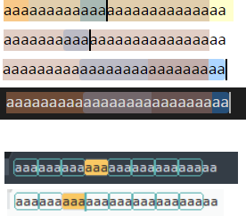
Although the image below is not showing white selected text as described above, it does show the difference between VSCode and SublimeText when using find while also selecting some text. VSCode just ends up blending each block, resulting in 4 different colours for something that should have had 3 at most. SublimeText does not let you select text when using find which avoids the mess in the first place, but it’s also smarter about marking matching groups.

2 Likes

#15

Build 3148 Changelog

Rulers are drawn with stippled lines

Not sure I like the stippled rulers much. Can they configured to be drawn solid?

1 Like

#16

I have list for Goto Symbol in Project spammed with functions’ invocations. Is this because of showInIndexedReferenceList option? With half of my code in this list it is really hard to use fuzzy search now.

0 Likes

#17

I don’t like whatever stuff was done to to selections, find/search highlighting, etc. It has broken all kinds of stuff in unclear ways.

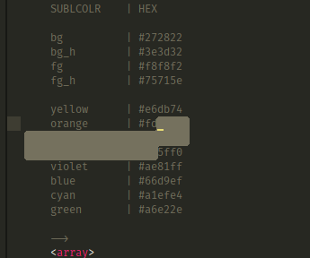
Example:

Similarly the find/search highlighting is all messed up and unclear how to fix it. At this point I don’t know if this is a good change or bad one because it’s not clear what has changed.

0 Likes

#18

The change log says, selectionForeground setting is removed in 3148. So now, your comment color (which is dominant by selectionForeground in previous ST) is similar to your selection color hence unclear.

1 Like

#19

So it’s a bug.

What’s the reasoning behind the change? Performance?

0 Likes

#20

Exactly. Also see:


1 Like