What would you expect to happen here?
Dev Build 3145
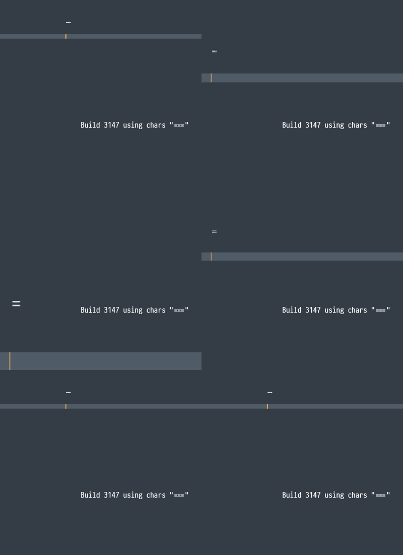
I never used ligatures before (and never felt the need to) and therefore don’t have any expectations on how they work in detail. I just found the behavior a bit funny and wanted to report back as @jps asked for. I guess there is no real solution as the characters are replaced just in time. Therefore things like that will always happen but won’t break anything.
The only possible solution was to drop the whole replacement if a ligature is partially selected
Selecting all three characters to handle the ligature as one character might be another but could be confusing, maybe.
Suggestion:
It would be great to allow drop shadow customization via theme for consistency. Currently, on stable branch, macOS users have drop shadows in popup and tool tip controls, however Windows & Linux users does not have.
macOS drop shadows will be fixed in the next build. I’ll add them for Windows at the same time, but I’m not aware of any way to ask for them under X11 aside from doing it manually, which I’m not keen on.
Autocomplete popup broken? blends in with the background
In that case it would be best to have an option to disable/enable that shadows on macOS, Windows. Because most users get used to see them on macOS and do not see on Windows and in order to avoid “Alarm! Plz, disable drop shadows on Windows” messages.
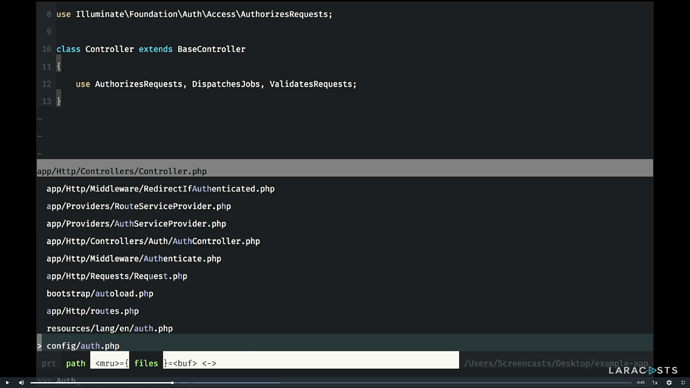
Will there ever be an option to increase the command palette size when searching for files? I find it hard to read the small font, font size 17 is ideal for me, see how readable it is in Vim.
Please 
This is already possible. You can try to change your theme manually:
E.g. Default.sublime-theme
Command Palette › Preferences: Browse Packages- Create
User/Default.sublime-themewith next contents:
[
  {
    "class": "quick_panel_label",
    "font.size": 17
  },

  {
    "class": "quick_panel_path_label",
    "font.size": 13
  }
]
- Done
P.S. Also if you want to change that without having to know any code you can try DA theme. It has related options and a lot of other things.
Sorry if you misunderstood, I’ve changed those values already, but I would also like the full path to be font size 17 too, so I would like it if the quick panel spanned the full width of the editor or at least 80% the width, I hope I made sense.
Thanks.
Ah, I understood. Option to set max width of the quick panel would be great. But there are many more important issues, so I don’t think if this will be available in the near future.
Agreed, they surprised us with ligature support, maybe they can treat us loyal customers to this too?
Just seen Material theme creator is trying to get people over to VS Code as he’ll stop fixing issues with Sublime, but I could never cheat on this beautiful editor, I just wish it had some of the creature comforts that I was used to before I switched from Vim.
@jps I feel like a spoilt child asking for all these things, but it would make the editor superior to it’s competitors, you’ve just caught up with ligatures but why not take the lead? 

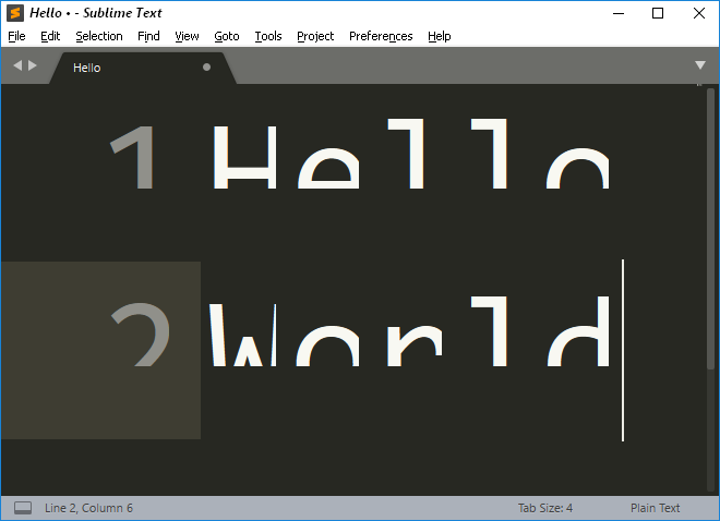
At very large font sizes, the glyphs get truncated. Screenshot of a vanilla Sublime Text installation on Windows:
Related to the previous post.
* Sublime Text Build 3147 (portable, x64)
* Win10 Pro x64 Version 1703
Ha, looks like you got a cursor buddy  .
.
You didn’t feed him did you? Never feed them. Then they keep coming back.
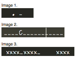
Ligatures in proportional fonts break positioning of the caret and the rest of the text. OS X 10.12.6, Sublime Text 3147. Images at the end of the post due to restrictions for new forum members.
I will use the ... ligature to demonstrate. Image 1 contains first one regular full stop character, then three in a row: . ... They characters are displayed correctly using a ligature. (Let’s ignore the aesthetic value of this ligature):
In image 2 there are no space characters, only full stop characters correctly converted into ligatures. The caret is right after the character C. That is, if I press Backspace, the character C will be deleted. Yet, as you can see,
the caret is drawn as if the full stop characters were full size.
In image 3 the contents of the line are xxxx...xxxx... xxxx. That is, there is only a single space character on the line, it is located before the last x’es. It seems a ligature inside a word correctly affects the position of the other characters in the word, but not other words.
Hope this helps, feel free to contact me directly for more tests.


