Sublime Forum

Dev Build 3136

#21

Check out http://www.sublimetext.com/docs/3/themes.html#colors-derived – you can derive colors from the background, foreground and accent color. Generally I would expect foreground or accent to be your main choice for something like an icon symbol. This is what the Adaptive theme does for the Find panel buttons.

After you get the color you want, you can use the http://www.sublimetext.com/docs/3/themes.html#layer_properties to tint one or more layers.

Edit: I do have the intention of working on icon functionality in a future build, to make it more robust and add some features, but it won’t be during this dev cycle.

5 Likes

#22

That requires new icon API or at least something like this if you want different color for each icon:

<?xml version="1.0" encoding="UTF-8"?>
<plist version="1.0">
  <dict>
    <key>scope</key>
    <string>source.js</string>
    <key>settings</key>
    <dict>
      <key>icon</key>
      <string>file_type_js</string>
      <key>color</key>
      <string>greenish</string>
    </dict>
  </dict>
</plist>

Update:
If you want to have a single color icons, @wbond have described solution above.

1 Like

#23

Something like that. I guess it needs some sort of color code or palette to match up the colors, without hardcoding. Another idea for the moment is a plugin that detects colors from a color-scheme, chooses several “nice” colors and generates the pngs on the fly from svg source.

0 Likes

#24

I tried both of these during the development of the new themes. I decided against {} because it was too visually similar to the <> which is used for HTML/XML. The {;} looked kind of funny, and it was very hard to get pixel perfect semicolons that fit with the weight of the rest of the icon outlines used.

The primary motivation for the various icon choices was to have a symbol that was abstract, but all visually distinct. Previously all of the icons used a similar page outline that made it difficult to scan for different file types. The new icons are crisper, eschew the paper outline, and should hopefully be fairly easy to distinguish without a detailed look.

Colors could make scanning easier, but there isn’t currently a way to implement colors that would work well with the Adaptive theme, and the Default theme’s set-color sidebar likely wouldn’t play well with colors derived from color scheme.

4 Likes

#25

I’ve wanted to implement that in A File Icon. But that’s a big hack with a lot of possible issues. Better to wait for an icon API.

1 Like

#26

It might be a bit off topic, but I’ve problem with the quick project switcher. It’s lose all history. Could it be because i’ve push “clear items” in open file menu?

0 Likes

#27

Nice to see regular updates :slight_smile:

0 Likes

#28

Not sure it’s since the last update, but using the updater, the Sublime application is now named Sublime Text (3136) instead of Sublime Text. This caused the command line alias to stop working until I figured it out and renamed the application.

0 Likes

#29

What operating system are you using?

0 Likes

#30

Mac OS Sierra 10.12.5 (16F73)

0 Likes

#31

Looking through the updater code, that seems to imply the upgrade failed in some way. I’d remove the app and do a fresh install to be sure. Definitely let us know if you see this again, and we can try to dig in and see why it may be happening.

3 Likes

#32

@wbond: Is it possible to adjust font weights for light color schemes a little bit? Depending on situation I need to switch between light and dark color schemes. But font’s which render strong in a dark color scheme are barely visible on white background even though they are tinted black. They render too lightweight. I guess this is caused by font smoothing algorithms. I tried with Source Code Pro Light and Roboto Mono Light.

0 Likes

#33

You should be able to select different weights in your settings and theme, yes. If you are asking if Sublime Text could dynamically do this, I doubt that would be a good idea, or even possible on most platforms.

1 Like

#34

Modifying the theme would be just ok. I have a custom Adaptive.sublime-theme to override font_face and add some borders to popups anyway.

As I did not work with themes so much, do you have any quick hint or entry point where and how to add such a rule. I guess I need two rules: One for dark and one for light themes.

I can find a font.bold option in the docs only. No font.weight to tweak.

0 Likes

#35

font_face should accept a full face name (including the weight). Build 3127 included a bunch of enhancements to the font selection logic, so it now should be possible to use any installed weight. Sometimes different OSes use different aspects of font metadata for the name (ExtraLight vs XLight on some fonts), but if you are having trouble let me know.

1 Like

#36

Two issues:

1 theme fonts

While font_face: in Preferences accepts Roboto Mono and Roboto Mono Light, using second one in sublime-themes is not possible. Doing so causes fallback to default font.


    {
        "class": "sidebar_label",
        "font.face": "Roboto Mono", // works
        "settings": ["ui_font_roboto"]
    },

    {
        "class": "sidebar_label",
        "font.face": "Roboto Mono Light", // fallback to default font
        "settings": ["ui_font_roboto"]
    },

2. Issue

font_face in normal views is set per Preferences and thus not changed by theme or color scheme. Therefore I have no chance to manipulate font_face or font_weight by selecting another color scheme. But the problem is, light color schemes render fonts much more light than dark ones.
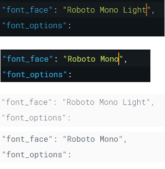
Example

Here is a screenshot with Roboto Mono and Roboto Mono Light on dark and light color scheme. While I would prefere the light font in dark themes it is barely visible on white background even with black font color. So I’d need to switch to normal font weight.

For some reason the font smoothing causes font rendering to differ depending on background color. I don’t know how Skia renders fonts but I hoped there is some kind of font-weight setting which could be adjusted depending on background. I could also imagine to adjust such a value in a color scheme or settings file, but it would somehow require to be associated with the background color.

A font should render with same weight no matter of background color. Not sure how to achieve it.

Of course, I could create two skins with my Skin package, one light with normal font face, one dark with light font face, but I would prefere the fonts render with same weight out of the box by just changing the color scheme.

0 Likes

#37

A font should render with same weight no matter of background color.

The way font antialiasing works, color and contrast have a huge impact on perceived weight. In addition to your eyes perceiving it differently on light or dark backgrounds (and that’s not even considering halation and other effects). Usually (even in print) you select a lower weight font on dark backgrounds, and even adjust kerning etc., and it’s not expected of the rendering (or printing) software to try and do this automatically because there are so many aspects that go into our perception of font weight.

I could also imagine to adjust such a value in a color scheme or settings file

You can select different antialiasing modes in font_options and see what works best on your combination of font, os, theme and display technology.

1 Like

#38

I’ll look into Roboto Mono Light not working – it should.

Also, we don’t use Skia for the text buffer, only the theme labels and minihtml. For the text buffer we use directwrite directly.

As a general note, I don’t think it is up to Sublime Text to try and adjust the OS font aliasing based on perception issues due to contrast.

2 Likes

#39

hi i’m new and was wondering how do i go about downloading the dev build 3136?

0 Likes

#40

Visit https://www.sublimetext.com/3dev. You’ll need a license to use a dev build.

If you don’t have a license, you can download the latest beta at https://www.sublimetext.com/3.

1 Like