Sublime Forum

DA UI Is Now a Public Beta. Adaptive, Customizable, Elegant UI Theme and Color Schemes for Sublime Text 3

#1

Introducing DA UI

 
Hi everyone,

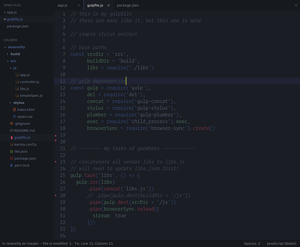
After 7 months of development, testing and a bunch of feedback from Boxy Theme users, I’m happy to make an official announcement for DA UI — a set of beautiful, clean, elegant interface and syntax themes for Sublime Text 3.

DA UI Showcase

Key Features

  • Unlimited variations.
  • Powerful options.
  • First-class syntax highlighting.

The easiest way to see them all is just to try it. However some details can be found in the README.

Get It

The package is installed via Package Control ›

Install A File Icon package for support of the file-specific icons.
An alternative icon pack will be available in the next release.

Pricing

Early in the project I decided to make it a commercial package to help keep it going and be able to provide a high-level of support. Pricing will be announced later this year.

Currently it’s absolutely free during the beta period.

In any case there will be available evaluation mode. This mode includes full functionality and there is no time limit, however, continued usage requires the purchase of a license.

I appreciate your support. I’ve decided that everyone who supported my projects (A File Icon, Boxy Theme) at Patreon before this announcement will get it for free once we reach to stable version 1.0.0.

Additional Information

I think it’s pretty stable and feature-rich for initial public release. Of course there is a lot of work to be done, but I hope we are on the right way.

Documentation, screenshots and other improvements will be available later. Currently everything you need is available from ST Command Palette: just open Command Palette and type DA UI.

Also later this week I’ll release DA CS package which will include dozens of popular color schemes those are compatible with DA UI engine.


P.S. Huge thanks to @jps and @wbond for Sublime Text 3.0. New theme engine is absolutely awesome :rocket:
P.P.S. Huge thanks to Boxy Theme users for your support and suggestions :fireworks:
P.P.P.S. I hope you’ll like it :heart:

13 Likes

#2

Wow! Outstanding!

I can just feel the love to any detail, you’ve put into that project.

I played around with this UI and had a “short” look into the overwhelming amount of settings, which really seem to allow a lot of stuff, while keeping the generated theme small and therefore performant. The default themes look very well designed out of the box - can’t find any issue so far. I like the ability to set the GUI font with just one key and its awesome good cooperation with all color schemes.

God job!

1 Like

#3

Is Boxy still going to be maintained?

0 Likes

#4

Unfortunately, no. Boxy Theme will be deprecated once DA UI reaches to stable version 1.0.0. There will be the last release, which will contain existing PRs, some fixes to support next version of the A File Icon and the announcement of the DA UI.

DA UI engine allows you to do a lot more than Boxy settings abuse. However some features such as bar, alternative icons and etc. are missing. Some of them will be added later, others – not. Feel free to file your issues and suggestions here.

Also later this week I’ll release DA CS package which includes dozens of popular color schemes those respects DA UI guidelines, including all Boxy ones. It will be absolutely free and open source. Syntax highlighting have changed and the number of accent colors was reduced to 6. But overall they will be a lot better and finally customizable.

0 Likes

#5

liking this a lot - a tweaker’s dream!

spent a few minutes playing around with a custom color scheme i’m working on and it looks so much better with your theme - of course it needs further tweaking and exploring all the options…

thanks very muchly.

one question: how much are you thinking of charging?

2 Likes

#6

I think it will be available for ~$10 (+/- $2). I hope such pricing will be able to cover the costs of development. Of course there will be some student and bulk discounts.

In any case the main aims are:

  • provide the UI that fits your needs,
  • leave the ST devs time to dev, not to answer UI-related stuff,
  • make Sublime Text just a little bit better, cause I :heart: it a lot.

So I have no plans to make evaluation mode too distracting.

3 Likes

#7

I like DA UI. But i did not find a way to change the text colour of dirty tabs like this

        // Dirty tab label
    "class": "tab_label",
    "parents": [{"class": "tab_control", "attributes": ["dirty"]}],
    "fg": [201, 169, 249] // rgb(201, 169, 249)

How can I do this?

2 Likes

#8

Currently, that’s not possible. I’ll add this in the next beta build :wink:

2 Likes

#9

This is really beautiful, i will gladly support this upon release.

1 Like

#10

I really thought that Boxy would be my last theme, but apparently you managed to outdo yourself! Congrats.
I’ll be interested in proposing an updated version of the Espresso Libre color scheme if you’re interested.

1 Like

#11

No problem :wink: It will be available soon :slight_smile:

0 Likes

#12

I think it would be good to have support for Git Gutter and Sublime Linter much like Monokai Pro.

0 Likes

#13

That is already planned. It will be available in the next release :wink:

0 Likes

#14

DA CS is ready for manual installation. It will be available soon on Package Control :fireworks:

I hope you’ll find your favorite one :wink:

0 Likes

#15

I take it in the meantime we can just drop the DA CS schemes from GitHub into a Sublime folder? Could you clarify where they should go?

1 Like

#16

Currently, you can just download and extract sublime-da-cs-master.zip into Packages/DA CS.

When it will be available on Package Control, the steps are next:

  1. Command Palette › Package Control: Upgrade Package › DA CS
    (or re-install it if this command doesn’t work for some reason).
  2. Command Palette › DA UI: Re-apply Settings › Color Scheme
    (if you have some custom settings).

I’ll improve upgrade process in future releases.

1 Like

#17

ST 3146 fixes:

If you are on the dev channel you may notice that default color of the auto complete labels have changed (it became less visible on Windows at least). That’s because opacity is working now and the next default setting causes the problem:

  "auto_complete_label_foreground_color": [
    "opacity", "#808080", 0.45
  ],

Temporarily, you can update your user theme settings to fix that:

Command Palette › DA UI: Theme Settings

"auto_complete_label_foreground_color": "#808080",

or

"auto_complete_label_foreground_color": [
  "specify",
  ["rgba", 255, 255, 255, 0.45],
  ["rgba", 0, 0, 0, 0.45]
],

NOTE

If you have any other theme-related problems with the new dev build, please tell me. I’ll provide you temporary solution and fix that in the next release.

1 Like

#18

Love it. So good :slight_smile:

1 Like

#19

Ok, we have an other issue with ST 3147 on macOS:

I’ll investigate it, probably it can be fixed from the theme side.

Also, I have plans to add drop shadow for popups on Windows & Linux by default for consistency. What do you think?

0 Likes

#20

I’d be very pleased to see that. The missing shadows with most popups using nearly view’s background colors really sucks.

An alternative was to create tooltips/completion popups with “totally” different maybe complementary background colors. I already played around with that by changing the --background and --foreground css color variables, which apply to most popups even those using mdpopups. The problem with this solution is just mdpopups’s code highlighting feature which expects --background to point to the view’s one.

1 Like