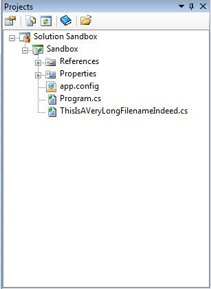
The current behaviour is consistent with previous versions, in the sense that the text items are aligned at a particular level. However, I can see the argument that adding folder icons adds confusion given that in complex trees the previous behaviour was at times confusing too. The icons also add to the horizontal real-estate which again, in complex trees, further confuses matters.
I’m not sure what the best solution is here. For consistency, a “file icon” to the left of files would probably clear up alignment confusion. In that case it would be nice to have icons per file type and, as others have mentioned, colouring for file types so that particular groups of files jump out at the user. As a final point, being able to sort sidebar files would again be useful for those working on large projects; alphabetically as now and by extension, size, modified timestamp - ascending and descending.
Of course, it’s nice to be able to turn these things “off” for those who want to keep things clean, maximise their real-estate and not be bombarded by eclipse/visual studio style clutter.

