Sublime Forum

With Windows Ease of Access making text bigger, menu titles in some themes run into each other

#1

I’ve got Windows 10 setup with Ease of Access->Make Text Bigger set to 140%.
Sublime Text version 4126.
I’m using color scheme ‘Breakers’ to demonstrate.
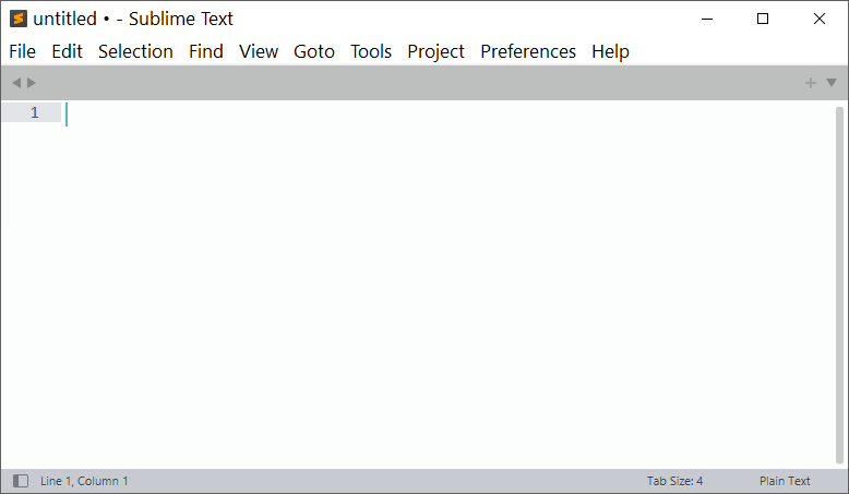
Theme default and everything is fine in the menus:

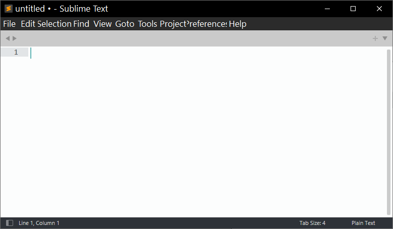
However, if I switch to the Default Dark Theme, the menu titles run into each other:

I notice the same thing if I tweak the Adaptive theme to show the menu bar per the trick here: Tweak Adaptive Theme to show menu bar

Is there some way to get this to work correctly with the Default Dark or Adaptive themes?

0 Likes

#2

I assume that also happens in Safe Mode?

Presuming yes, does the problem resolve itself if you change the theme, then quit and restart Sublime?

0 Likes

#3

Yes, going into safe mode then selecting default dark produces the issue.
Closing Sublime Text and then re-opening normally (where Default Dark is the selected theme) it still happens.

The problem goes away when you switch back to the Default theme, then re-occurs when you switch to Default Dark. It’s definitely linked to something in the Theme, but I’ve not nearly enough understanding of all the things that go into a theme to figure out what it might be.

0 Likes

#4

The initial guess would be font size related things. On the other hand, the distinguishing factor between the two states is that the menu is darker in one than in the other, and we know that Sublime defers menu drawing to the OS, and for darker menus it uses (if I recall correctly) an undocumented windows API to do the job. So at some level it might be a windows related issue.

0 Likes

#5

I’ve put in a bug report https://github.com/sublimehq/sublime_text/issues/5387 we’ll see if there’s anything to be done about.

0 Likes