I’m having a bit of trouble seeing some of the diff colors of the dark UI theme. Some of them are much fainter than what is shown via the preview on the website. For someone with not the greatest eyes, its making it quite difficult to use the software, unfortunately.
I’ve tried multiple times to make a custom theme, but failed each time as I tried to understand the system based on the documentation provided.
I’d like the colors to match more similarly the to diff colors of the dark mode of Github Desktop (which were tweaked when I and some others pointed out that they were harder for those with bad eyes to see).
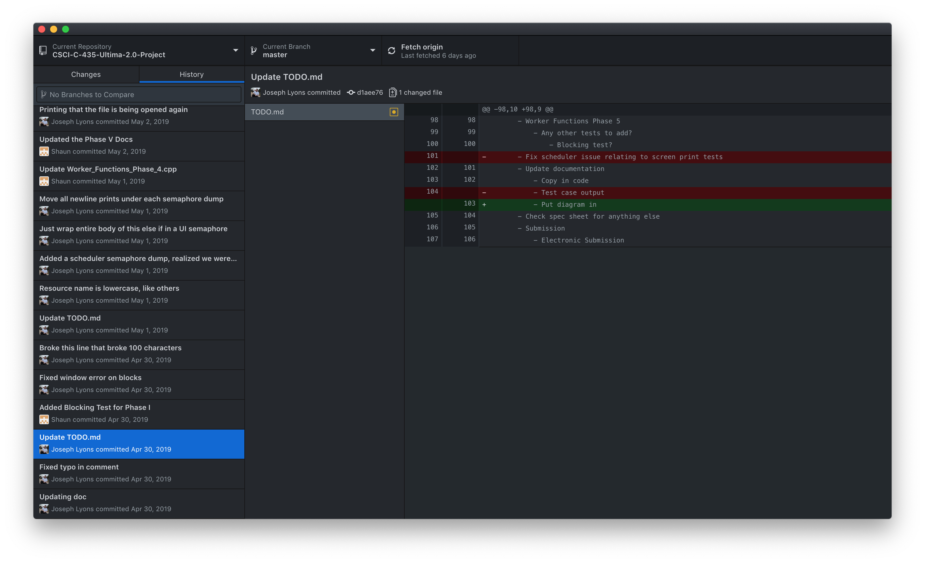
Desktop Diff Colors:
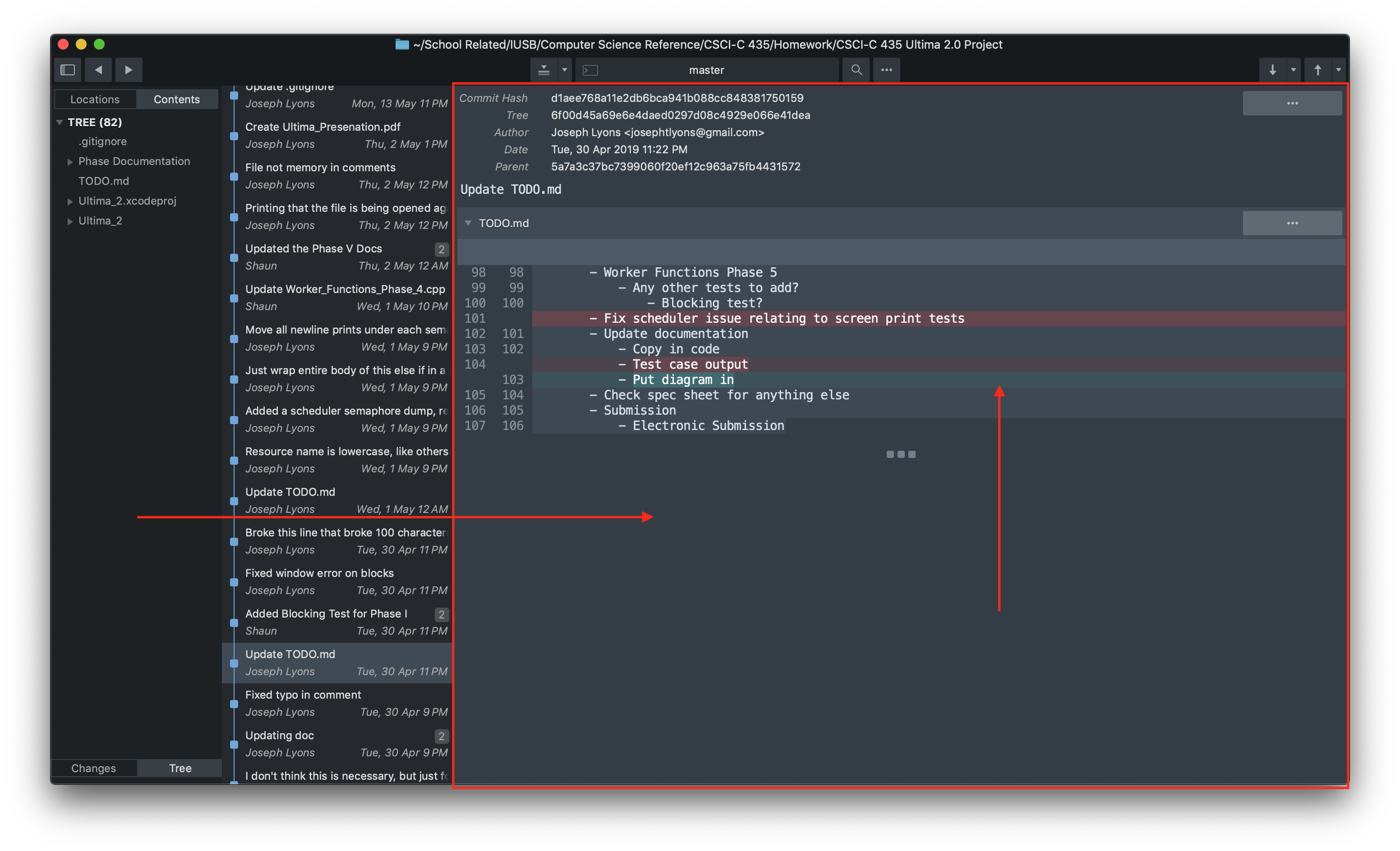
I think the biggest issue is the blue/grey background of the area that shows the diff content. It would be nice if it were similar to the left side (see the horizontal red arrow). Then, all the diff colors associated with both the inline and side-by-side, as sometimes I like to swap between them.
I love the feature set of this program, but am currently not being able to use it that well with my eyes and my inability to put together a custom theme.
I’d be willing to send someone some compensation, via PayPal, if someone could piece together a file that overrides the dark theme with these few changes. Or, if anyone has a custom theme that they would like to share that improves upon this, that would be great.
JosephTLyons(at)gmail(dot)com is my email, if you’d be willing to help me and prefer to talk in private.