Hi,
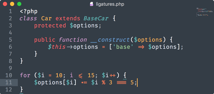
what UI-Theme is used in these screenshots from the 3.1 announcement blogpost in combination with mariana color scheme? It’s not the adaptive theme as it seems because the adaptive theme has a different accent of the top bar and in the screenshots the topbar adapts to exactly the theme color. I like this minimalistic look. How did you achieve this?
Cheers
Bijan


