Sublime Forum

Weird fonts in new update 3.1 Build 3170

#1

Hi, I’ve just updated to the new build 3170, but my Hebrew fonts (for labels,h1,h2,h3 etc.) in the editor are corrupted, and completely unreadable! (re-typing the text doesn’t help, obviously)

please Fix ASAP since many users and myself are using sublime for projects involving RTL languages.

If there’s a way to downgrade,until there’s a fix, I would be happy to know.

Thanks!

0 Likes

#2

Sublime has never supported RTL languages. What is the change in behavior between 3170 and the build you were using before?

0 Likes

#3

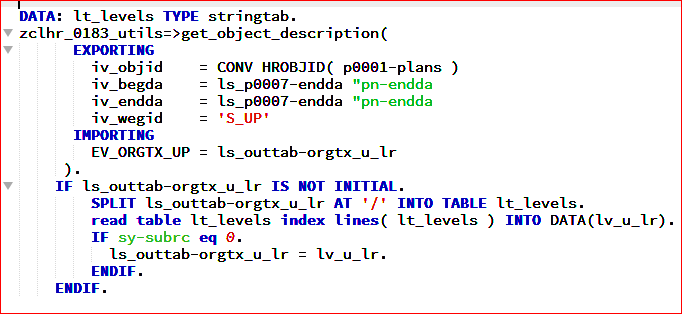
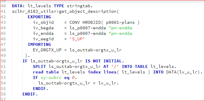
I have also encountered something similar that the Chinese characters have different heights or uneven font baselines, especially compared with English characters in the same line. This problem does not exist before this update. And here is a example in Markdown editing page.

0 Likes

[BUG] Chinese characters and English characters are not vertically aligned
#4

Are the Chinese and Latin characters from the same font?

0 Likes

#5

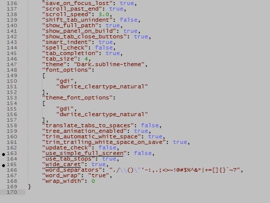
Seems to be an issue on DirectWrite of Windows. use gdi in font_options.

I’m using macOS and everything goes fine.

0 Likes

#6

I think so, since I just input the characters without switching any options about fonts. And before this update, the same operation cause no problem.

0 Likes

#7

We very significantly changed the implementation of glyph caching and also updated positioning to use text shaping, allowing us to do far more than we used to be able to accomplish. The other thing we did on the Windows side was switch the default to DirectWrite from GDI. GDI has a bunch of bugs, and does not work with scaled windows properly due to the heavy pixel snapping. Since we need to support new technologies like different per-monitor DPI scales on Windows 8.1 and Windows 10, we need to default the app to use a font engine that can actually produce correct results in those situations.

0 Likes

#8

hi ThomSmith, indeed the RTL characters were displayed backwards until now , but I was still able to use it, and got used to reading them. (typing the words was Ok, it was just the display)
the Problem now is that they aren’t event displayed backwards, but the are scrambled all together, and goes one character on top of the other.

0 Likes

#9

This solved the problem. Thanks!

0 Likes

#10

Thanks! It works for me!

0 Likes

#11

Thanks for your detailed explanation, and the problem disappears after I manually use “gdi” in font_option.

0 Likes

#12

It’s kind of weird, but light theme and dark theme are different.

I’m using Piatto light and font is awful (some colorful sprites and glitches around each letter). But dark theme is ok.

“font_option”: “gdi” doesn’t help

0 Likes

#13

P.S. And now font is vertically flattened

0 Likes

#14

I am agree, now all fonts became less nicer.

0 Likes

#15

but before was more nicer

Can we do somthing to fix it ?

0 Likes

#16

you’re programming your ABAP on Windows with the Consolas font?
I had the same problem and fixed it with adding this to my user preferences:

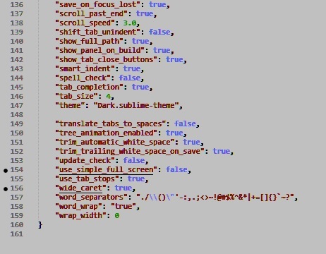
        "font_options":
	[
		"directwrite",
		"dwrite_cleartype_natural"
	],
1 Like

#17

Yes, you right!
I am using the Source Code Pro font. It is my new favorite.
but it does not help olso.

0 Likes

#18

The difference between build 3170 and 3143 is that we now respect your cleartype tuning preferences. It would appear to me that perhaps you have cleartype tweaked in a way to use really heavy antialiasing? I would be wrong about this, but that is what it looks like to me.

Just to be clear @kingkeith, using dwrite_cleartype_natural switches rendering to GDI natural mode, which brings along the bugs of GDI like not working well with DPI scales, etc.

0 Likes

#20

I guess I should investigate other solutions then, thanks for the heads up. If nothing else honors my clear type settings I will try changing them (otherwise other apps will look wrong) - before resorting to these font options I tried editing the registry directly and it seemed to have no effect, even after restarting ST.

0 Likes

#21

It looks like there’s something definitely wrong; at least, on my work Windows PC. It almost looks like the font is a raster font that’s scaled too small:

Display scale: 100%
Display resolution: 1280x1024
Font face: Lucida Console
Font size: 8
Truetype ON:

Directwrite: (default settings)

GDI + dwrite_cleartype_natural:

0 Likes