Sublime Forum

Visual feedback when the mouse cursor hovers over a hunk

#1

I’ve used Sublime Merge for over a year and am loving it. There are a couple ideas which, in my mind, would make the tool slightly more user-friendly:

  1. When the mouse hovers over a hunk of diffs, it would be good to see a visual feedback illustrating the extent of the hunk. It could be done, for example, by changing the background color of the hunk, or drawing a frame around it. Without such feedback, it’s hard to see the extent of each hunk, as the headers don’t look much different from the diffed text itself. (It would be nice to be able to change the color of the hunk headers too!)
  2. It would be useful to have buttons displayed on the hunk header, to show more lines above or below the header. To do so now requires dragging the header up or down, which is tedious (small mouse click target, clunky over a slower VNC). See ReviewBoard for an example: here the user may press a button to view 20 more lines in a hunk, or even expand to show all intervening lines between the current hunk and the previous or next one.
  3. To provide the user with a visual feedback, the cursor should change into an hourglass (or whatever the OS-specific equivalent is) when performing a lengthy operation. This should apply to git commits, refreshing the view, etc.
1 Like

#2

These are great ideas, but it I can hijack your thread a bit to make a general point; I find it extremely difficult to decode what I’m looking at when I look at the changes / diffs with both of the standard themes in SM.

For this reason, I find I fall back on using the diff tools built into VS2017/19

I understand intellectually what each thing represents, but I just can’t “see” at a glance what the consequences of the change are.

I think this is a result of the issue alluded to by the OP; with a flat theme, small colour palette, identical font size and line height, and very regular width and alignment of elements, I just cannot immediately grok what SM is showing me and I have to painstakingly decode the interface to work it out.

I’m sure a lot of thought went into the design, but it just doesn’t work for me.

Probably worth saying I have slight grey/green/brown colour-blindness, my difficulties are true of the light and dark themes, so I don’t think this is the issue.

In general, I think Apples old excessive skeuomorphism and Google’s Material Design are two extremes, neither of which represent an ideal way to present a visual interface; the pendulum should swing between the two a bit.

0 Likes

#3

You should (check for and) add each of those as separate enhancement requests on the official issue tracker.

0 Likes

#4

Good point - I prefer to have some idea what change I’d like to see rather just whining that I don’t like something but I’m struggling a bit with this. I’ll give it some thought.

0 Likes

#5

@mrsean2k, oh gosh, I actually meant that comment for @Midnight_Gardener. (oops :man_facepalming:)

Then again, it can apply to you as well after some thought like you said. Feel free to brainstorm or ask for feedback here on the forums.

0 Likes

#6

@srbs ah well that was my own guilty conscience at work :slight_smile:

1 Like

#7

@srbs, thank you for the suggestion. I filed separate issues for ideas listed in my original post: 1351 and 1352.

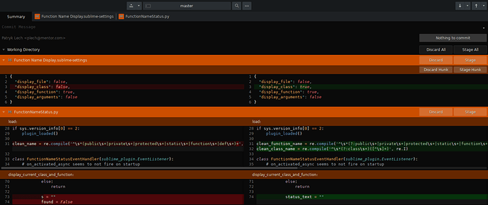
I also played a bit with the dark theme/color scheme and made it much more palatable:

If interested in changing your dark theme to the above (or downloading it and tweaking it further), issue 1351 contains the relevant files.

0 Likes

#8

After a mere 5 months, I’ve indicated a preference. All IMO and YMMV obviously.

0 Likes