Sublime Forum

Theme development question

#1

Good morning everyone,

I’ve been working on altering (customizing) the Spacegray theme to my own personal taste - just started and really just messing around.

My questions are as follows:

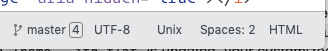
In the status bar area, is there a way, or how do you add a stroke or divider color between the status bar and the sidebar and main content area: See screenshots for what I have and what I’m trying to accomplish.

Appreciate any encouragement, helpful advice or constructive criticsm.

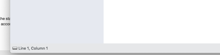
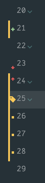
This is what I’m trying to make it look like:

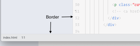
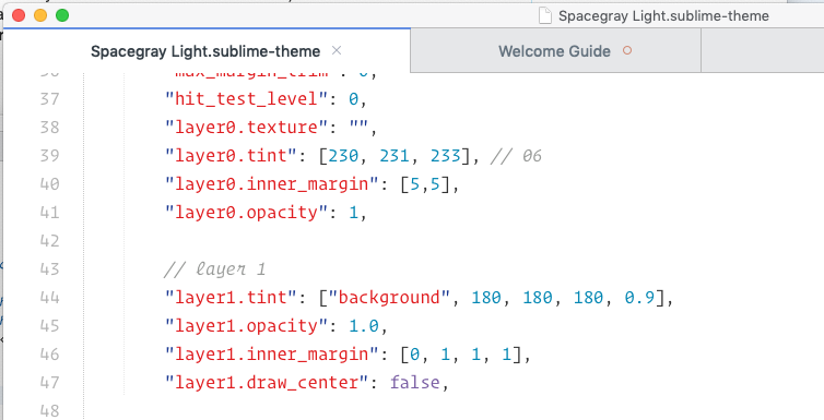
This is what I currently have. I haven’t seen anything that allows me to add a border so I must be missing something:

0 Likes

#2

I guess you’ll need to add a texture layer, and the texture would need to be an image that contains the border?

0 Likes

#3

You’d need to add a second layer to the “status_bar” with “draw_centered” 0. The “inner_margin” defines the borders. The example sets 1px top-border

  {
    "class": "status_bar",
    "content_margin": [12, 8, 4, 7],
    // Layer 0: content
    "layer0.tint": ["background", 0, 0, 0, 0.075],
    "layer0.opacity": 1.0,
    
    // Layer 1: border
    "layer1.tint": ["background", 255, 255, 255, 0.1],
    "layer1.opacity": 1.0,
    "layer1.inner_margin": [0, 1, 0, 0],
    "layer1.draw_center": false
  },

2 Likes

#4

Thank you for taking the time to respond @deathaxe - that info was very informative and helpful. Appreciate it. Is the title bar skinable? I have tried to add a border to the bottom and it doesn’t seem to work.

Anyway, appreciate everyone who’s taken the time to respond - appreciate it takes time out of your day and it is appreciated!

0 Likes

#5

titlebar, main menu and context menues are native control elements, which can’t be changed.

The titlebar may be changed on MacOS. You may have a look into ST’s Adaptive.sublime-theme to find out how. I never saw a MacOS live.

0 Likes

#6

Again, thank you for taking the time to answer my question. I found a way around the titlebar bottom border :). However, I’ve been looking for a few days and can’t seem to find an answer. Is there a way to provide padding within the tabs? Specifically, each tab has a title, give it a left and right side padding - is that possible?

Thanks for taking the time to look over my post(s).

1 Like

#7

This is the tab_control class.

According to https://www.sublimetext.com/docs/3/themes.html the content_margin property can do what you want.

  {
    "class": "tab_control",
    "content_margin": [16,  8, 12,  9],
  },
0 Likes

#8

Thanks @deathaxe! I really do appreciate you taking the time to answer what I’m sure are simple and probably repetitive questions.

It’s coming along nicely! Can’t wait to release this thing. Been trying to pick apart the spacegray theme and tweak it to my liking.

1 Like

#9

You’re, welcome.

The theme looks really good.

2 Likes

#10

Thank you. I’m happy with it, although I do intend to tweak the color theme - just want to get the elements of the theme itself looking good.

Been looking over the documentation - can’t seem to find a way to move the close button so it’s closer to the edge of the tab instead of being so close to the tab_label. Is that even possible, do you know?

0 Likes

#11

I guess, it would require to set the close buttons content_margin to a desired size and assign a tweaked image to it, which fits into the rectangle defined by the content_margin.

  {
    "class": "tab_close_button",
    "layer0.tint": [255, 255, 255, 0.7],
    "layer0.texture": "THEME/assets/icons/default/close.png",
    "content_margin": [20,8]
  },

The tab_control's right margin should be reduced then.

1 Like

#12

Thanks again @deathaxe. I’m not figuring out the tab close button issuel. I’ve tried to extract the spacegray theme to better understand how it works, but doesn’t seem like I can do that (I have the package resource viewer installed).

Anyway, last question pertaining to this tweaked theme. Is there away to move around the elements within the status bar? Also, can’t seem to figure out how to space them evenly. Not a show stopper, but does make for a challenge for someone with OCD like me :slight_smile:

0 Likes

#13

The status bar buttons can’t be moved around. You can tweak the size with the content_margin and min_size attribute only. I guess the latter one causes the different gap sizes between the labels.

  {
    "class": "status_button",
    "content_margin": [13, 0, 12, 0],
    "min_size": [40, 0]
  },

About the close button: After thinking twice, resizing the image might even not be a good idea especially if tabs getting smaller, if too many of them are open. Would also be an argument to keep the padding as small as possible. Otherwise the captions get truncated too early.

1 Like

#14

I’m beginning to believe I need to do a better job of actually reading the class I’m on :slight_smile: I went with the following solution, based on your recommendation and it seemed to get the result I was after (besides being able to move things around a bit)

    "class": "status_button",
        "content_margin": [10, 0, 9, 0],
        "min_size": [40, 0,] 

Now, if I could only figure out that close button on the tabs, :slight_smile:

0 Likes

#15

Hi guys, its possible change the colors of add, diff, deleted in Sublime Text?

Instead of yellow I prefer to have different colors for differents changes.

0 Likes

#16

@beamupscotty , I am liking the theme. One request please - Can you add customizations to give the autocomplete’s background a bit of contrast?

0 Likes

#17

Only “modified” is available as of 3188. The next build will likely be able to provide distinction for added/deleted. I’ll be working on updated docs for color schemes and themes soon with git features,

10 Likes

#18

Thanks @wbond. Nice to know that.

0 Likes

#19

Can someone tell me what area I need to look at in order to style this (it’s the package control window) - thank you.

0 Likes

#20

The Command Palette and the Quick Panels used by several plugins such as Package Control should be represented by the overlay_control in a theme, if I recall correctly.

The text input can be addressed via

  {
    "class": "text_line_control",
    "parents": [
      {
        "class": "overlay_control"
      }
    ],
  },

There are quick_panel, quick_panel_row and mini_quick_panel_row entities as well, but I am not sure whether they belong to normal quick panels or the switch_project_window.

2 Likes