I have two problems regarding to the dark theme.
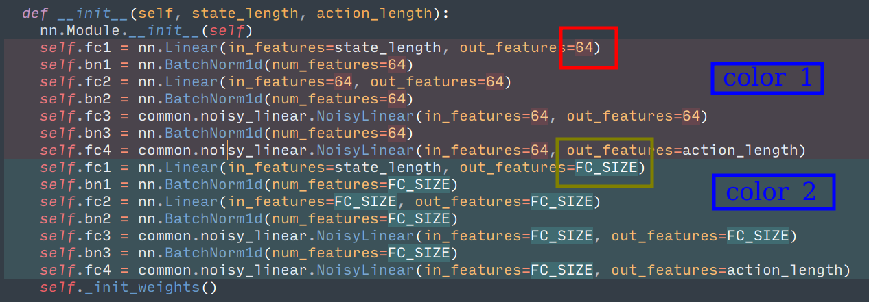
Problem 1: As can be seen from the screenshot, the surrounding color of 64 (marked with the red box) is hard to notice, the surrounding color of FC_SIZE (marked with the green box) is ok. (After switched to the dark theme, I thought that sublime merge has changed the diff algorithm, since there are no word-level or character-level highlight any more, it’s just now I realized that, the word-level/character-level highlight is still there, it’s just that the color contrast is a bit too low for me to notice)
Problem 2: the contrast between “color 1” and “color 2” (marked with blue box) is also a bit too low in my opinion. I understand that this may be an intended behaviour and aims to lower the distraction, but, since we are in a diff context, I think it is ok to raise the contrast a little, to let the user notice the difference more sharply.
Keep in mind that I’m a little insensitive to color (strong protan).