Sublime Forum

Tabs redesign proposal

#1

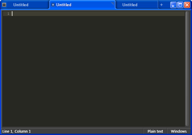
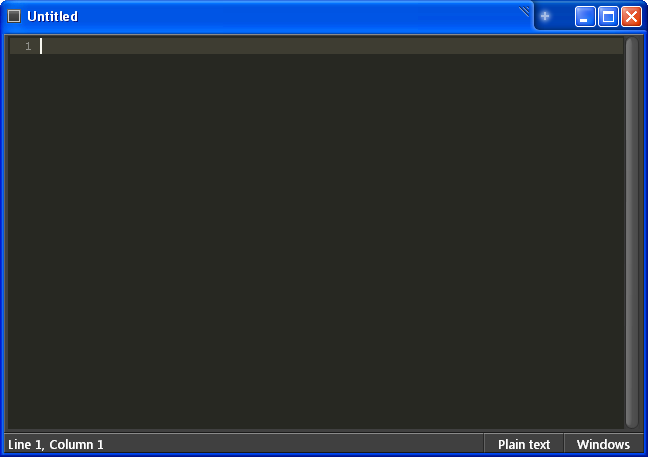
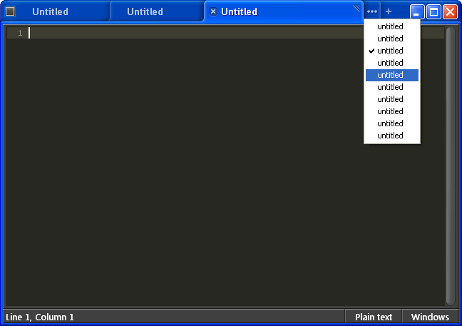
True to the sublime spirit of putting the code at the forefront, I’ve put together a few mock ups on a new tabbing system/structure. Idea’s come from a mixture of recent tab design trends across major browsers. The suggested system would use a tab design similar to Safari 4, but with tab semantics and interactivity more along the lines of FF3 and Chrome. Although the current system is as good as it gets when compared to other text editors, I think sublime is striving for something greater then current generation text editors. Although there is a lot more detail i can go into, I’ll keep this post short and dive in to more detail as necessary. If nothing else, it sure is nice to look at!

Edit:
Try the links below for direct links to the actual images. (sans scroll wheels).

http://www.sublimetext.com/forum/download/file.php?id=39
http://www.sublimetext.com/forum/download/file.php?id=37
http://www.sublimetext.com/forum/download/file.php?id=36

Peace.
Moe.


0 Likes

#2

Ooooh… pretty! I like the way chrome does tabs.

Any idea how to integrate split windows?

0 Likes

#3

I like it, but I don’t know how easy would be to put that into the interface (programming wise that is…)

0 Likes

#4

They’re great looking mockups moe!

With regards to what’s possible, I spent some time earlier in the year taking a look at redoing how tabs work. Drawing a custom window frame with integrated tabs is reasonable, but doing it in such a way that it integrates with the style of the OS is too labour intensive: it would mean separate versions for XP, vista basic, vista aero, and windows 7. Custom window frames are also somewhat questionable in light of a possible Linux port.

0 Likes

#5

[size=150]@jps:[/size]

This is the age old custom vs. native debate. Chrome took one approach, safari took another. I personally prefer a custom frame and not one that is OS defendant. Among other benefits, such as maintainability, a consistent user experience across platforms is key. The key takeaway from the mock-ups is that you save nearly two toolbar like sections by integrating the tabs directly into the title bar, and frankly that’s where I think tabs belong, as they do represent in essence new windows.

[size=150]First class tabs.[/size]
Treating tabs like icons within a folder.

I think the way we interact with tabs today at large, is too linear, and sequential. Open up any folder on windows and you can select an icon, CTRL+Click to add another icon to the selection, repeat to remove a selected item. Drag multiple icons simultaneously. SHIFT+Click to select multiple at once, and the right click context menu actions apply to all icons in your selection. You could also scroll to see what icons beyond the cuff … etc, simple and intuitive.

[size=150]Why cant we do that with tabs?[/size]
I think its one of those things that will seem almost obvious in retrospect.

Case in point.
Lets assume I have 16 tabs open, 8 of which are currently visible. What I would like to do is close all tabs but 1 and 15. With “first class tabs”, you could simply click tab 2, scroll over and SHIFT+Click tab 14 to select all tabs between 2 and 14 (inclusive), skip over tab 15 and CTRL+Click tab 16, right click on any of the selected tabs for a context menu, and click close. Imagine!

Peace,
Moe.

0 Likes

#6

this reminds me an old idea which i looked for long time on different OS types. i had the (un)luck to work with the sun solaris OS (sun’s unix based OS), anyway, there was nice ideas there, but the one i like most was the ability to iconize running applications (correct me, but i think windows 3.1 behaved the same).

so, it truly turn your desktop into your workspace, and without the need for tabs, i was working with 30-50 files, arranged by groups (just dragging the icons anywhere i want). it was also was combined with the ‘front’ key on solaris keyboard (yeah, it had it special keyboard) which was super-important - you could work on an open file which cover the desktop, and you need another one, that you know you have placed on the upper-right corner of the desktop (iconized - remember?), with out the ‘front’ key you would need to minimize (iconize) the file you work on, then open the iconized file you need, not too great. but with the ‘front’ key, you would press it, and all the background icons would brought front, so you can click on one of them - genius!

long story, but when i read moe’s idea i see this. very very handy indeed. let me sum up the features as i know them:

  • each tab (running instance of an edited file) can be iconized into the editor own workspace (desktop like)
  • you can drag the icons and put them in any order you want on the workspace, forming groups or what ever
  • clicking on one, will open it to continue edit it
  • ‘front’ key when pressed, bring all the iconized tabs to the front, allow you to click on them, while keeping the currently open tab as the background (you can click on it to return to it, or just press again on the ‘front’ key)

enhancements i think of:

  • icons could be minimaps of the closed file, allow you see some of it contents
  • selecting more than one iconized tab will open them in separate panes

vim.

0 Likes

#7

Maybe user should be able to edit multiple files simultaneously?
If there will be possibility to select multiple tabs using Shift key it is quite simple to implement :smile:
It will improve code refactoring.

0 Likes