Sublime Forum

Sublime UI

#1

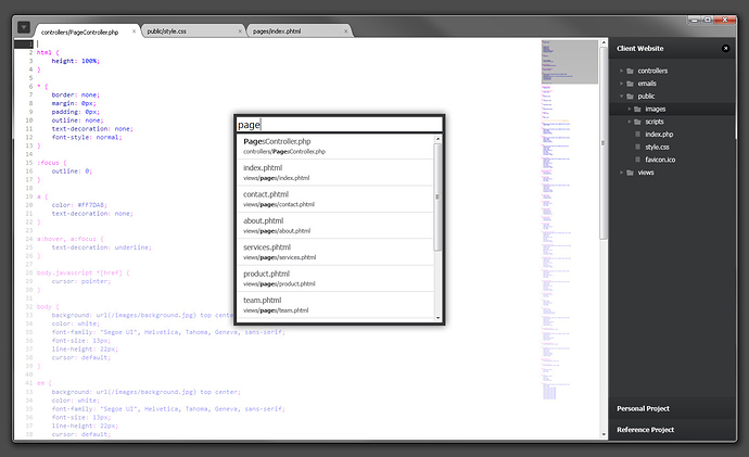
I have seen a few posts with some awesome UI designs for Sublime and thought I would give it a go myself!

I think that tabs on top would be brilliant and really free up more of the screen for code, along with grouping all of the menu items into one drop down to get rid of that bar too.

Personally, I would prefer the sidebar on the right, it just seems more natural to me, and lets the white tabs blend into the code to make it clearer which is selected.

The focus of this design is to keep things simple, and give as much screen space to the code as possible and hopefully keep any design frills to a minimum.

As soon as some more theming capability is available I’ll definitely be working to build something as close to this as possible.

On a side note, how many people prefer coding on a dark background?


0 Likes

New UI?
#2

I love it! Very nice touches like the highlight of the line number area for the current line. Really like the color of the text background merging with the tab, makes it very clean. Sidebar on the right is also my preference.

Personally I sometimes use white and sometimes dark but definitely think that sublime needs to have a good white scheme as well because it can be much easier on the eyes.

0 Likes

#3

Is that a finished design? I’m not sure that the top left icon should be a drop down, but sticking to other chrome central windows, it should be the sublime icon.

I prefer a dark background personally.

0 Likes

#4

I think that would be a good idea, and it would fit there nicely. As I was adding the one drop down for the menu I realised how many items there are at the moment and was thinking about grouping them into 3-4 buttons above the “Client Website” tab in the sidebar.

I might try a dark background version to see how it blends with the tabs.

0 Likes

#5

No. Don’t place it there. That would make Sublime completely different to other windows including cross-platforms. That HCI decision would be bad. It’s not what people expect, Chrome is a push into more space for content and I find that I have to repeat to several people where the menu items are these days.

0 Likes

#6

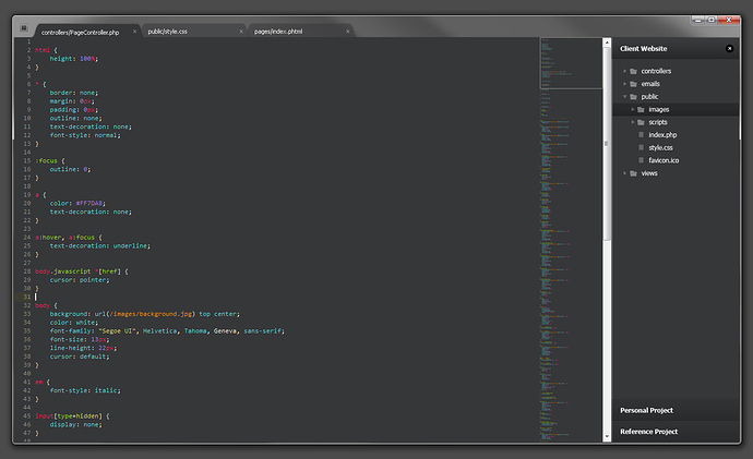
Just a quick example of a dark theme, I’m guessing the custom scrollbars in Sublime are to stop them from standing out so much when you use a dark theme!


0 Likes

#7

[size=150]SCROLL BARS[/size]
https://chrome.google.com/extensions/detail/jfichaompnhpmlpjhcjebedbgaeoeple
This is light, awesome, sleek and saves space.

Also, just like text-mate we need to have a open in the bottom/footer panel which currently
shows line and column numbers a dropdown menu like thing which allows a user to select
code highlighting.

0 Likes

#8

Woaw! That’s just an amazing UI you made there. Any chance we can enjoy it soon?

0 Likes

#9

That dark theme…
Beautiful.

0 Likes

#10

Plz remember that Apple tried the “tabs within titlebar” thingy for some time and they got a bunch of bad criticisms for it. People mainly had problems hitting the titlebar correctly for dragging the windows. We should not try to get into that area - just like the border of the plate belongs to the customer (and should not get messed up with food).

Respective to the dark/light question, I find myself switching between slate and my modified tango color schemes according to the environmental light level (when the sun shines it’s easier to read black on white and vice versa). So I would want both variants :smile:.
In addition to that I prefer to have the sidebar on the left so that the text area is in the middle of the screen when in fullscreen mode.

One question I miss in every discussion is: How should it look like on other systems than windows? For example the dark sidebar above looks quite awful within OSX using a light color scheme.

I really hope that Jon improves and documents the theme area properly so that we can have proper native (including native scrollbars or look-alike) and negative themes (with cool custom gfx).

0 Likes

#11

The popularity of Google’s Chrome and the consequent adoption by both Firefox 4 and Internet Explorer 9 (and others?) counters this point unequivocally.

I can agree with this - as long as performance and cold starts aren’t affected.
But, ultimately, I feel the presentation tier is far along enough.
And development should be focused on adding some of the more imposing features, like sidebar file operations and context based snippets/code completion.

0 Likes

#12

[quote=“theblacklion”]
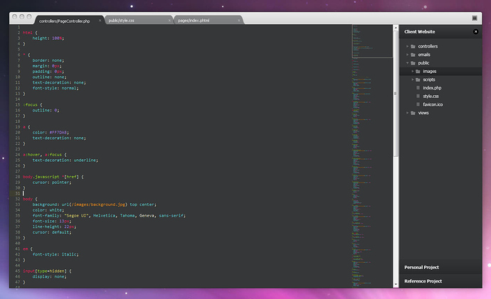
One question I miss in every discussion is: How should it look like on other systems than windows? For example the dark sidebar above looks quite awful within OSX using a light color scheme.[/quote]

I did do a mock-up on OSX but never uploaded it, it still has Windows scrollbars but doesn’t look too bad having a dark interface on the OSX chrome.

I think there is still more than enough space on in the title bar to move without worrying about usability. I think the main issue is actually doing it and then working out how tabs will work when there are 2-4 panes open in the window.


0 Likes

#13

It’s my understanding that Sublime uses a custom UI toolkit… and as for scrollbars I would like to see them in the style of this theme and/or chrome extension.

http://skiesofazel.deviantart.com/art/Orta-184118297
https://chrome.google.com/webstore/detail/jfichaompnhpmlpjhcjebedbgaeoeple

Thanks sublimeuser for the tip on the chrome scrollbars extension, they are so much better and make chrome much nicer.

0 Likes

#14

The default UI has to change because it’s dramatic.

If I want to discern the active tab among the inactive ones I have to get closer to the monitor.
Highlight when using “Go to anything” is barely visible to the human eye.
It takes some skill or a trained eye to actually spot the scrollbars.

I don’t begin to know what the author of this UI had in mind. Mortification?

0 Likes

#15

I’m guessing it was rather simplicity, but I do agree that the default theme’s usability isn’t optimal and should be fixed.

0 Likes