I just updated SM today to the latest version, and while I can see the utility of the file tabs in the commit section, I personally don’t like them – it feels too cluttered. Can these be turned back off?
Sublime Merge build 2020 - hide file tabs in commit section?
djohnston
#2
Hi @cwood,
Thank you for using Sublime Merge, and sharing your feedback with us!
Currently it’s not possible to disable file tabs. Generally speaking though, we like to give our users lots of freedom to customise and tweak to their preferences.
I’ll be noting this feedback down, and sharing with the wider team.
Many thanks,
- Dylan
2 Likes
jdance
#3
Hello, I second this proposal. I still have not gotten used to the new UI, there seem to be files everywhere. The “sublime” aspect has diminished a bit and it feels more cluttered. I don’t understand the “Files” view, and I do not understand the file tabs. I mean, someone probably do understand them otherwise you would not have made them, but I don’t  I managed to find a way to hide the “Files” tab but the individual modified file tabs still remain.
I would also like to suggest some way to see the modified files as a tree, for example when renaming a whole directory this is very useful. Is this what the “Files” tab is supposed to show?
Here I have simply renamed a folder “views” to “viewss”. But there is no way to tell this in Sublime Merge, even though it is a very simple thing. Instead I have files everywhere, repeating the same information. Is there something I am missing to how these views are supposed to be used?
I would go so far as to suspect some new interface designer have come into the project, kind of forgetting the spirit of the initial very much sublime and clean design. If so, hello new designer! An option to hide the tabs would make me very happy and I can overlook the lack of overview when it comes to folders.
2 Likes
TheSecEng
#4
This is one the issue tracker as a feature request and I know @djohnston has mentioned that they are actively looking into the best way to implement this. Many users have voiced their interest in this.
This is also one that has been voiced by many members, I believe there is a feature/enhancement request for this as well.
2 Likes
rsalmei
#5
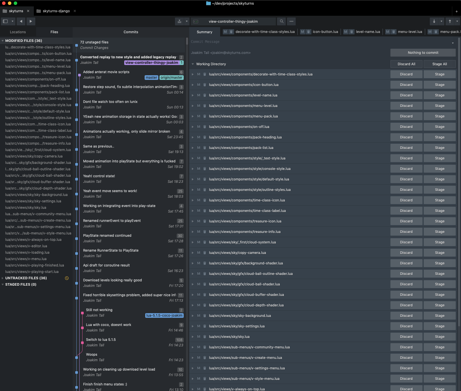
+1, also waiting to be able to disable the duplicated files tabs (even triplicated considering the one on Locations).
I love the fluid way they appear below the commit pane, and I think the collapsed file handles are just like tabs, in a vertical way. IMO it is not necessary another tab for any single file in there, nor the Files tab, at all.
Actually, I don’t like the whole tabbed aspect of this version. I mean the inner tabs, not the top ones for other repos, which I like.
I’d like those inner ones to be completely disabled if possible, removing that whole line and gaining more space on all columns:
- In the left column, I want just a sidebar, with branches, remotes and stashes;
- in the middle one, the commit log;
- in the right one, the commit data/message pane and the fluid file handles.
That’s it, thank you so much for this beautiful piece of software!
0 Likes
I also thing there should be an option to disable tabs. This takes clutters the interface and takes my focus away. I never use tabs on macOS and disabled them in IntelliJ IDEA, too…
0 Likes
cwood
#7
Funnily enough, it’s now been a while and I totally don’t even notice those tabs any more!
1 Like
jdance
#8
I would still like to disable them! They are totally weird for me. I have learned to filter them out but the UI still feels cluttered, especially when introducing new users
0 Likes
rsalmei
#9
Does ANYONE on this world really need to see the modified files TRIPLICATED on the SAME screen? I wonder how the design evolved to this…
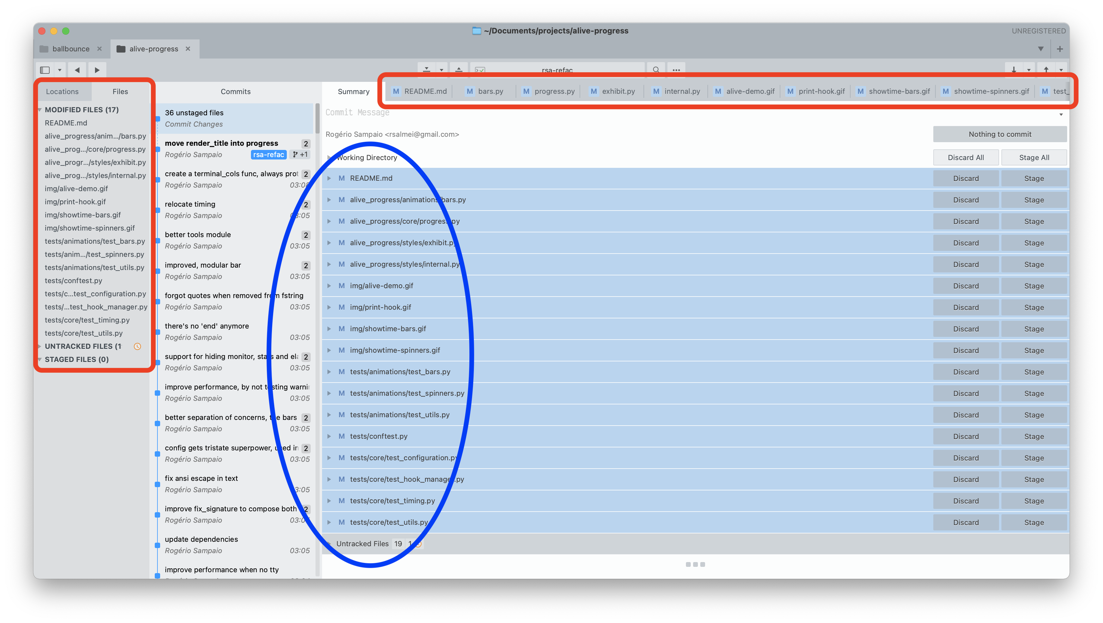
Personally I love the blue section, work only in there.
Both the red sections could be wiped out, and then since their tab area would contain just one item (Locations and Summary), they could also be removed and leaving more vertical space… It would be awesome.
2 Likes
jdance
#10
Agree 100%! Thanks for making me not feel crazy 
Still really love the app, big part of my life
0 Likes
cwood
#11
I use the lefthand Files section on occasion to e.g. determine if a given commit causes any database changes. So I think it’s useful to keep, especially because the left side can be switched back to Locations and you don’t see the files anymore.
0 Likes
cwood
#12
Also, I just made this comment and Discourse thinks it was 31 minutes ago. Good times.
0 Likes