Using ST3 3176, recently updated to Mojave from High Sierra. I have a macbook pro 2015, retina display. Everything looks great. I also have 2 external thunderbolt connected displays, not retina. When ST is on that monitor, my font weights are almost bold. I can use “font_options”:[“gray_antialias”], to tone it down a bit, but it looks much worse, ie not as clear. This wasn’t an issue in High Sierra, using the same ST build, so I’m guessing its something that changes on Apple’s end. Any other options I can try?
ST3 Mojave external monitor font issue
wbond
#2
Yes, Apple did change how they do antialiasing in Mojave. http://osxdaily.com/2018/09/26/fix-blurry-thin-fonts-text-macos-mojave/
0 Likes
aflat
#3
This does only happen with ST3. iterm2, firefox, chrome, vscode(I know electron…so chrome), android studio all seem fine. They are a bit more blurry, but ST makes my font bolder, and more blurry. I get the blurry part, but the bolder part is annoying. I did try the suggestions in the post you supplied, it didn’t help with the boldness.
0 Likes
aflat
#4
Slight correction, didn’t have all the combos
defaults -currentHost write -globalDomain AppleFontSmoothing -int 1
and
defaults write -g CGFontRenderingFontSmoothingDisabled -bool NO
combined make it not as bold, but all apps have a bit lighter font now, not just ST.
0 Likes
wbond
#5
I haven’t updated my Mac to Mojave yet, but was considering doing so today. Once I do that I can see if I can figure out why we might not be getting the desired glyphs back from Core Text.
0 Likes
wbond
#6
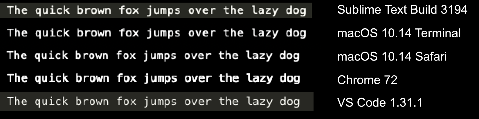
I did a bit of testing, and I’ve confirmed that we are rendering fonts properly, per what Apple does. I tested Chrome and VS Code (since you mentioned them) and they are the ones that are rendering improperly, both at @1x (normal res) and @2x (retina).
I’m attaching two PNGs to this post. Both are 3x zooms of the output from the various programs. All programs are set to use Menlo at 13px. The default Mojave font settings are used. You’ll notice that Terminal and Sublime Text have more letter spacing. By default we emulate Terminal and round the letter positions to whole pixels, instead of sub-pixels. You can turn this off with the no_round setting in font_options.
From these you can see we are pretty much pixel perfect reproductions of Apple’s font rendering on Mojave. I also confirmed that we properly create sub pixel antialiased rendering when you run defaults write -g CGFontRenderingFontSmoothingDisabled -bool NO and log out and back in.
Here is the normal res output:
Here is the retina output:
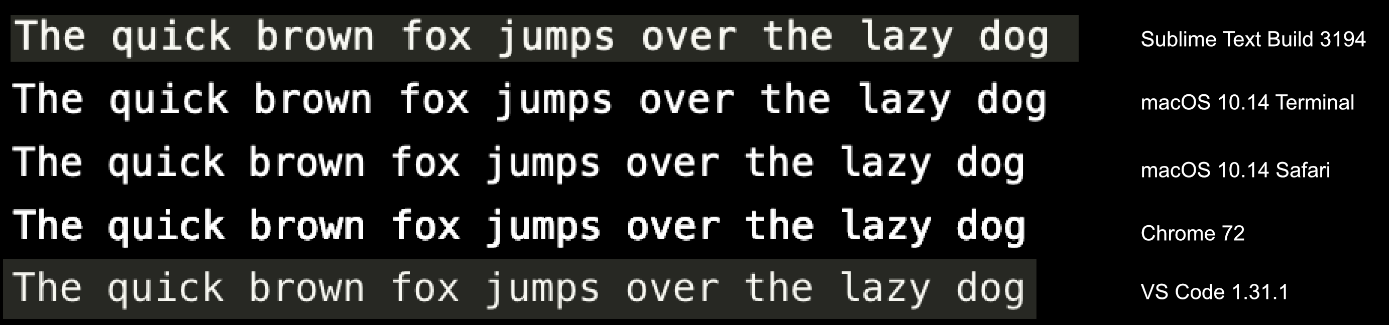
At both the normal and retina resolution you can see that Chrome’s antialiasing is too heavy, and VS Code is too light.
4 Likes
Build 3200 Mojave Support; What is it?
dcd
#7
I noticed a stark worsening of font legibility when upgrading from 3176 to 3200 in macOS Mojave (10.14.3) on my external 27’ (2560 x 1440) monitor.
I’m attaching screenshots for reference, I hope you can appreciate the difference:
3176 top, 3200 bottom
Also the rendered font got slightly smaller although I made no changes to settings between installs (settings remained the same between screenshots).
I am aware of the font rendering changes in macOS Mojave but Sublime was a welcome outlier until 3200 in an overall worse font rendering on non retina displays.
Any tips on how to revert this? I will stay with 3176 until this improves.
Anyway thank you for the new release!
1 Like
wbond
#8
As the post above shows, we render basically pixel perfect in 3.2 with what Apple does on Mojave.
What you were most likely experiencing was what Apple changed in the font rendering. Previously subpixel antialiasing was used. Now Apple prefers gray antialiasing. To prevent things from looking too bold, they alias differently if the background is light or dark - it is context-aware grayscale antialiasing. As of build 3.2, based on my testing, we are faithfully reproducing this.
My hunch is that you got used to the non-context-aware grayscale antialiasing in 3176. It should be possible via macOS settings to control the font smoothing to tweak how heavy the antialiasing looks. This should reflect properly in native apps that use CoreText, especially Apple apps. Some apps like Chrome don’t seem to respect this, and are way too bold (see my testing in the previous post).
1 Like
tablatronix
#9
hmm, yeah this bad on non retina, it is so antialised the colors change! , doesn’t make sense. It is a blurry mess.
attached side by side update(3.2) on left, non retina and retina

0 Likes
wbond
#11
From your posts it is not clear:
- Which window is which
- What issues you have with the font rendering
In one place you mention colors and another antialiasing. Since we are discussing text rendering, making some crops of an area to focus on, along with a description of what you see the issue to be would be most helpful in ensuring I understand you.
I did see a report from one user about Mojave and color spaces at https://github.com/SublimeTextIssues/Core/issues/2697. I’m not sure what changed with Mojave in combination with the transition from 3176 to 3200 that may have affected this.
From my post at ST3 Mojave external monitor font issue, you can see that my tests so far indicate we are matching Apple’s apps in terms of text rendering. If you have some contradictory results, please share them so I can investigate further.
0 Likes
tablatronix
#12
This is not really mojave related, this is after 3.2 update ( on mojave ), maybe a different issue then.
(colors changing meaning the aliasing is so severe that the colors lighten on dark background is what I meant)
This is the change from subpixel aliasing in 3.2
top image is side by side on non retina display, 3.2 is the left app, 3176 is the right ( drastically change )
bottom is the same but on the retina display( fairly similar )
0 Likes
wbond
#13
The images from 3.2 look correct to me. It appears 3176 colors were way oversaturated. EDIT: Additionally, I know for a fact that 3176 did not properly perform context-sensitive grayscale antialiasing. This is likely the stronger antialiasing you are seeing in 3176. I think this non-context-sensitive antialiasing is what Chrome is doing also, and hence why in the 300% crops above it looks heavier than everything else.
As I stated above, I’ve created 300% crops of our text rendering on 3.2 and they look exactly like Apple’s apps. If you can produce some contradictory evidence, I think 3.2 is the correct rendition.
0 Likes
tablatronix
#14
But the drastic different between retina and non retina then ?
The colors ARE different it looks like, no idea what the deal is I will look into it further, but I color picker the theme background and they do not match, might there be some kind of gamma or brightness adjustment in 3.2 ?
Bg matches on retina display, does not match on non retina…
0 Likes
wbond
#15
This has to do with the switch between subpixel and grayscale antialiasing. If you google about the change, there was discussion about Apple ditching subpixel antialiasing because iOS doesn’t support it, and they are working towards convergence between iOS and macOS.
On non-retina screens, grayscale antialiasing makes a much bigger difference. Because of this, they switched to context-sensitive grayscale antialiasing where they varying how heavy the antialiasing is based on the lightness of the background color. You won’t really notice the different on retina since the pixels are so much smaller.
0 Likes
tablatronix
#16
What about the background colors not matching between 3176 and 3200 ? Want a screen shot ?
0 Likes
wbond
#17
I believe that has to do with the issue I linked to. I have not had time to diagnose that yet. I’ve been working on a few more pressing issues.
0 Likes
tablatronix
#18
Of course, Thanks Will,
I think this(my post) has something to do with an old issue #800 - incorrect color rendering, so something did change that in this version regarding color space rendering etc.
0 Likes
dcd
#19
Just to report back quickly. This did it for me, fonts appear a bit ‘thicker’ again:
defaults write -g CGFontRenderingFontSmoothingDisabled -bool NO
Thanks for taking the time @wbond and congrats to you and the team on the new release, very happy with it apart from this hiccup. It’s good to see Sublime still alive and kicking!
0 Likes