Indeed, that would be great – at least when there are lots of tabs, and the usual dot indicator gets invisible.
Soda Theme - New Sublime Text 2 UI theme
Howdy Jon,
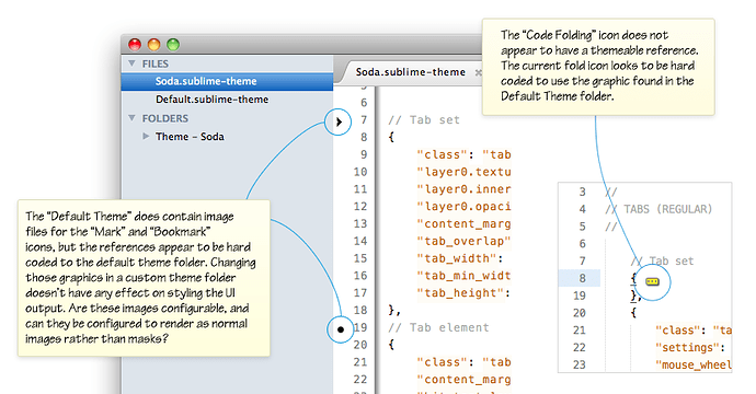
I was wondering if there’s a way I can theme a couple of the remaining UI components that appear to have hard references to assets in the Default Theme folder?
The outstanding items I’ve tried (but failed) to customise are:
-
Gutter: Bookmark icon
-
Gutter: Mark icon
-
Editor: Folded code …] indicator
If I add them to my themes folder they don’'t seem to get picked up, but if I edit the source images in the Default Theme folder they work from there.
I’ve noticed that some of the other UI plugins have managed to customise the gutter icons, if anyone knows the rules I’d be keen to know.
There’s also some other details of visual rendering anomalies on the github wiki page: github.com/buymeasoda/soda-them … -and-ideas
I’m keen on getting something in as well, I’ve got some ideas but playing around with execution at the moment.
Ian
I’ve added my initial take on the “unsaved changes indicator” to Soda Theme.
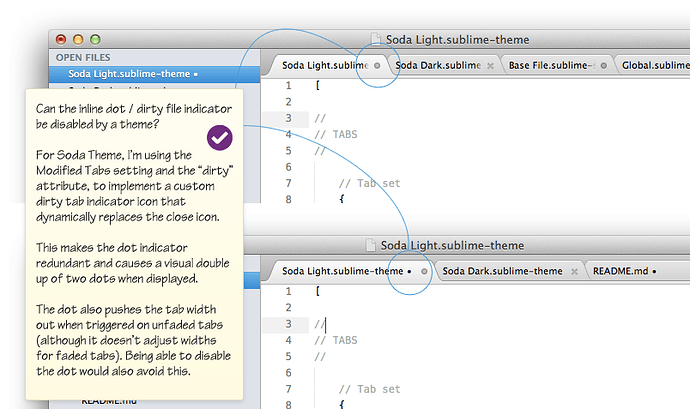
When a file is edited, the close button dynamically changes to a circle icon to show unsaved changes (or for users with close buttons disabled, the circle will simply appear).
One thing that arose from this implementation is that it makes the existing text based label dot redundant, and I’d really like to disable it via the theme.
Is there option or setting for themes to be able to disable the default text based dot that renders at the end of a tab labels name?
It would be nice to be able to turn this off to avoid the double dot effect (see below), and it would have the added benefit (for themes that don’t need it), of not causing tab widths to be pushed out due to the text dot rendering.
Here’s some details on that request, and a look at the unsaved changes indicator of Soda Light:
[quote=“buymeasoda”]I’ve added my initial take on the “unsaved changes indicator” to Soda Theme.
[/quote]
I do like the look of this approach but it seems to suffer from the same issue as the original dot method. When I have too many tabs open, I cannot see your dirty indicator. At least with the orange glow, I could always see it. Though I do like the look, functionality is always very important to me.
Is there a way to force the close icons to always be shown that I am just not aware of? If not, it would be nice if you could implement a dirty indicator that doesn’t disappear when a lot of tabs are open.
Yeah, that is something that would be nice to find a way to fix.
There seems to be some logic in place (that may be configurable by a theme, or perhaps is hard coded in the app), that auto-hides the close button at a calculated minimum width. If anyone knows how to adjust this, let me know and I’ll try some adjustments to keep it there at much smaller sizes.
At the moment on a 1280 wide resolution with an average sized sidebar, it’ll fit about 21 tabs with a visible indicator, regardless of the length of the tab label file names. With wider resolutions, or no sidebar showing that number increases, but yeah, I end up with lots of files open too and would like to resolve that.
Jon, are there any parameters that can set what the trigger width is for auto-hiding the close button?
Changing the close button for dirty files should also be done for Open files in the side bar, as I suggested here:
Preferably it should also be done for dirty files in the Folders section in the side bar, since one might hide both tabs and Open files and just show the project folder.
Completely agree. I would also like to see this.
At the moment, based on my interpretation of how Jon has implemented the “dirty” state trigger, it appears to be a property of the tab_control, rather than something more abstract, like the file itself.
When determining whether or not to trigger the dirty file icon in place of the close button, the theme does more or less the following check: “For this close button, if the parent tab element’s dirty attribute is true, display the dirty file icon”
The actual theme rules are:
// Tab dirty button
{
    "class": "tab_close_button",
    "settings": "highlight_modified_tabs"],
    "parents": {"class": "tab_control", "attributes": "dirty"]}],
    "content_margin": [8, 8],
    "layer0.texture": "Theme - Soda/Soda Light/tab-dirty.png",
    "layer0.opacity": 1.0,
    "layer1.opacity": 0.0
},
You can see the check there with: “parents”: {“class”: “tab_control”, “attributes”: “dirty”]}],
I’m not aware at the moment of a way to leverage that for the sidebar tree without Jon adding some other form of indicator for determining if a file is clean / dirty.
I’d certainly use it, if there’s a trigger available or one was added.
The gutter icons paths are hard-coded, as you’ve noticed. The main reason for this is that the current gutter drawing logic isn’t aware of the theme system, and isn’t able to export elements to be themed by it. It’s also worth nothing that the gutter icons have some post-processing applied to them, so they’ll be tinted to the same color as the region added via the add_regions API.
The icon name is an argument to the add_regions API call, and may be dot, circle, bookmark or cross (although it reality name will work as long as there’s a corresponding icon in Theme - Default).
The fold marker path is hard coded for a similar reason, although it doesn’t have the tinting applied.
The current logic is that the tab close button is only shown if it would leave the label with at least 18 pixels of space. The number isn’t currently configurable.
Cheers, good to know.
Is the handling of the fold arrow icons in the gutter different to the mark / bookmark icons? I’m guessing this is because of the way bookmark / mark are manageable via the API and plugins?
[quote=“buymeasoda”]PLEASE NOTE: Theme folder location has now been relocated from “Packages/User” to “Packages” in the latest update
The theme has now been updated to work when placed inside the Packages folder instead of inside Packages/User. If you have cloned the theme into the User folder, you will see a broken theme (with red backgrounds) on the next git pull. To correct this issue, move the “Theme - Soda folder” from inside User to inside Packages.
See GitHub: Theme location issue https://github.com/buymeasoda/soda-theme/issues/10 and “Sublime Forum: Theme location discussion” (this thread) https://forum.sublimetext.com/t/how-to-create-a-new-language/47/1#p11550 for more details.[/quote]
I tried to copy it in Packages/Users but I still doesn’t see this theme is available 
As it says in the text you quoted, the theme folders go in Packages not Packages/User
And they don’t “show up” anywhere: you need to add the theme name to your Global.sublime-settings in User.
[code]// Place user-specific overrides in this file, to ensure they’re preserved
// when upgrading
{
“theme”: “Soda Light.sublime-theme”,
“highlight_modified_tabs”: true
}[/code]
I think the terminology is confusing, what with Themes and Color Schemes.
[quote=“handycam”]As it says in the text you quoted, the theme folders go in Packages not Packages/User
And they don’t “show up” anywhere: you need to add the theme name to your Global.sublime-settings in User.[/quote]
I’m getting ready to release a beta version of a theme manager to address this. Look for it in the plugin announcements section within the next 3-5hrs 
Ok so I’ve read through here, and none of these directions seems to be working right for me.
I am a total newb when it comes to ST2 and git. However these are supposed to be easy to follow instructions…
…and this is what the outcome was:
http://i385.photobucket.com/albums/oo298/Bmoner85/Posts/ScreenShot2012-01-25at72822AM.png
What is going on here?
Just download it manually. Go to https://github.com/buymeasoda/soda-theme/
Click download zip. Unzip. Place the resulting directory “Theme - Soda” into your Packages/User folder.
In User/Global.sublime-settings, add "theme": "Soda Dark.sublime-theme"
That’s it.
[quote=“handycam”]Just download it manually. Go to https://github.com/buymeasoda/soda-theme/
Click download zip. Unzip. Place the resulting directory “Theme - Soda” into your Packages/User folder.
In User/Global.sublime-settings, add "theme": "Soda Dark.sublime-theme"
That’s it.[/quote]
Ok I got it to work. I wasn’t aware I had to place the WHOLE directory in there. I thought I had to take what I needed from out of that folder and rename it.
Another problem though is that as soon as I saved the theme, my tab text went nuts.
How so? Sometimes you need to restart ST2 to fix any graphical errors that occur when the theme loads.
You’ll need to place the theme folder, which should be named Theme - Soda into just the Packages directory, rather than Packages/User. If you have it in the User directory, then that’d be why everything went wonky 
I’ve added this to the Soda Dark theme!
		<dict>
			<key>name</key>
			<string>Embedded source</string>
			<key>scope</key>
			<string>text source, string.unquoted</string>
			<key>settings</key>
			<dict>
				<key>background</key>
				<string>#343434</string>
			</dict>
		</dict>
I gives highlights on other code languages, with this is easier to read between multiple languages on the same file! (imho  )
)
[quote=“harleyotto”]This is excellent!
What color scheme are you using in the screens?[/quote]
It says right on his github page, including the link to download them: https://github.com/buymeasoda/soda-theme/


