Sublime Forum

Show result and base simultaneously when doing 3 way merge

#1

I’m using p4merge for resolving merge conflicts. I am very used to seeing 4 panes with left/base/right/result views. In Sublime merge there are only 3 views with ability to switch between base and result. It’s very inconvenient having to switch between base and result. If SM would show all 4 views at the same time, then I could fully switch to it.

Here is how it looks in both SM and p4merge (3 panes vs. 4 panes).

0 Likes

#2

Guess this is a question of taste. I tried p4merge before switching to SM but found it horrible. p4merge is somehow confusing and it’s easy to loose track about which side to use.

The three panes with my changes on the left an their (remote) changes on the right seems much more intuitive.

0 Likes

#3

I think it’s more than taste. Sure, p4merge is more confusing for those who are not used to it but once one does get used to it, I think there should be no arguing that it is just more useful and faster to work with 4 views.

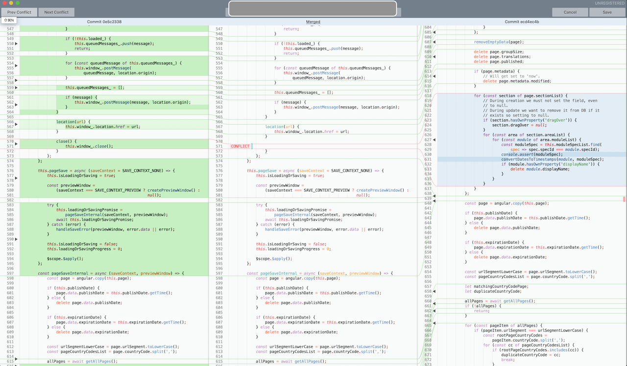
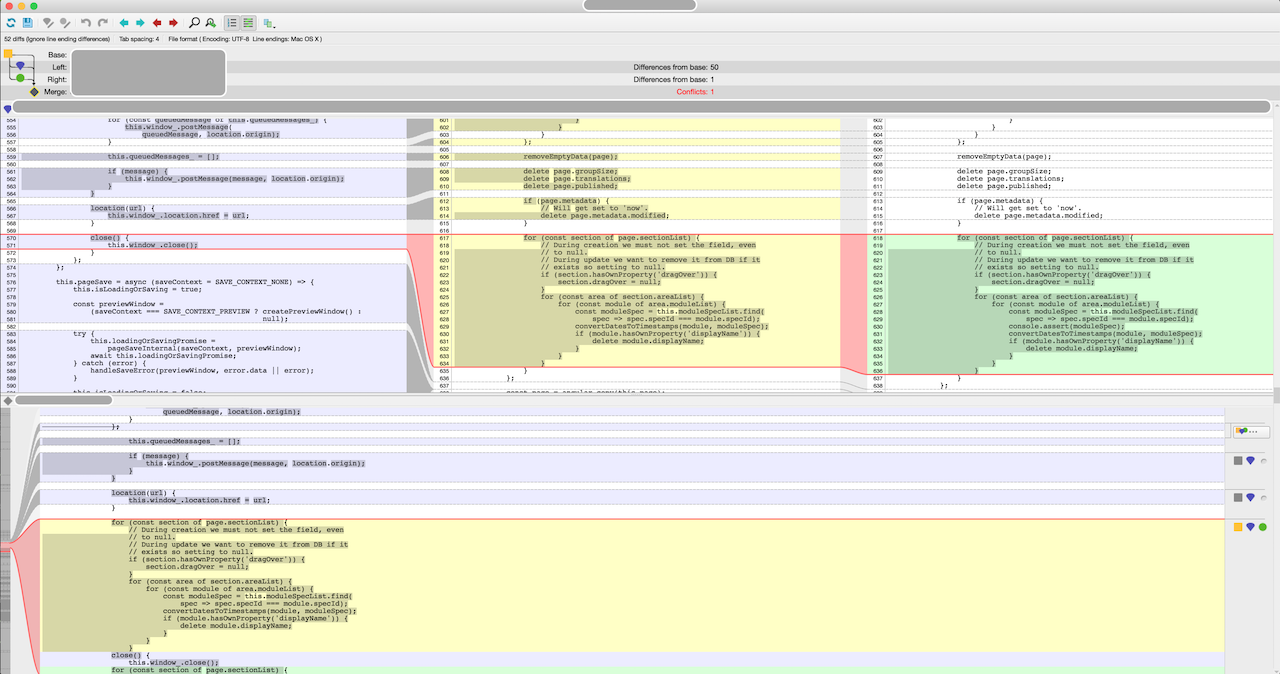
I’m not sure if you are arguing that seeing base is not useful or that seeing all 4 views at once is not necessary. In case it’s the former, I’ll give you an example. There are cases where you just have to see the base of the remote to fix the conflict properly. For example, look at the p4merge screenshot above. The remote (green chunk) changed one line relative to its base (yellow chunk). Now, “master” doesn’t have that block anymore. It might have moved or refactored that code. You need to see the base to understand what remote has changed to re-apply that change in the merged code.

It shouldn’t be questionable that seeing more is in that case beneficial. And while you can see that in SM too, you have to switch views and that is disorientating for me at least (also I think there is no keyboard shortcut for switching view so one has to use mouse).

(I’ll give it to SM that it somewhat highlights the line that was added on the right side, but not sure it’s that clear or that it would be in all cases.)

If this feature gets added, there probably needs to be a way to switch between 3 and 4 panes. Even if only because 4 views are more confusing.

0 Likes

#4

It was more or less a spontaneous feeling when I saw the p4merge screenshot ;-). I tried hard, but I don’t get used to it.

Maybe the word taste is not accurate to express it well. I know that 4 pane layout from kdiff3 as well and agree, that the base revision is sometimes required to be able to understand and resolve the conflict, but in the provided screenshots the yellow (base) and green (remote?) hunk just show the same content. This is what SM’s layout just avoids.

I personally just find the 3-pane layout more intuitive in most situations. Wrote some bindings to do conflict navigation and picking left or right via ctrl+alt+cursorkeys and got used to it much faster than with p4merge. In most situations I was faced to such conflicts, I knew about the changes and the function of the code as my changes were not too old. Maybe a different situation in some long lived branches though.

Its just hard to find the correct balance between the least required information displayed and to see too much.

Btw.: Toggling between merged and base is possible via ctrl+0 It just feels like the CONFLICT marker expands to the base code by pressing the key combo as the borders of the hunk stay in sync - at least for smaller hunks.

0 Likes

#5

Personal preference then - nothing to argue about. :wink:

But just to clarify… remote (green) and remote base (yellow) do differ with one line - console.assert call is added in green chunk. SM highlights that slightly albeit a bit poorly – while still valid diff, it spans over two lines rather than highlighting that specific line.

0 Likes