On VSCode, and any decent IDE, search is in a separate panel. Search results don’t get mixed with files.
On Sublime, search is like you opened a new file named “Find Results”, in a new tab.
Who thought this was a good idea? Yuck.
On VSCode, and any decent IDE, search is in a separate panel. Search results don’t get mixed with files.
On Sublime, search is like you opened a new file named “Find Results”, in a new tab.
Who thought this was a good idea? Yuck.
You could split the layout in 2 rows and bring the search results to the bottom row I suppose.
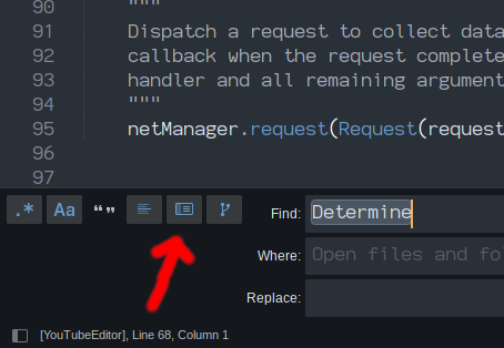
You can also turn off the option to display the search results in a tab if you want them to display in a separate panel (via this button, shown enabled here):
Is that an ST4 thing or does it come from a plugin? I’m not seeing that or the branch option to the right of that in ST3.
It’s there in ST3 as well:
If you use a different theme, the button will appear differently, but it should always appear in the same relative position. If you hover your mouse over it, the tooltip says “Use Buffer”.
Yup, different theme, different icon. Learn something new every day (or so)! Thanks.
This puts the search results right at the bottom. It’s more impractical than in a new tab.
Why can’t it be like VScode?
Practicality is in the eye of the beholder. If I want the search results to be on the left, I would put them into a tab, go into two column mode, and move that tab to the left side of the layout.
Sublime has the flexibility to give you that if that’s what you want.
That would work if you want a permanent panel with search results opened all the time, which nobody does.
It doesn’t look like you can use ctrl-f to search through the results (and context), nor multi-select all the results, so that approach doesn’t seem better to me.
In projects with dozens of files open, I wonder what makes opening another pseudo file with search results so inpractical.
I agree with manually modifying layouts just to arrange the find results view is a bit awkward. It works but it doesn’t feel natural (nor sublime). It feels like there is just a lag of a better solution. Even when used to work with multi-column layout you often happen to have the wrong panel focused when starting search, so the results open where you don’t want them.
Clicking a marked result to open the containing file opens it in the same panel as the find result view, which means you need to change tabs very often to switch between results and files. Feels not too optimal even though not a big deal for someone used to quickly navigate between panes and views via keyboard.
The find results view often opens in the middle of somewhere. In order to give it a certain preceedence it may probably be opened as left most file and made “sticky” to always keep there.
Another general approach was to enable all kinds of panels to be arranged in vertical manner. On (ultra-)wide-screen displays it may make more sence to have panels fly in from the right instead of the bottom of the window.
This would automatically create a kind of temporary 2 column layout with search results on the right if desired by the user. Another benifit might be the find panel which could cooperate better with output panels in such a constallation. Means find panel could remain open, while output panels are visible on the right.
My biggest issue with project searches is that I wish they had a separate field for excludes. I don’t like doing a project include and exclude on the same line.
With that said, I usually use a 3rd party app for project searches, so it doesn’t bother me in actuality, but when I did use Sublime’s project search, I never liked the include and exclude patterns required in the same input field.
I also didn’t like that I couldn’t cancel a project search, but maybe that’s changed now?
Everything else I’m fine with.
Like Benjamin and deathaxe noted, it’s important to be able to search inside of the search results again. Actually, Visual Studio (the IDE, not the text editor) also dumps its search results in a regular buffer so you can search inside of the search results. For super large projects, this is a must-have.
It’s not that they are on the same “line” per se as much as it is the same field. I’d like excludes to be tracked separately with their own history. I’d like to change just the include and keep the exclude etc. Or reuse an exclude later for a future include.
I have to disagree, what is great about ST3 search is that it contains the surrounding text, which gives you the context of the search term where it is used, this would be too messy in a narrow side pane. VSCode search pane only give the one line which is not always so useful and you have to click trough each line to determine which results are applicable. Also to be able to search the results is very useful.
As an configurable option it would be OK, but I would not like to see it as a replacement.