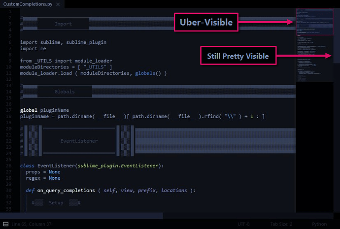
Is there any way to make the slider on the scroll bar stand out better? It’s very dark, almost the same colour as the scroll bar background, and very hard to see.
Scroll bar slider is hard to see
If you change “overlay_scroll_bars”: to “enabled” in your preferences you should get scroll bars based on the current theme when you actually scroll which I don’t seem to understand since that’s what scrollbars are generally for. Apparently they are modeled after Max OSX Overlay Scrollbars Win7
As of 2190 Windows scrollbars appear to be borked. If “overlay_scroll_bars” are set to “system” it’s my understanding that they should use the default system scrollbars. I should point out I am on Windows 8 so that may have something to do with it.
I’ve tried enabled, disabled and system and none of them make it any easier to see the scroll bar. The disabled is interesting because the scroll bar disappears until you use the mouse scroll wheel and then it shows up, without the almost black background which does help.
The curr3ent scroll bar is so hard to see it’s almost unusable.
Bump, any progress on this topic? I too wish for some flexibility to change the appearance/style of the scroll bar. I am on Windows 7 and it would be nice to see the standard scroll bar! 
PS. “overlay_scroll_bars”:“enabled” works OK, but still would be nice to see the standard scroll bar in Windows 7.
I could barely see the scrollbar “handle” because of the lack of contrast, so in lieu of another solution (my searches turn up nada), I replaced the image file that controls this color with the one attached. It’s found in the “Theme - Default” package. Of course I realize that an upgrade will probably override my file, but desperate times call for desperate measures.
![]()
@mbarrish Thanks for the tip on the scroll bar colors. I did what you did, just opened up gimp, located the icons and changed them to some visible color.
+1. The nearly-invisible scrollbar handles really make Sublime Text almost unusable. Any word on a fix for this?
In no particular order:
#[1]
Use the Mini-Map instead.
#[2]
Find a Theme that suits your preference.
#[3]
Modify the [ default | installed ] theme to suit your preference.
I recently wrote up a post regarding visibility improvements in ST, although it doesn’t cover scrollbar settings. ( but it does have some tips for altering mini-map colors )
Two things you can look into are the scroll_bar settings @ your sublime-theme file and the overlay_scroll_bars setting at your sublime-settings file.
Here’s mine:
( I mostly use the mini-map viewport, but will occasionaly use the scrollbars for larger files )
( I’ll be releasing this as a combined theme & color scheme after I wrap up some current projects )
Thanks much for the reply. Regarding themes, it’s funny, but I’ve tried all 22 of the themes that ship with ST2, and none of them have a “thumb” that stands out from the scrollbar background color. “Blackboard” is about the best, so I’m using it, but it’s only marginally visible.
However, the mini-map is a great idea! Thanks.
I think you may be referring to color schemes. To the best of my knowledge, SublimeText only ships with a single default theme.
Color schemes affect the color of your documents & their respective syntax, whereas themes affect the color of SublimeText’s interface.
( tabs, sidebar, console, input & output panels, scrollbars, etc. )
Ah! You are right: I was confusing “color schemes” with “themes.” Now I see they are separate. Okay, I’ll check into getting a new theme. I don’t suppose you know of one that has a brighter thumb?
Not off the top of my head.
However, if you review the third suggestion from my previous post, you can change the colors to whatever you want.

