Sublime Forum

Quality Render Engine: SM2, ST3, ST4

#1

Hi.

English is not my native language, sorry.

I have a monitor that although it is 1080, it is physically narrow vertically, I have to increase the font size or scale, to work comfortably with the Sublime products and others.

I recently purchased SM2 and trying to customize the dark theme, I noticed that the font rendering quality is not good enough compared to ST3.

The rendering of ST3 is excellent, and that’s why I started using it a few years ago.

The ST3 render adds some shades in pink / magenta tones, which make the smoothing look very very soft.

The ST4 render, possibly the same as SM2, does not add these color shadows, in fact, they are cleaner, as they are not colors foreign to the adjacent pixels, however, it generates a lower quality render.

I’ve been playing with the SM2 render options under windows, the hardware acceleration doesn’t improve the render quality, the anti-aliasing of the Consolas font is lousy.

None of the SM2 option combinations listed below achieves the rendering quality of ST3:

“directwrite”
“gray_antialias”
“subpixel_antialias”
“dwrite_cleartype_classic”
“dwrite_cleartype_natural”

Because of this, I thought I’d check out the Alpha ST4 render, out of curiosity, and to my surprise, using the same settings as ST3, ST4 renders a bit worse than SM2 and ST3.

To be able to see the differences in detail, use photoshop that allows to turn layers on and off, to compare the images, also use a zoom of 200%.

In this link you can download the psd with the captures:
https://drive.google.com/open?id=1aoEqk-b9VxP_KSMyFmRLIjqrbDllHqSE

Anyway you can see the differences with the naked eye, if you have to see what I indicate here. For example the letter F, in ST4 is very weak on the left.

You may also notice the very sharp parentheses on ST3, not so great on ST4.

I’m working on customizing the dark theme for SM2, and showing the green color that git used originally, instead of the one that comes by default with SM2, I have also changed the font type of the commit panel.

But, what I want to show with the capture in SM2, the terrible smoothing that it does with the source.

I want to think, this will be solved.

Greeting.

1 Like

#2

It would be helpful to include the operating system you’re using and provide comparison images in a non-proprietary format :slight_smile:. We have made a number of changes to the font rendering since ST3, however they should not affect the look of the font.
0 Likes

#3

Nvidia Driver [456.55]
Microsoft Windows [Version 10.0.19041.572]

I have added the individual captures in TIF format, all of them
have the color profile included.

I do not use any format with compression, to avoid the loss of details, that is why I chose the TIF format.

Use the link above to download them.

0 Likes

#4

Thanks. It looks to me like ST4 is not using subpixel antialiasing. This can be for a few reasons:

  1. You have the setting: "font_options": ["gray_antialias"] set, unlikely given it’s working in ST3
  2. Your System doesn’t have subpixel antialiasing enabled. ST4 made some changes to better support mixed subpixel layouts by better adhering to system settings. If your system is configured to do grayscale antialiasing that would be why. See this article for more details.

If you want to use grayscale antialiasing for other apps but have subpixel antialiasing for Sublime Text you can use the setting: "font_options": ["subpixel_antialias"].

1 Like

#5

Hi.

I have uploaded comparisons in a single image, between ST 3 and 4, also another from Netbeans. The images are at 200%.

You can see how ST3 has excellent rendering quality, as does Netbeans.

As I mentioned earlier in this thread: The ST3 render adds some shadows in pink / magenta tones, which make the straightening very very smooth.

This is particularly true for ST 3, you can see the smoothing in the letter F and the parentheses in the comparison.tif file.

If there are no changes to the ST4 engine, maybe ST4, it doesn’t read the configuration correctly, that’s why it doesn’t render the same as ST3.

I should clarify that in Netbeans, the Consolas font is in size 14 and in bold.

The configuration used for ST3 and ST4 is:

"font_size": 10,
"font_face": "Consolas",
"font_options":
[
"ss10",
"no_italic",
"subpixel_antialias"
],
"ui_scale": 1.15,

Greeting.

0 Likes

#6

Can you confirm whether a native windows application like notepad is rendering text like ST3 or ST4?

0 Likes

#7

Yes, Notepad looks just as good as ST3, with Consolas font and size 10.

0 Likes

#8

Thanks for confirming that, I’ve been able to diagnose and fix the issue.

0 Likes

#9

Well that’s great !!!

Maybe you can transfer the correction to the SM2 engine as well.

Greeting.

0 Likes

#10

It’s the same codebase, so fixing it for ST also fixes it for SM.

0 Likes

#11

Hello everyone.

The ST4 rendering engine has been fixed, it is now as good as ST3.

In build 4094, we can already enjoy great code quality.

The font smoothing works perfect, applying any font size and simultaneously, scaling the UI.

This is important, since with these two variables, we can adapt the size of the UI and the size of the text of the code, as we please.

If you work with git repositories, you may want to increase the size of the text in the repository folder list.

Remember:

The renderer can change the font size in real time, however, when scaling the UI, you need to restart ST4 to apply the change.

When you apply a value other than 1.00 to the UI, the text in the code zone is scaled as well.

If you find that the font size of the code text is somewhat large, you can reduce the font size.

The detail here is, that the values ​​for the font size seem to be integer values.

My functional configuration:

{
	"color_scheme": "Packages/Color Scheme - Default/Mariana.sublime-color-scheme",
	"font_face": "Consolas",
	"font_options":
	[
		"ss10",
		"no_italic",
		"subpixel_antialias"
	],
	"font_size": 10,
	"ignored_packages":
	[
		"Vintage"
	],
	"sublime_merge_path": "c:\\program files\\sublime\\merge\\sublime_merge.exe",
	"theme": "Adaptive.sublime-theme",
	"trim_trailing_white_space_on_save": true,
	"ui_scale": 1.15,
	"show_encoding": true,
	"show_line_endings": true,
	"word_wrap": false,
	"draw_minimap_border": true,
	"indent_guide_options": ["draw_active"],
}

We hope to have these same fixes in the rendering engine in SM2 soon.

Greeting.

1 Like

#12

SM2 dev build 2041 was released 5 days ago with a lot of similar release notes, I would figure it’s been fixed there.

0 Likes

#13

Hi @srbs.

I don’t have the dev version of SM2, but thanks for the info.

Greeting.

0 Likes

#14

Hello everyone.

Like ST4, SM2 has received fixes in the rendering engine, the quality has improved remarkably.

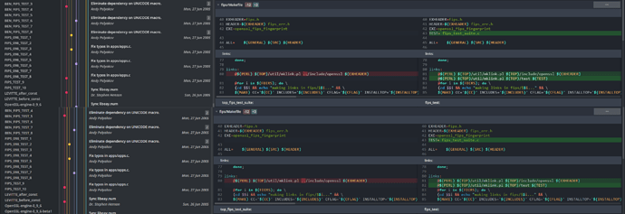
In the image above you can see the render of SM2, Stable Channel Build 2039, below the Dev Channel Build 2041 version.

Many thanks to @srbs, who informed me of the render fixes, in the Dev version. Now I enjoy the quality code.

On the other hand, you will surely notice a lot of difference in general, with respect to those who use SM2, with its dark theme by default.

In the commit tree and code area. I have modified many things, to adjust it to my liking, however, I have not finished doing it, it is very uphill, you have to modify and touch many things, that is why there are things to finish.

I am trying to bring to SM2 the genuine git colors (red / green, used in the GUI version of git), to see the differences, I am quite satisfied with the result, SM2 has a great potential, to exploit, when using the alpha channel , to generate transparency, very precise.

However, it is a difficult foal to tame, you have to invest many hours !!! Even so, the red and green color on a dark background as a base, generates many problems of contrasts and readability of the code.

One way I found to deal with this problem, was to use bold text, depending on the color of the text.

When moving the files, to modify the dark theme, from SM2 SC B2039 to SM2 DC 2041, there are things that do not work well, it is not enough to replace the files, there must be changes there, which ignore the configuration.

As you can see, on line 45 the words appear to be bold in the SC version, while in the DC version, they look “skinny”, although I cannot confirm this due to the little free time I have at the moment.

Anyway, you can see with the naked eye the great improvement in text smoothing. With emphasis, on the parentheses and the symbols @$( on line 81.

Even turning on OpenGL acceleration shows the improvements, however OpenGL does not seem to have a visual advantage over the default settings.

You are free to change the font size and scale the UI and still have excellent anti-aliasing; If you scale the UI, remember to restart SM2.

Greeting.

0 Likes