Sublime Forum

New logo discussion?

#85

Though I DO believe the current icon is sufficient, it IS rather annoying to have a linux terminal open on the task bar along with an instance of Sublime… When I’m in “mouse mode”, I will 9 times out of 10 accidentally click the wrong app a few times. The icons just look too similar.

No biggie, I can change the Icon to something else…

0 Likes

#86

Ok, do whatever you want dreaming about new icon and creating it, but keep in mind that Sublime Text 2 have an OS X version too and OS X applications have a perfect icons. So, the Sublime Text 2 icon must be also perfect. Look at Coda, Espresso and etc. first.
No offense, but it is true. It’ll be painful to have such a great app with ugly or unsuitable icon and I suppose everybody share my feelings about that.
Try best.

0 Likes

#87

[quote=“atomi”]Are there plans to add file type icons?
Embedding just a few in the main exe might be worth the small effort.

I use the portable version of ST2 and a script that associates all the sublime preferences/settings files with ST2.
And I made this quick icon just to help me distinguish between these files and others.

I’d like to have a couple more as generic as possible just to visually distinguish some of the various code file types I use. But I’m not much of a designer and the icons I’ve tried making don’t stand out like they should when they are small.

Edit: Sorry I hope my message doesn’t detract from the logo discussion, but I think this it’s relevant enough for the designers here to take a look at.
Thanks In advance :smile:[/quote]

This is really nice, thank you!

I can take a shot at making the filetype icons a little more visually appealing if you don’t mind sharing the source file :smile:

0 Likes

#88

Here is the PSD I used schmrom.deviantart.com/art/Filet … D-88637169
Thanks to the designer, it was very little work to get the sublime document icon done using that source.
I darkened up the edges a little and just dropped in the current Sublime Text logo.
That was about it on my part. But yeah, have fun with it :smile:

Edit: There is also this source available at deviantart jasonh1234.deviantart.com/art/Le … -106107697
Not really designed to work as a tiny icon, it would need some extra work to get it there as well.

0 Likes

#89

[quote=“ricfurness”]I fell in love with Sublime Text 2 recently, but the icon did seem to taint my dock a little.

I decided to create my own - nothing overly fancy, but something to ‘keep me going’ until it has an official refresh.[/quote]

I really liked the direction here, but since there was no icon file, I created one myself.

Here’s the icon files:
cl.ly/0Q3e3a1r0N151P0A3d1v

How to create the icon file:
tuaw.com/2007/02/26/how-to-make-mac-icons/

How to install the icon file:
gim.ie/amZq

Tools Used:
Photoshop
Illustrator
Icon Composer | en.wikipedia.org/wiki/Apple_Deve … n_Composer

0 Likes

#90

HI all,
I actually quite like default icon in principle, its simple and easily distinguished.
I use a mac though so simple flat icons tend to stick out like a sore thumb on the dock.

I created the below for my own use but thought I would share it here.

download icons for windows/linux/osx : http://bit.ly/popqhz

0 Likes

#91

Love it. Reminds me of the obelisk in 2001.

0 Likes

#92

Thought I would toss my hat into the ring. Our team has been using this icon for a while and have enjoyed it. Thanks!


0 Likes

#93

This one’s awesome! I’m using it now too. :smile:

0 Likes

#94

Nice work :smile: I’m using this one now too.

0 Likes

#95

ICO?

0 Likes

#96

Looks great, just switched to that :smile:

0 Likes

#97

Based on a logo I saw here, I quickly sketched this one out. I think the Sublime Text logo should be sublime, simple, and peaceful. What do you think, does anyone like it?


0 Likes

#98

Hey Guys!

I am new convert to Sublime Text… but I’m lovin’ it and will definitely be spreading the word!

However, upon first launching the app, I honestly thought the present logo was actually some strange graphic glitch or failure with the icon file somehow. It looks like some kind of tiny .gif which has been maginified to undignified proportions. It is almost “anti-logo”. Has now beaten the “Terminal” icon for the title of “Worst Icon on Kris’ Dock” (not affiliated in any way with the restaurant chain of the same name).

So I have decided it is my duty to try my hand on this. For the past 10 minutes I have focused copious amounts of my brainpower to problem of your graphical representation. And this is the result. I hope it gives you an erection, as it did me. And I don’t mean that in a weird way.

Basically… I just tried to think of what people associate the word “sublime” with. Other than a big letter “s”, of course. I could only think of one thing.


0 Likes

#99

The problem is that logo reminds me os Adobe Illustrator (way back when) which was something very similar but Boticelli’s Venus instead of Da Vinci’s Gioconda.

0 Likes

#100

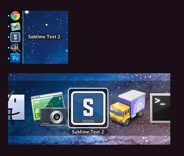
I updated my icon to be a little cleaner, a bit fatter of a border, and use a more updated version of a code sample:

Still a little rough as I don’t have too much time to fuss with it, just a little distraction from coding. OS X .icns file if anyone wants the updated version:

Sublime Text 2.zip (230 KB)

Here’s some shots of it in context, to see how it stands out in the dock when smaller, and among other apps when task-switching:

0 Likes

#101

Harumph.

One could argue that there is more difference between Boticelli’s venus and a DaVinci’s Mona Lisa… than between one variety of “s inside a thing” than anther variety of “s inside a thing”. (it looks like Skype… It looks like Superman… It looks like a stop sign… It looks like… )

But you dont like it, so that’s cool. No. Really… it’s ok.

sniffle

0 Likes

#102

[quote=“Squiggle”]Taking some inspiration from a variety of the icons already posted, here is a first attempt at another variation (although I’m no icon maker, so I don’t know what I’m doing). Please feel free to run with it.

Text in the background is part the svg file itself and sublime_plugin.py for the right hand side, using solarized dark theme.

All done with Inkscape.

[attachment=1]sublime-text-2-icon.png[/attachment][/quote]

This is the one that I use. I freakin LOVE it.

0 Likes

#103

Just thought I’d throw another icon into the mix… I tried to keep some spirit of the while representing the theme I use (Tomorrow Night 80s, https://github.com/ChrisKempson/Tomorrow-Theme). It could certainly use some more refinement.


Sublime Text 2.icns.zip (228 KB)

0 Likes

#104

I love @natebeaty’s icon (and am using it now), but I have to be honest - pretty much any of the icons posted so far would be better than the default one. For such a superb piece of software, the icon really does look awful (and doesn’t give me quick visual distinction between that and a terminal when I have a lot of apps open).

0 Likes