I love the art and the personality of the app reflected in icons, but I hardly ever use dock or taskbar icons. I’m a launchbar and approcket user, I’ve always preferred to launch apps from the keyboard.
New logo discussion?
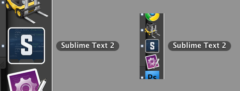
Here’s something I threw together for personal use on OS X:

… which stands out nicely on the dock and task switcher.
(Funny thing is I made my own TextMate icon when I first started using it in 2005, before it had a decent icon.)
I’m really enjoying ST2 so far as another TM expat, but the icon could really use a bit of love on OS X.
I can’t stop fussing with this thing. Here’s another pass, this time larger:
…odd having to pick the code to show in the icon. I’m assuming CSS isn’t the most common use of ST2, and there could probably be a more elegant snippet of something on there. But you get the idea.
Hey, all. I’m a TextMate exile and had to change the ST2 icon in order to maintain my sanity. Here’s a placeholder I came up with until a new logo or icon is released. It’s inspired by the TM icon I had been using. I’m attaching a PNG, PSD, and ICNS file. On a Mac, just control-click on the ST2 icon and click ‘show package contents’ and go to Contents>Resources and replace the ICNS file with the new one. You might need to quit ST2 and re-add it to your dock for the new icon to appear.
http://dac.tl/client/dactl/sublime_icon.png
ST2_Icon.zip (104 KB)
thanks. here’s a zip of the icns file if anyone wants to use it:
Sublime Text 2.icns.zip (196 KB)
I also put together a dark gray version:
Sublime Text 2-dark.zip (194 KB)
… and a revised blue version with fatter border & showing indent guides:
Sublime Text 2-blue-revised.zip (230 KB)
I agree that the application needs a new icon, the current one says nothing about what it does and is also very difficult to pick out on a Mac OS or Unity (Ubuntu) dock. This post is intended as constructive criticism, not as an insult to anyone’s ability to design icons, however, I suspect that most of us here are coders, not professional designers.
That said, I don’t think anything mentioned so far here is a suitable design. The Apple “Human Interface Guidelines” (HIG) is one of the best thought out documents I have read on design of applications, UI, and icons. It gives many best practices and the reasoning behind them. Those apps with icons that stand out have very often followed most or all of the guidelines in the HIG. It doesn’t apply all the time and certainly, it is geared more towards the Mac OS user interface, however I believe a well designed icon could follow most of the best practices and look ‘at home’ on all 3 platforms.
Examples of the style I think the icon should follow are the Mac icons for Cornerstone, TextMate and Transmission. However, as an example of a very well designed icon that is quite famous, but has absolutely nothing to do with what the application actually does, have a look at the Coda icon (the leaf).
I might have a go at designing something, but I am also looking around on icon sites to find something suitable. If the developer reads this though, I would recommend hiring an icon designer to get a ‘proper’ icon/logo as the current one doesn’t really have an identity.
Edit: This: http://shlyapnikova.deviantart.com/art/Blueprint-Icon-172068160 is the sort of style I think would be suitable, but obviously more for a code editor, not an icon editor.
I fell in love with Sublime Text 2 recently, but the icon did seem to taint my dock a little.
I decided to create my own - nothing overly fancy, but something to ‘keep me going’ until it has an official refresh.

[quote=“natebeaty”]I can’t stop fussing with this thing. Here’s another pass, this time larger:
…odd having to pick the code to show in the icon. I’m assuming CSS isn’t the most common use of ST2, and there could probably be a more elegant snippet of something on there. But you get the idea.[/quote]
Very nice  I shall use this~
Nah, CSS is fine. We all use it to edit CSS at some point, not so much with C++, C#, PHP, Ruby, Python or Perl (two of which I can’t stand, and I am sure everyone else reading this has a hate and a love in that list).
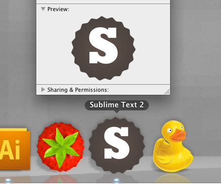
Hi guys! My name is Martin and Im from Poland (Cracow). I just install Sublime as a Ruby editor. It is just great! Because I work as a graphic designer I decided to take my best shoot 
I hope you are like it  If so contact me by mail (neurotok@gmail.com) to get a source files.
Pozdrawiam!
[quote=“Neurotok”]Hi guys! My name is Martin and Im from Poland (Cracow). I just install Sublime as a Ruby editor. It is just great! Because I work as a graphic designer I decided to take my best shoot 
…][/quote]
Ooh, different and I like it!
Hi all,
My name’s Anthony and I’m a freelance Digital Art Director. A very nice developer I’m working with at the agency I’m currently working for suggested I have a bash at an icon for this application so here it is  It may need more work and although I’m not keen on option one I thought would include it anyway just for discussion. I’ll upload some close ups on my site in the next couple of days :- designembraced.com/SublimeIcon.jpghttp://www.designembraced.com/SublimeIcons.jpg
[quote=“Neurotok”]Hi guys! My name is Martin and Im from Poland (Cracow). I just install Sublime as a Ruby editor. It is just great! Because I work as a graphic designer I decided to take my best shoot 
img69.imageshack.us/img69/9776/sublimeg.jpg
I hope you are like it  If so contact me by mail (neurotok@gmail.com) to get a source files.
Pozdrawiam![/quote]
+1 !
some of my icon concepts…
.
I would love to design the new sublime site for the version 2 release.
thanks.
.
Wow, just signed up to post this comment. Love the colour scheme. Can’t believe there are not more replies to this.
Sublime needs a new logo / website when version 2 final comes out and Jon should hook up with you (if he hasn’t done so yet). You definitely have the skills to create a professional looking brand for Sublime.
Top work!
[quote=“Design Embraced”]Hi all,
My name’s Anthony and I’m a freelance Digital Art Director. A very nice developer I’m working with at the agency I’m currently working for suggested I have a bash at an icon for this application so here it is  It may need more work and although I’m not keen on option one I thought would include it anyway just for discussion. I’ll upload some close ups on my site in the next couple of days :- designembraced.com/SublimeIcon.jpg[/quote]
[quote=“Neurotok”]Hi guys! My name is Martin and Im from Poland (Cracow). I just install Sublime as a Ruby editor. It is just great! Because I work as a graphic designer I decided to take my best shoot 
I hope you are like it  If so contact me by mail (neurotok@gmail.com) to get a source files.
Pozdrawiam![/quote]
I think this is my favourite logo so far, but I’m not sure I like the logo being round, and the X needs changing to a regular one that joins in the centre.
The logo should be simple, and modest, Sublime Text doesn’t shout about all of it’s features and it doesn’t need to, people use it and love it for being a great program, and that is how developers find a new IDE.
I don’t think the logo should have:
Interface elements - They will be too small to see and locks you into a UI design
Code - This could put people off looking to code in say Ruby if the logo has HTML tags, or CSS on it
Bevels, gloss, texture - To me, Sublime is flat code, there is no textured background, or glossy buttons, it’s incredibly simple and the logo should show it
Unrelated imagery - Like the Lime, because of SubLIME, or pencil, ruler and blueprint paper because it’s a code editor, I think they’re completed unrelated to the software
Logo as part of the text - The logo can’t sit within in the text, the two need to be able to separate, so it can be used as an icon
I know that leaves a logo that you could say is very boring, but as long as it’s well designed like Neurotok’s then it’ll suit perfectly.
I think the website needs updating to better show that Sublime can run on any platform, and instead of screenshots there should be a video that runs through the main features of within about 30 seconds. Covering GoTo Anything, multi-select, mini-map, themes, snippets and then ending by quickly flicking through all of the languages that can be used in Sublime text. That would sell it to me, and give me everything I need to know to want to download it.
I made the same Sublime Text icon bigger and a bit more polished… in case anyone cares here are the Mac OS X .icns file.
Sublime Text 2 Icon.zip (131 KB)
This is a slightly improved version of my icon… how with a sample document icon for python.
Sublime Text 2 Icon.psd.zip (81.2 KB)
Sublime Text 2 Icon.zip (99 KB)


